
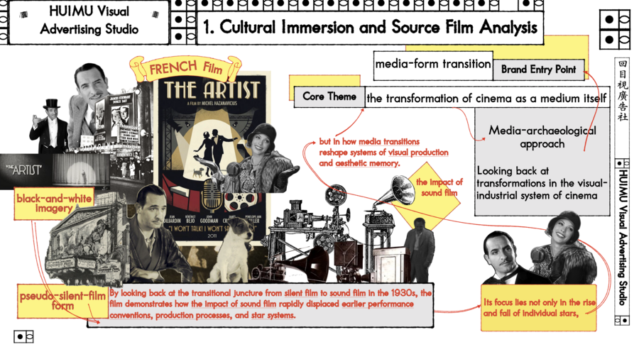
1. Cultural Immersion and Source Film Analysis
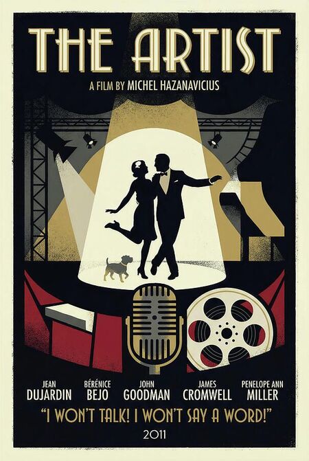
This brand project originates from the French film [The Artist (2011)]. Rather than succeeding through narrative complexity, the film takes the transformation of cinema as a medium itself as its core theme. By looking back at the transitional juncture from silent film to sound film in the 1930s, the film brings into view an old visual system of the film industry that disappeared as a result of technological change.
Through black-and-white imagery and a pseudo-silent-film form, the film demonstrates how the impact of sound film rapidly displaced earlier performance conventions, production processes, and star systems. Its focus lies not only in the rise and fall of individual stars, but in how media transitions reshape systems of visual production and aesthetic memory.
Therefore, The Artist is not a film about sound, but a work that looks back at transformations in the visual-industrial system of cinema through a media-archaeological approach, providing a clear methodological point of departure for this project.
2. Cultural Translation and Repositioning
So I distill the film’s core spirit: Looking back at historical moments of media-form transition in order to reactivate an entire obsolete visual-industrial system.
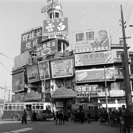
Within the contemporary Chinese context, the structural counterpart to the cinematic media transition presented in The Artist is the comprehensive shift from paper based printing and hand-crafted visual production to digital and electronic media. This transition occurred with particular intensity and speed in China.
It is precisely in this sense that this project translates the media consciousness found in The Artist into the field of Chinese advertising visual production, focusing on hand-crafted printing and typographic aesthetic systems that have been rapidly forgotten, and exploring their possibilities for reactivation in contemporary contexts.
3. Brand Strategy and Narrative System
HUIMU Visual Advertising Studio(HMV回目視廣告社)
3.1 Brand Positioning:
HUIMU Visual Advertising Studio is an online visual advertising studio.It focuses on media archaeology and contemporary translation of Chinese paper-based advertising aesthetics from the first half of the 20th century.
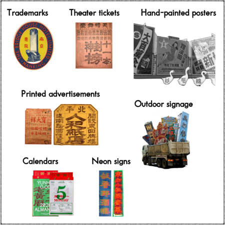
The brand provides material production for advertising and urban public visual fields, including trademarks, theater tickets, hand-painted posters, printed advertisements, outdoor signage, neon signs, and calendars.
HUIMU Visual focuses on modes of viewing and visual orders that have been eliminated as a whole through digitalization, and reintroduces them into contemporary urban and commercial visual circulation.
3.2 Origin of the Brand Name:
HUIMU (回目) is formed from two Chinese characters. HUI (回) means «to look back, ” pointing to a re-examination of older media aesthetics; MU (目) means „gaze“, emphasizing advertising as a medium. HUIMU (回目): the concept of huimu in traditional Chinese narrative structures, referring to headings that prompt, focus, and guide the viewer’s attention.
3.3 Brand Core Values:
Reorganizing the logic of visual production originally formed under conditions of hand-drawn and printed into an advertising visual system within contemporary contexts.
3.4 Brand Commitment — Cultural Function&Audience
· Brand Audience: Cultural publishers that continue to use print mediate, The young designers, and more.
· Brand Cultural Function: Rebuilding a distinctly Chinese urban visual culture amid the global trend toward digital homogenization of city visuals; And rescuing traditional crafts that have been eliminated in the digital wave.
3.5 Brand Vision — Potential for Extension
HMV is not a one-off project; its brand vision is envisioned as a visual production system that can operate continuously in the city, and possesses the following potentials for extension:
· Derivative Outputs:
- Production of paper-based brand visual materials;
- Customized themed advertisements;
- Applied to publications, exhibition visuals, cultural events, and public space design.
· Derivative Activities:
- Conducting oral-history interviews with Advertising Masters on the verge of disappearance;
- Open related workshops;
- Collect old materials for publication and archiving
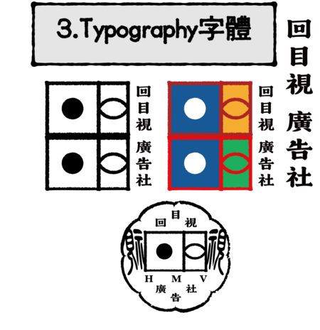
4. LOGO
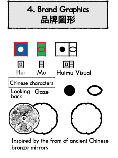
The design of HMV’s logo and its variations allows key visual elements to change depending on the context in which it is used.
The graphic inspiration for both logo versions and their extended variations comes from the Chinese character 回目 and the shape of an ancient Chinese bronze mirror. It also references logo designs from the era of hand-drawn printing.


5. Visual Identity System: Mood Board, VIS
Mood board including Color Palette, Print and Texture, Typography, Core Inspiration and keywords.
The aesthetic style is built upon the typographical order and image logic formed under the conditions of early Chinese print media, emphasizing visible traces of handcrafting, high-information-density page layout, and the material properties of the printing medium.
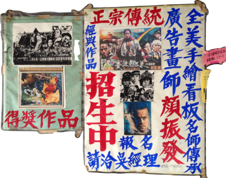
This is a collection of application examples for reference.
The overall style exists between industrial rationality and hand-made imperfection, forming an advertising visual order that stands apart from the «smoothness» of contemporary digital interfaces.
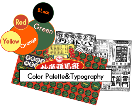
Color Palette and Typography
Although the film [The Artist] is a black-and-white silent film, the brand’s colors did not simply copy the film’s color scheme in form. Instead, they referenced the core values of the film—the color combinations of hand-printed materials from the old visual industry system.
The color scheme is inspired by the color schemes of the old printing industry;
And the layout is arranged using the typesetting method of movable type printing.
6. Communication Outputs: 6.1 Main Poster&Flyer
In terms of brand communication outputs, I first created a main visual poster and two versions of flyers for promotion.
The poster’s color scheme and layout referenced collected inspirations.
The green-black and orange-black flyers facilitated mass printing and distribution.
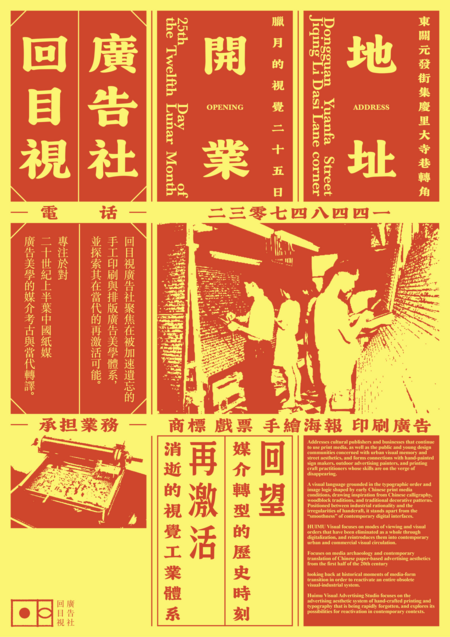
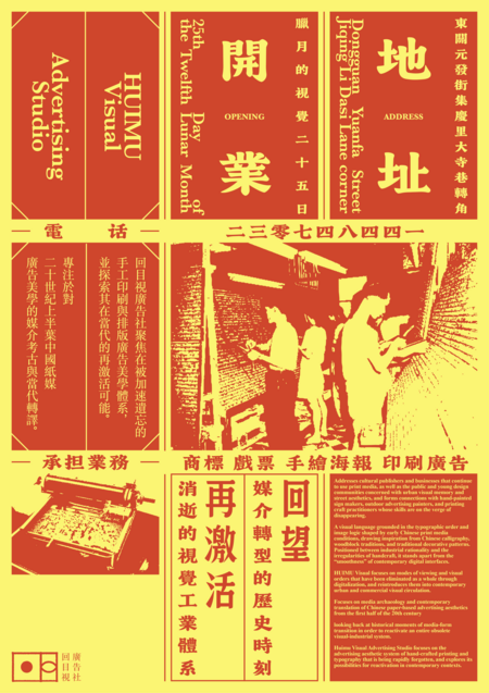
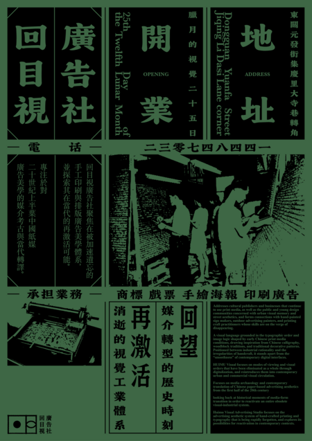
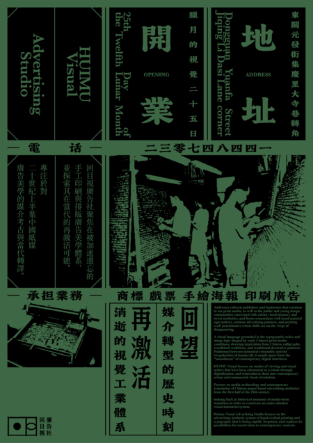
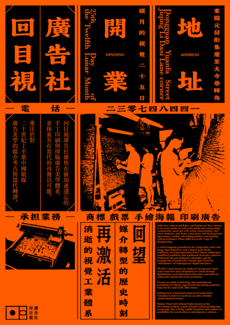
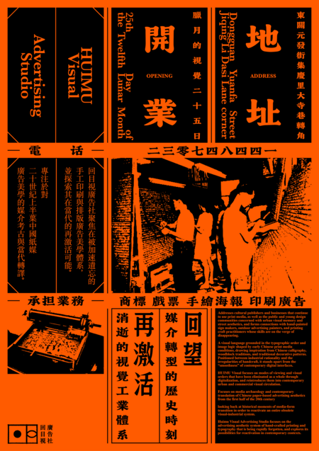
Because it is aimed at a Chinese audience, the text is mainly in Chinese, with an English translation.
I also made two versions with English and bilingual titles.
6.2 Examples of social media content

I chose three different types and styles of social media to promote and publicize the brand. The homegrown Chinese social media platform is Xiaohongshu (Red Note).
I registered a brand account on China’s leading visual-sharing social media platform, targeting local audience.
I used the Red Note to spread brand extension activity—[HMV Media Archaeology An Oral History Project], Transformed interviews with letterpress printers into visual narratives for social media, building the brand story and fostering community connection.

As the premier platform for showcasing brand visual identity, Instagram is utilized to publish posts that present our key brand visuals.
It also serves to share collected vintage newspaper and advertisement clippings, sharing China-rooted brand aesthetics with a broader, multicultural audience.

Twitter, unlike Instagram’s visual focus, is suitable for in-depth discussions of brand philosophy.
Through dialogue and research sharing, visuals can be transformed into topics, establishing brand cultural relevance with the global community.
It complements Instagram’s visual narrative and together completes the brand story.
6.3 Brand Extensions: Fictional Packaging
Finally, to clarify the brand’s application scenarios, I created four derivative products: fictional packaging. These are: Custom canvas tote bag, retail packaging bag, folding carton flat layout, applied label.
7. Oral Video Presentation


