COLOR USAGE IN FAMOUS PAINTINGS
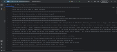
In this project, I worked with a data set named «512 Color Decomposition of 1000 Famous Paintings,» which I found on Kaggle. This data set illustrates the colors found in paintings, as well as their usage.
I picked this topic because colors are very important in art and illustrations. Analyzing data on colors can allow us to determine an artist’s style.
For data processing, I used a programming language called Python, along with its libraries Pandas and Matplotlib, to produce four different visualizations
These are a chart of the most used colors, a chart of Claude Monet’s top colors, a brightness histogram, and a comparison of color use between artists.
I depicted the data in the graphs with my own color schemes. This made the graphs easily readable. This example demonstrates simple statistics such as grouping, ordering, and finding the average and applies these statistics to the understanding of art.
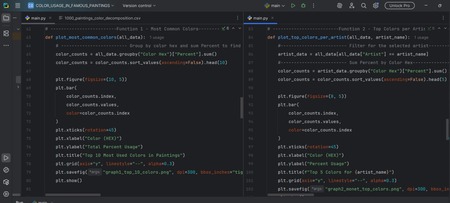
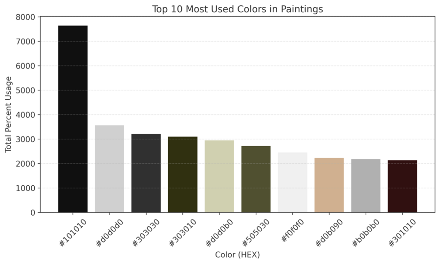
First, I examined the most common colors of all. This first graph represents the top 10 usage of all the colors in all the paintings. It is like looking at the most frequently used items in one thousand different recipes. I added up the total usage of each color, and this graph represents which ones were used most. The colors are even in the actual color they represent. The most prevalent ones are the bright yellows and oranges that fill famous artwork.
Moving forward, I chose to concentrate on a single artist — Claude Monet.
In order to grasp his style, I filtered the information to display only his works of art. From the second bar graph, I was able to identify his personal favorite five colors. This way, I will be able to clearly identify the colors that he recurring used in his paintings, such as the greens and blues that he used to make his water lily paintings famous.
And then I had questions about more than just the color.
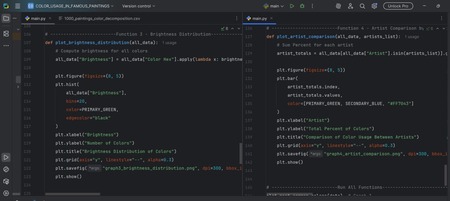
Color is not just whether it is blue or red. It is also a function of its brightness or darkness. Therefore, for my third visual, I worked out how bright all colors are. This histogram depicts the spread from dark to light colors. We notice from the graph that most colors lie in the middle, indicating artists tend to concentrate on painting mid-tone colors in their artworks.
Lastly, I made comparisons between different artists. The final graphic shows three very different artists side by side, Claude Monet, Vincent van Gogh, and Paula Modersohn-Becker. By looking at the total color each artist used in their work and comparing the two values side by side, it becomes easy to note the distinctions among the artists. For instance, an artist may use a broader range of color in their work than another. So, in essence, through the process of making art data, we are able to decipher the underlying patterns that exist past the point of its aesthetic value. Such graphs enable us to decipher how we feel when we view artwork.


