Communication theory: «Оh»
Communication theory in the field of design
Logotype and project description
Communication in design can be defined as the process of generating meaning by sending and receiving verbal and nonverbal symbols and signs that are influenced by multiple contexts. Color, typeface, composition, and medium are nonverbal symbols; the designer «encodes» a message through them, and the viewer «decodes» it, relying on their own experience and the specific situation of perception. Any poster or visual identity here is not just a picture, but an element of a meaning-making process.
Communication theory is a lens or a framework through which we see and interpret the world and our everyday practices. For a designer, this means that a layout, interface, or identity is considered not only as an aesthetic object, but as part of a communication process: who is the sender, how the message is structured, what the goals are, and what possible interpretations different audiences may have. Craig’s 7 Traditions in Communication Theory precisely offers a set of such «lenses».

Communication through corporate colour and font
Within the Semiotic tradition, communication is understood as sharing meaning through system of signs. The visual language of a brand is a system of signs through which the perception of the brand’s level, its distance or closeness to everyday life, its irony or seriousness is formed. Different typography, formats, and visual metaphors allow it to send the message without actually naming it — the viewer reads the embedded meanings through codes, even if they are never explicitly verbalized.
The Socio-cultural tradition emphasizes that repeated visual practices reproduce social order and norms of taste. Design and contemporary art can thus be understood as part of social practices that daily reproduce order and norms. Through recurring visual formulas, ideas about a desirable lifestyle are reinforced.
Communication through a system of signs, colours and metaphors
The Critical tradition focuses on discourse and ideology and on who controls language in society. From this perspective, design is not neutral: the choice of visual imagery and wording in a slogan is tied to which groups are included in the «norm» and which end up at the periphery. Social Identity Theory shows that part of our self-esteem is built through group membership; we strive for positive self-esteem by showing solidarity with the in-group and distancing ourselves from the out-group. The visual style of a brand here acts as a marker of «us» and «them».
How a brand conveys social belonging to groups
The Rhetorical tradition treats communication as the art of public speaking and influencing through verbal and nonverbal means. In contemporary design, presentations, posters, and digital campaigns take on the role of rhetoric. The Narrative Paradigm (Walter Fisher) describes people as «storytelling animals» who perceive life as a chain of stories and evaluate messages in terms of narrative coherence and narrative fidelity, that is, their internal consistency and correspondence to one’s own experience. Visual identity and brand communication materials should come together into such a coherent story.
Сommunication as the art of influencing through verbal means
The distinction between objective and interpretive theory is linked to the fact that the former seeks explanation and prediction through testable hypotheses and quantitative methods, while the latter seeks understanding and interpretation in context, relying on a «community of agreement» around meanings. For design, this means that visual solutions can be tested both through quantitative studies of audience response and through qualitative methods that explore how different groups interpret the same images.
Communication through interaction with the target audience
The Elaboration Likelihood Model shows that persuasion can proceed via the central route (through careful cognitive processing of information) and the peripheral route (through peripheral cues). In crowdfunding research, it is emphasized that performance is enhanced both by issue-relevant information and by peripheral signals, including pitch design and branding. In design, the central route corresponds to the structure and clarity of information, while peripheral signals are the visual style, mood, and details of the identity. Together with Social Identity Theory, this makes it possible to understand a brand as a communicative environment in which identity, values, and relationships between groups and individuals are constructed through a system of signs.
Communication through visual style
In sum, communication theory turns design from pure styling into a structured meaning-making process. It gives designers conceptual tools to plan how messages are encoded, how different audiences will decode them, and how visual choices shape identity, power, and social norms.
Presentation of brand for a general audience
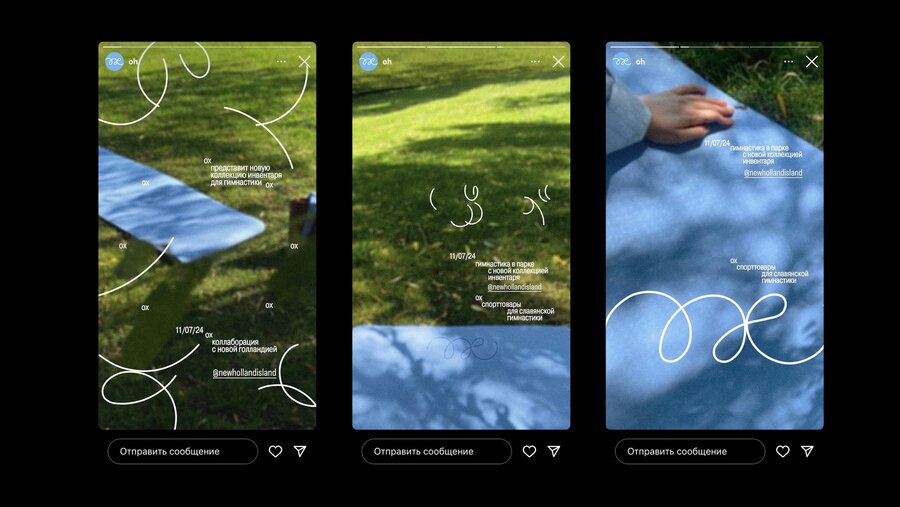
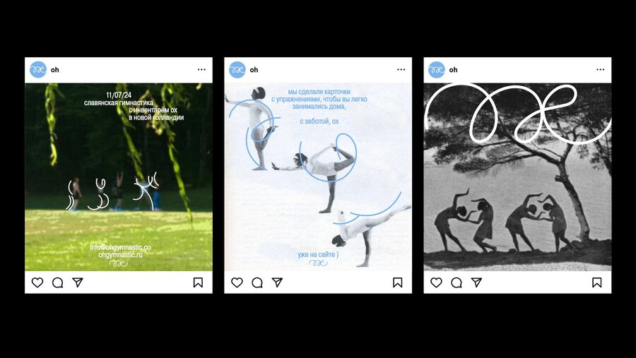
«Oh» is a brand that builds communication with its audience around bodily experience, inner states, and a sense of harmony. Its message is encoded not through complex verbal constructions, but through nonverbal symbols and practices: movement, breathing, rhythm, and the tactility of materials. In the logic of the phenomenological tradition, communication here is understood as lived experience — experiencing oneself and the world through the body and a dialogue with the surrounding environment.
The ‘Oh’ brand
The brand is grounded in Slavic gymnastics, presented not as fixed knowledge of the past but as a living practice open to individual interpretation. Within the socio-cultural tradition, «Oh» functions as a mediator of cultural meanings: it gently integrates the user into a cultural context, without imposing ready-made interpretations but allowing them to emerge through repeated bodily and visual practices. The past is not declared directly; it becomes part of everyday rituals.
Visual foundation of the brand
Our products are suitable for those who already practice yoga or bodywork and are looking for something new, as well as for people with an active lifestyle for whom not only physical development but also spiritual balance is important. «Oh» is chosen by those who value an individual approach, attention to detail, and a feeling of care in every object.
Brand products
We create functional and sustainable items that are pleasant to use every day. The packaging is designed to be easy to carry and to continue using after purchase — nothing excessive, everything purposeful. «Oh» is a calm invitation to movement that begins with respect for yourself and the world around you.
Brand packaging
Presentation of brand for a professional audience
«Oh» is a brand consciously structured as a holistic communication system in which the product, visual identity, and material environment jointly produce stable meanings. Its value core — life balance, bodily awareness, and connection to cultural roots — is translated into a visual and tactile language through a system of nonverbal symbols. In terms of communication theory, the brand functions as a meaning-making environment rather than just a set of visual solutions.
Within the socio-cultural tradition, the brand acts as a mediator of local cultural knowledge, integrating elements of Slavic gymnastics into the contemporary context of bodily practices. Communication here is not purely informational but practice-oriented: meanings are formed through the user’s regular interaction with the brand’s objects.
The brand’s visual language — minimalism, clean forms, cyclical lines, and a calm color palette — works as nonverbal signs that direct attention inward rather than outward. In terms of the semiotic tradition, these elements function as a system of signs that create a sense of continuous movement and presence, even without explicit verbal explanation. The metaphor of direction and cyclical motion is realized through rhythmic lines, minimalist graphics, and a restrained palette. Visual elements function as signs that support the narrative of an ongoing process — movement, training, breathing.
Visual brand communication
The color palette and typography are deliberately «lowered» in visual loudness. This is a rhetorical strategy of understatement, where influence is achieved not through expressiveness but through clarity and pauses. Within the rhetorical tradition, the brand avoids direct persuasion, preferring to build trust through the consistency of its visual narrative.
Brand colour palette
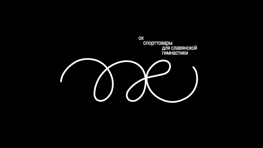
The naming «Oh» functions as a polysemic sign. It simultaneously refers to the Slavic analogue of «Om», to a bodily reaction during effort, and to a moment of insight. In a phenomenological logic, the brand does not fix a single meaning but leaves space for its personal «decoding» by the user.
The packaging continues this communication strategy. Sustainable materials, linen textures, and an embossed, almost invisible logo create a «quiet rhetoric», minimizing visual cues that are not related to the practice itself. The equipment bag becomes part of the user experience, not a disposable carrier. In this way, the brand predominantly activates the peripheral route (Elaboration Likelihood Model): trust and attachment are formed through mood, care, and the repeatability of experience rather than through rational persuasion.
Communication through logo and corporate identity in packaging
Communication theory as basis for the presentations
Communication theory became the framework through which the General Audience Engagement and Professional Audience Engagement presentations of the «Oh» brand were constructed. The messages were divided into two modes of meaning production: through personal experience and everyday practices for the general audience, and through the language of systems, signs, and strategies for the professional community.
Phenomenological tradition
This tradition focused the texts on the user’s subjective experience. In the description for the general audience, the emphasis is placed on a personal connection to the practice: the brand is described through how it feels rather than through abstract characteristics. In the naming «Oh», the phenomenological aspect is also emphasized — as a bodily reaction and a moment of inner insight, which is especially articulated in the professional description.Communication through the customer’s subjective experience
Socio-cultural tradition
The socio-cultural tradition shaped the understanding of the brand as part of everyday practices and cultural codes. In the general audience presentation, «Oh» is described as a way to integrate Slavic gymnastics into daily rituals, thereby gently reproducing a connection with tradition and a certain lifestyle. In the professional audience presentation, this logic is articulated directly: the brand is positioned as a mediator of local cultural knowledge and as a tool for forming a community around mindful bodily practices.
Semiotic tradition
The semiotic tradition made it possible to construct «Oh» as a system of signs. In the professional description, it is emphasized that the visual identity is a semiotic system in which lines, cyclical forms, the palette, and typography send the message without actually naming it: they encode ideas of cyclicality, life balance, and movement. The naming «Oh» is described as a polysemic sign that combines a bodily reaction, concentration, and a reference to the Slavic analogue of «Om».
Integrating communication practices into merch
Elaboration Likelihood Model (ELM)
The Elaboration Likelihood Model was used to separate two levels of argumentation. In the text for the general audience, peripheral cues dominate: images of nature, material tactility, a calm palette, and an emphasis on care and emotional comfort. In the professional text, the central route of processing is activated: terms such as semiotic system, rhetorical strategy, and socio-cultural context are introduced, and the links between values, identity, and user experience are described.Communication through feelings and values
Communication Theory: Bridging Academia and Practice // edu.hse.ru URL: https://edu.hse.ru/course/view.php?id=133853 (дата обращения: 12.10.2025).
