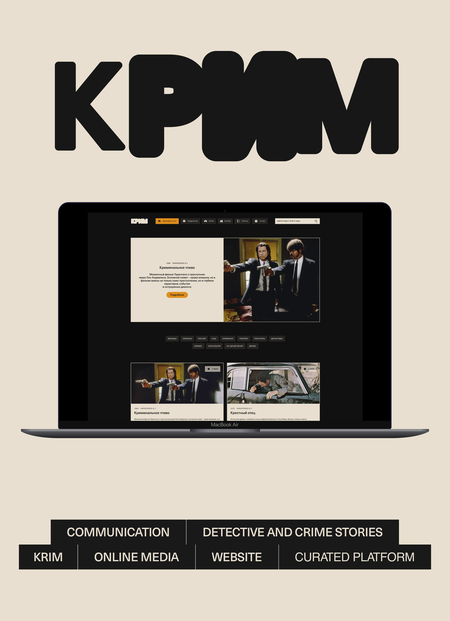

Communication design is a multidisciplinary field that can apply communication theory and sociological frameworks to create structured, meaningful, and goal-oriented visual messages. Its purpose is not limited to aesthetics, but lies in shaping how information is perceived, interpreted, and emotionally processed by an audience within a specific social and cultural context.
Communication theory provides designers with tools to understand how messages are constructed, transmitted, and decoded. In communication design, this knowledge allows designers to make informed decisions about visual hierarchy, narrative structure, tone, and media choice in order to influence attention, understanding, and persuasion.
One of the key models relevant to communication design is the Elaboration Likelihood Model (ELM). It explains that audiences process messages either through a central route, based on logic and structured information, or through a peripheral route, guided by visual cues, tone, and overall atmosphere [2]. In design practice, this means adapting visual hierarchy, content depth, and layout to the audience’s level of attention and involvement.
Another important framework is the Narrative Paradigm, which views communication as storytelling. According to this approach, people evaluate messages based on coherence and relevance rather than pure facts [4]. In communication design, narrative logic helps organize information into meaningful sequences, allowing users to perceive content as connected and intentional rather than fragmented.
Communication design is also closely linked to semiotics, which understands communication as the production of meaning through systems of signs [1]. Typography, color, composition, and visual style function as non-verbal signs that carry cultural and emotional meaning. Designers rely on shared visual codes to ensure that messages are decoded as intended, especially in digital environments where visual rhetoric plays a central role.
Audience and context are essential factors in effective communication design. Sociological approaches emphasize that meaning is shaped by cultural norms, expectations, and usage situations. Designers must therefore adjust communication strategies depending on who the message is for and in what context it is received, balancing information, persuasion, and emotional tone.
Together, these theories show that communication design is a strategic tool that structures attention, guides interpretation, and builds relationships between a digital product and its audience.
These theoretical principles form the foundation for how communication design is applied in practice. In this project, they are used to structure the presentation of the brand KRIM — both for a general audience and for a professional audience.
The following section demonstrates how communication theory informs the way the brand is introduced, explained, and positioned: how its purpose is communicated and how meaning is constructed through visual and narrative choices.
What is KRIM?
KRIM is a curated digital media platform for people who love detective stories, thrillers, and crime fiction as cultural narratives.We cut through the noise of endless streaming lists and bookstore shelves. KRIM provides expertly curated selections across all media—from seminal films and must-read books to immersive games and engaging podcasts—ensuring you always find your next thrilling story.
The platform does not focus on real crimes or news events. Instead, KRIM explores how detective and crime stories are created, told, and experienced across different media. It helps users navigate this vast amount of information with clarity and curiosity.
Book cover for KRIM
The Context and the Problem
Detective and crime content is one of the most popular genres today, but it is often scattered across platforms and presented in a sensational, overwhelming way. Users are faced with endless lists, aggressive headlines and fragmented recommendations in which shock trumps understanding.As a result, discovering new stories becomes tiring rather than engaging. There is a lack of thoughtful structure, cultural context, and emotional balance — especially for users who want intelligent entertainment rather than constant tension.
Difference from competitors
KRIM’s Approach
KRIM offers a different way to explore detective and crime stories. The platform is built around curation rather than overload, and guidance rather than noise.Content is carefully selected and organized to help users quickly find what truly matches their interests. Through clear navigation and filtering, KRIM turns discovery into a calm and enjoyable process. The focus is not on consuming as much content as possible, but on understanding the stories, their details and the underlying motives of the characters.
Films section on the KRIM website
Content and Features
KRIM combines several formats into one consistent system. Users can study films, series, books, podcasts and games through selection and editorial reviews. Each piece of content is placed in a broader cultural and narrative context.Interactive tests help users better understand both the content and themselves — their tastes, moods, and preferred types of stories.
Tests section on the KRIM website
One of KRIM’s key characteristics is its atmosphere. Despite the dark or mysterious themes, the platform allows the user to feel safe. Light irony, calm tone of voice and thoughtful design reduce anxiety and make the study of complicated stories comfortable.
KRIM Communication
KRIM treats mystery as a form of intellectual play rather than fear. It invites users to observe, analyze, and reflect — without pressure or emotional overload.
Outdoor advertising
KRIM is designed not only as a content platform, but also as a space for connection. A smaller, engaged community allows users to participate in shaping recommendations, discussions, and thematic selections. This sense of belonging turns passive consumption into shared exploration. Users become part of a collective curiosity about stories, patterns, and human behavior.
KRIM Telegram channel
To understand what KRIM stands for, it is essential to look at the values that guide the platform. These core principles shape not only the content and community experience but also how the brand communicates, engages, and builds trust with its audience.
Brand values
The semiotic theory of communication is based on the transmission of meaning through systems of signs [1]. In communication design, both verbal and non-verbal signs work together to shape perception and emotional response. One of the key verbal signs of any brand is its logo, as it forms the foundation of brand recognition and meaning-making.
The name KRIM is an abbreviation of the word «criminal», directly referencing the thematic focus of the platform. The logo exists in several visual variations, reinforcing the brand’s flexible and interpretive nature. Its form is based on the metaphor of a drop falling onto text, causing it to blur and spread. This visual effect evokes the image of «KRIM» dissolving into a dark, gloomy alley, reinforcing associations with mystery, uncertainty, and investigation.
Logo variations
The color palette functions as a non-verbal sign system that deepens the brand narrative. Beige references the paper of a detective’s notes, suggesting analysis and reflection. Dark gray evokes wet asphalt, while muted gray represents twilight and the approach of night. Bright orange acts as an accent color, reminiscent of a street lamp cutting through darkness.Together, these colors construct a cohesive atmospheric code that supports the genre while remaining emotionally balanced rather than aggressive.
Brand colors
To extend this metaphor and enhance immersion, the brand uses custom illustrations that imitate a detective’s sketches. This visual approach bridges the digital and physical worlds, as hand-drawn notes and small sketches are familiar tools of personal thinking and investigation. The use of beige further reinforces associations with paper, strengthening the illusion of real investigative work.
Through these visual cues, users interpret symbols subjectively, forming their own emotional responses, associations, and hypotheses. As a result, the user is not just observing the service but feels positioned inside its narrative space.
Illustrations
The interface predominantly employs sharp-edged shapes, reflecting the brand’s core semantics: precision, professionalism, and analytical clarity. This choice also supports the overall metaphor of investigation and control. Rounded shapes, while typically associated with comfort and softness, would contradict the conceptual framework of a platform dedicated to crime and detective narratives.
Another important link between the digital and physical worlds is the book metaphor. Pages follow a vertical format similar to book covers, reducing perceptual dissonance for the user. The presence of a quotation section emphasizes thoughtful engagement with source material, demonstrating analytical depth rather than superficial retelling. Such details contribute to trust, loyalty, and increased receptivity to the brand.
Film page



