contents
- Reflection on the course material. Narrative visual strategy
- Presentation to a general audience
- Presentation for a professional audience (designers)
- How we arrived at the strategy
narrative visual strategy
Throughout the course, we moved from seeing communication as simple «information transfer» to understanding it as meaning-making. Any brand is not only a set of visuals, but a story-world people enter and interpret. The sender constructs this world through symbols, tone, and values; the receiver decodes it through their own cultural context.
In design, this means a logo, poster, interface, or social media post is never «just aesthetics». It is a rhetorical message that shapes how a region, a community, and creative work itself are perceived. That is why our strategy for the Creative Industries of Nizhny Novgorod is narrative: we build a clear storyline — from individual creativity to public recognition, from «my idea» to «our shared creative economy».
The semiotic tradition helps us treat design as a system of signs: the folder metaphor, the palette, modular layout logic, and the repeatable slogan structure all encode meanings of collaboration, order, visibility, and professionalism. The sociocultural tradition reminds us that identity must live in everyday practices — events, partnerships, showcases, and how creators actually share work. The critical tradition makes us reflect on representation and power: the brand should not privilege only «prestigious» sectors or reproduce center-periphery stereotypes, but support a fair and inclusive ecosystem.
In sum, we approach branding as a controlled process of constructing meaning — using semiotics, sociocultural insight, critical awareness, and rhetorical tools to persuade audiences that Nizhny Novgorod is not only a consumer of culture, but a producer of creative value.
presentation to a general audience
Who are we?
A project that helps develop creative industries and businesses in the Nizhny Novgorod Region.
It brings together the public sector, companies, and creative individuals to jointly create an ecosystem that will expand public engagement in the creative economy.
Who is the brand for?
The target audience is people aged 30 to 40 involved in creative industries: design, IT, gastronomy, fashion, contemporary art, and culture:
— Legal entities (commercial organizations) and individual entrepreneurs registered in the territory of the Nizhny Novgorod region for at least three years
— Legal entities (commercial organizations) and individual entrepreneurs registered in the territory of the Nizhny Novgorod region for at least one year
— Individuals registered at their place of residence in the Nizhny Novgorod region
— Legal entities (non-profit organizations) and individual entrepreneurs registered in the territory of the Nizhny Novgorod region for at least one year
They are united by an interest in local identity, new formats of interaction, and the visual expressiveness of the environment. They are active participants in urban processes, valuing style, meaning, and the opportunity for collaboration.
Brand message
The brand has 18 slogans, all built on a single structure: «Your [result of activity/product] — [in an iconic place associated with success or publicity].»
Art:
- «Your project is on the regional easel»
- «Your performance is on the city’s poster»
- «Your book is on the bestseller list»
- «Your film is in the main distribution»
Culture:
- «Your craft is in the region’s gold fund»
- «Your city is in the history of the world»
- «Your knowledge is in the main catalog»
- «Your project is in the architectural registry»
Media:
- «Your story is at the top of the news feed»
- «Your brand is among the successful cases»
- «Your code is in the innovation repository»
Applied Industries:
- «Your project is among the creative solutions»
- «Your idea is a regional treasure»
- «Your style is in the region’s wardrobe»
- «Your taste is on the menu of Nizhny Novgorod»
Related industries:
- «Your event — anywhere in the city»
- «Your idea — protected»
- «Your project — on the to-do list»
«Your» means personalization. It addresses the creator, participant, or viewer directly. This immediately engages: people feel the slogan speaks to their result, not something abstract.
[Object (result of labor)] — the concrete form of a creative product or initiative. It’s important here that the object is not a process, but a finished product that can be «placed» somewhere.
«—» (dash) — a syntactic bridge, a rhythmic pause. It connects subjective ownership with objective recognition, creating the effect of a completed journey: from your action to public success.
[Place/context of recognition] — a symbol of status or visibility.
Through these slogans, we show the path from personal creativity to public recognition, create a sense of the author’s involvement in the cultural and regional scene, and also shape the image of the site as a space where private initiative becomes visible, meaningful, and collectively shared.
Brand values
1. Respect for history and tradition.
We maintain a connection with the past, recognizing the value of heritage and experience, which underpin the present. For us, tradition is not a limitation, but the foundation of the authenticity and depth of each project.
2. Constantly moving forward. We believe in the energy of change: we discover new formats, ideas, and technologies, while maintaining an inner focus on quality and meaning. Moving forward is our way to remain vibrant and contemporary.
3. Development. We view development as a never-ending process of learning and self-improvement—both personal and professional. Every step, every initiative brings us closer to greater maturity, responsibility, and a new level of mastery.
presentation for a professional audience
Brand platform and positioning
Category: Regional creative industries ecosystem and cultural development initiative.
Positioning: Creative Industries of Nizhny Novgorod is the unified platform that showcases the region’s bold, diverse creative talent—creating a space where designers, developers, musicians, chefs, makers, and artists collaborate and grow together. It’s the identity that says: this region doesn’t just consume culture, it produces it.
From Craig’s perspective, we see the brand through multiple lenses at once: Semiotic: The identity functions as a clear sign system. The «folder» metaphor communicates structure, shared space, and curated diversity: different creative sectors are like files inside one organized system. Color works as semantic coding (culture as the connector; other colors as distinct «voices» of sectors). The slogan formula «Your X — in Y» turns creative output into an object that can be «placed» into recognizable contexts of success and public visibility.
Sociocultural: The brand is designed to live inside the routines of the regional creative community: events, open calls, networking, workshops, festivals, showcases, and collaborations across sectors. It normalizes a shared identity where creative work is not a marginal hobby, but a legitimate cultural and economic practice supported by institutions, partners, and a wider public.
Critical: We treat the identity as a tool that can reproduce or challenge hierarchies. The system avoids privileging only «high culture» or only commercially loud industries, aiming instead to represent the full spectrum of creative labor. It also resists Moscow-centric validation as the only standard of success, emphasizing regional agency: visibility and recognition can begin here and scale outward.
Rhetorical and Digital Rhetoric: The brand persuades by framing creativity as a journey to recognition. The slogans act as micro-arguments: your work deserves a public stage. Visually, contrast, modular compositions, and bold accents help the system cut through digital noise. In digital channels, rhetoric becomes interactive: creator stories, case showcases, event calls, and participation prompts continuously reinforce the message and invite action.
Overall, the Creative Industries of Nizhny Novgorod identity works as a full communication system, not a decorative style. Semiotics gives it clarity and structure (a readable set of signs: folder metaphor, coded colors, modular logic). The sociocultural layer makes it usable inside real community practices — events, collaborations, showcases, and everyday professional routines. The critical lens protects the brand from reproducing hierarchies and ensures the platform represents the diversity of regional creative work fairly. Finally, rhetorical and digital rhetoric turn the system into persuasion in action: it consistently argues that local creativity deserves visibility, recognition, and support — across print, space, and digital channels.
This is why the brand can function simultaneously as an ecosystem identity, a creator-facing motivational language, and a scalable visual toolkit for different industries while keeping one unified voice.
Visual Strategy (Semiotics + Visual Rhetoric)
Color Palette:
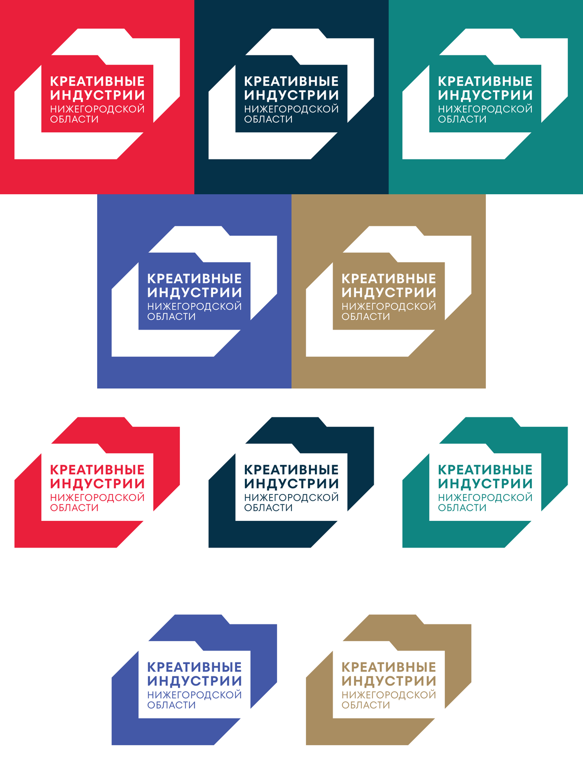
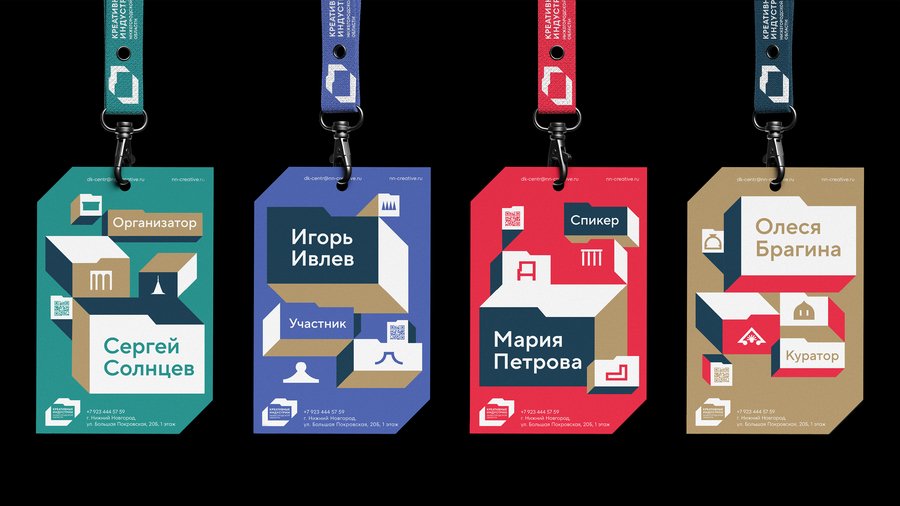
#008582 — the main color that represents culture and connects all other industries together. #063249 — a deep, rich teal, this color evokes both the cultural heritage of Nizhny Novgorod and the forward-thinking energy of modern creative sectors. Rhetorically, it positions the region as serious and credible. #AA8E62 — a warm, earthy beige that adds accessibility and human warmth to the system. It references craft, handmade quality, and the human element that runs through all creative work. #4459A8 — a vibrant, saturated blue, this color stands out and demands attention—it’s the «voice» of the brand that cuts through noise on digital platforms and printed materials. #EC1F3B — a bold, energetic red-pink that communicates passion, urgency, and creative ambition.
The palette communicates that Nizhny Novgorod’s creative industries are professional yet approachable, energetic yet grounded, diverse yet unified.
Graphics and illustrations
[1] Architectural source → simplified pictograms The graphic language is built from recognizable details of Nizhny Novgorod architecture (spires, arches, columns, roof silhouettes). These elements are reduced to clean, geometric icons in the brand palette. Semiotically, this links the ecosystem to local identity, but keeps the symbols universal enough to work across different creative sectors.
[2] Photo + modular blocks In layouts, documentary city photography is often desaturated/neutralized so the colored modules and icons become the main rhetorical «voice.» The composition uses sharp, folder-like blocks and cut corners to guide attention to the key message, while the photo anchors the brand in real places and real context.
[3] Icon set as a flexible toolkit Icons are treated like «assets inside a folder»: a modular set that can be rearranged for posters, stickers, UI, event materials, and navigation. The consistent silhouette logic and bold contrast keep them readable at any scale, while the embossed/outlined presentation shows how the system can adapt to different mediums (digital, print, signage) without losing identity.
Logo A logo built on the metaphor of a folder — the archetypal symbol of organization, collaboration, and creative systems.
The folder as a system for managing diversity Nizhny Novgorod’s creative industries span multiple sectors: IT, fashion, gastronomy, advertising, crafts, visual and performing arts. Like files within a folder—each with its own format but unified within a single structure. The folder signifies order within creative diversity, a shared «catalog» where different practices coexist.
The folder as a metaphor for collaboration Folders represent shared workspaces—cloud storage, collective projects, open access. This reflects how creative work actually happens: a designer collaborates with a developer, a musician works with a marketing strategist. The folder communicates that the brand is fundamentally about connection and exchange.