Communication theory in the design field
Communication theory explains how meaning is created, transferred and interpreted. In design this approach shifts the focus from creating visuals to constructing meaning through visual systems.
Logo
Any design object (a poster, identity or interface) operates as a message. It is built from signs that are read through cultural background, personal experience and context. Semiotic principles clarify how visual codes work: color marks emotion or hierarchy, form suggests function or character, and style positions the message within a specific cultural frame. Understanding these principles allows design to communicate purposely rather than intuitively.
The medium strongly affects perception. The same message appears differently in a gallery, on packaging or in social media, because each channel shapes attention and engagement. Designing communication therefore requires understanding how meaning transforms across platforms.
Poster
Communication theory also introduces the idea of noise: elements that obscure or distort meaning, such as inconsistent style, overloaded visuals, or unclear symbolism. Reducing noise allows the message to remain coherent and readable.
Within this project, communication theory helps articulate authorial intent and supports their visual decisions. It provides a framework for building meaning consciously, aligning aesthetic choices with the way messages function in contemporary visual culture.
Presentation to the general audience
Sculptural figures
This project reinterprets the traditional stone-carving art of Tuva, transforming cultural motifs into contemporary graphic design. By studying shapes, symbols and textures found in Tuvan craft, the designer translates them into modern visual language for formats such as T-shirts, tote bags, sculptural figures and functional accessories.
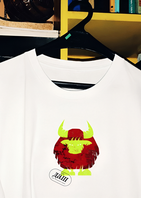
T-shirt
These objects feel familiar and usable, meanwhile carrying a clear trace of origin. They are not souvenirs or decorative folklore. They are contemporary items designed to be worn, held and used. They embed cultural memory into everyday routines.
T-shirt
Sculptural figures
The aim is not to copy tradition but to give it a new modern voice: to keep the cultural meaning while making it accessible to a wider audience. The project shows how heritage can evolve and remain relevant, turning everyday objects into carriers of history and identity.
Cards for sculptural figures
Presentation for professional audience
The visual system of the project is built on the reinterpretation of traditional Tuvan stone-carving codes through contemporary communication theory. The goal was to extract the core semiotic principles of the craft (such as its geometry, symbolic motifs and material expressiveness) and translate them into a coherent graphic language for different media.
Typography is developed as a neutral yet structural sans serif, functioning as a stabilizing element within the system. Its proportions reference the rhythm of carved lines: concise, precise and slightly weighted, creating an association with material resistance and hand-cut forms. Subtle terminal modifications echo incision marks, giving the typography a restrained but culturally rooted character.
T-shirts
The color palette is derived from natural stone shades (muted greys, deep browns, and mineral greens) complemented by selective accent colors inspired by traditional ornamentation. This palette maintains a balance between authenticity and contemporary clarity across digital and physical applications.
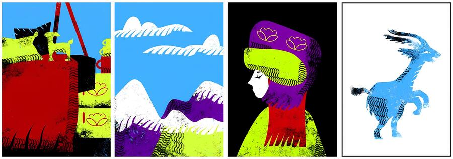
Instead of a pattern system, the project introduces a set of illustrative elements derived from abstracted fragments of stone-carving: mascot-like figures, symbolic shapes and modular graphic components. These illustrations do not replicate traditional craft literally; rather they function as flexible semiotic units that can be combined within compositions. Their adaptability enables designers to assemble varied scenes and narratives while preserving a consistent cultural and visual logic.
The illustrative method blends vector precision with layered shading to evoke depth reminiscent of carved surfaces. This hybrid approach maintains the crispness required for merchandise while retaining the tactile quality essential to the project’s cultural reference.
T-shirt
Communication touchpoints rely on the interplay between strong typographic statements and these combinable illustrative units. Messages remain concise and aligned with the conceptual foundation of the project, like reinterpretation, continuity and cultural specificity. The communication hierarchy follows principles from the course: reducing visual noise, increasing sign transparency and aligning form with intended meaning.
T-shirts
As a result, the design system is structured around:
— semiotically grounded visual codes derived from traditional craft — typography reflecting structural qualities of carving — a mineral color palette with culturally informed accents — a flexible set of illustrative elements that combine into larger compositions — a texture-oriented illustrative method bridging material and digital — a communication strategy balancing clarity and cultural depth
This approach demonstrates how heritage can be integrated into contemporary design practice preserving both aesthetic integrity and cultural meaning.
How communication theory formed the basis of the project
The project applies communication theory to reinterpret traditional Tuvan stone-carving into a contemporary visual system. The course frameworks helped structure how cultural meaning is extracted, transformed and delivered through modern media.
Banner
- Sender — Message — Receiver
Sender: the designer translating Tuvan craft heritage
Message: cultural identity expressed through modern illustration and wearable graphics
Receiver: a contemporary audience unfamiliar with the craft but open to cultural storytelling
This model clarified the project’s purpose: not to imitate historical motifs, but to communicate their meaning clearly through updated visual signs.
- Semiotic Approach
Semiotics helped define which visual elements could consistently carry meaning across media: — geometric forms serve as a reference to carved structure and rhythm — symbol-like mascots are carriers of cultural identity in simplified contemporary form — mineral color palette provide a connection to natural stone materials — texture-inspired shading evoke carved surfaces without literal reproduction
Through semiotic clarity, the project developed a visual language that is stable, adaptable and free from unnecessary noise.
- Communication Levels (Emotional / Rational)
Rational level: — historical roots of the motifs — transparency of adaptation (not copying but reinterpreting) — legibility across formats
Emotional level: — sense of connection to heritage — depth and tactility inspired by carved material — accessible, friendly mascot-like elements
Balancing both levels strengthened the impact of the visual system and made cultural content readable even for those outside the tradition.
Banner | merch
- Message Design Logics
Expressive logic: The system expresses the idea that heritage can be personal, usable and wearable.
Conventional logic: Communication follows culturally respectful norms, avoiding superficial stylization.
Rhetorical logic: Visual arguments show how tradition can evolve while maintaining its symbolic core.
Postcards
Communication theory provided the methodological foundation for the entire project.
It shaped how meaning was extracted from traditional craft, how visual signs were redesigned and how the final system communicates consistently across audiences and media.
Bibliography and image sources
The project is based on materials from the Communication Theory course.
Sophia Boriskevich’s project https://hsedesign.ru/project/f65d96e0ba274171ae1f121b0b588230


