Communication theory: SUMA
Сommunication theory in the field of design
Design is often described as a way to unite form and function, but at its core it operates as a communicative practice.
It constructs meaning and frames interaction through coordinated signals: visual, tactile, spatial, and procedural. From this perspective, design is less about isolated objects and more about creating conditions that help people orient themselves in their environment.
This becomes clear when we consider how meaning is formed through signs. Color, scale, texture, and composition function within a semiotic system and guide interpretation through cultural and personal experience. A sign is never neutral. Even minimal design decisions: the structure of a package or the rhythm of a layout, can direct attention, establish hierarchy, or shape perception. Design thus works as a system of cues that enables shared understanding without explicit verbal instruction.
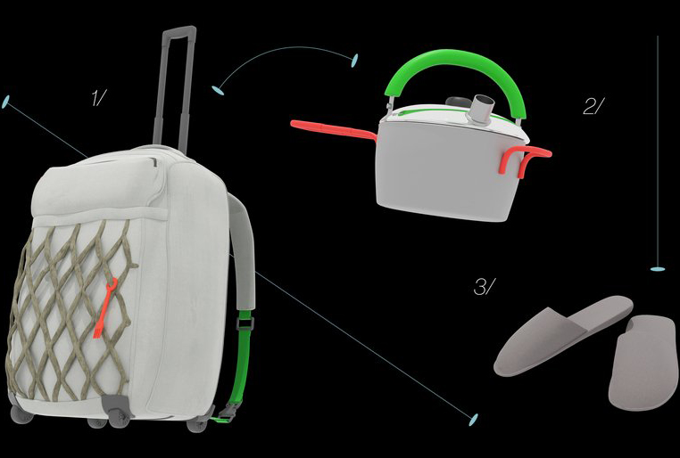
1/ Backpack-suitcase 2/ Basic set of household utensils 3/ Additional items
Communication also emerges through use. Objects suggest actions through their form and material qualities. Affordances communicate behavior nonverbally: a handle invites pulling, a recessed surface implies placement, a modular structure allows reconfiguration. At the same time, design organizes experience over time. Sequences such as unboxing, assembling, or navigating a space create micro-narratives that reduce uncertainty and help users understand what comes next. These structured transitions transform potentially chaotic situations into readable ones.
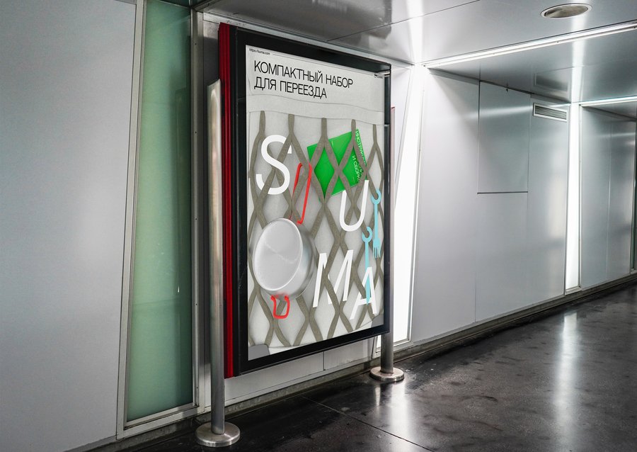
The poster
Design can therefore be understood as a medium in itself. The idea that ‘the medium is the message’ (McLuhan, Understanding Media: The Extensions of Man, 1964) highlights how the material form of an object or system influences the meaning users derive from it. Through its affordances and structure, design sets the boundaries of possible actions and interpretations. In doing so, it not only addresses functional needs but also shapes how people move through unfamiliar or transitional situations, both practically and emotionally.
Presentation for a general audience
The first move usually starts with a simple problem: you have a new room, but no system. Things you need right now are buried somewhere in boxes, and every small task turns into a search mission.
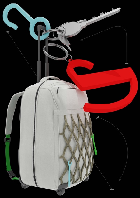
The backpack-suitcase
SUMA is a moving kit built to cut through that «first-day» noise. It comes as a compact case and gives you the basics that make a space functional immediately: tableware, small home items, and daily essentials without improvising. Items inside the case are grouped by first-to-do tasks, like cooking, washing and storing, so unpacking becomes a short sequence instead of an open‑ended search.
Some instructions contain stickers
What makes SUMA different is how it solves problems. The objects come with clear visual instructions and QR codes, so you don’t have to guess how something folds, clips, or stores. You just follow a few steps and move on. The system favors minimal text, clear iconography, and immediate affordances that reduce effort in first‑time use, aligning with onboarding best practices.
Backpack-suitcase from the inside
Inside the case, everything has a place and a logic. The design uses simple shapes, limited accent colors, and a feel that tells you what belongs together and what to do first, turning unpacking into a sequence instead of a mess.
SUMA also continues after the first day. Beyond the kit, the website lets you to order essentials, add missing modules, buy merch that matches the same visual system and track replacements when something wears out.
Start your space, not your stress! Choose SUMA, unpack in minutes, and get living.
Presentation for a professional audience
SUMA is built as a scenario-based system rather than a single object. Its strength lies in how consistently form, structure, and communication work together to solve a specific scenario: the first days after moving.
View of a backpack-suitcase on a person / general view from the back
The visual language supports this logic. All elements are based on simple forms and clean surfaces, which makes them easy to translate into schemes. This directly shapes the instruction system: manuals use line drawings, clear steps, and spatial logic instead of long explanations. They work as a universal visual language, saving time and attention, especially in stressful situations.
The instructions
Typography and color help structure information and guide attention. Suisse Intl is used in different weights and styles: Regular for main information, Medium for heads, and Cursive for additional information. The base colors: light grey (DFDADA) and grey (767676), form a calm base layer, while accent colors, green (2AA53B), light blue (8DBBD5) and red (F74C3A), act as functional markers. They signal differentiation, priority, or variation. For example, to distinguish additional items inside the kit while keeping the system visually calm.
Unfolding logic
The internal structure of the backpack is based on a clear usage scenario. Items required in the first hours are positioned for immediate access, while secondary elements are placed deeper inside. This establishes a clear order of actions at a moment when routines have not yet formed. The orthopaedic back panel addresses the actual weight of the kit, reinforcing an emphasis on physical comfort and reliability over short-term visual impact.
SUMA is built as a modular platform. The core kit sets the visual, material, and behavioral rules of the system. Additional products and sub-brands can be developed using the same code. This makes it possible to expand the brand through extensions rather than constant reinvention.
The website
The website follows the same structure, supporting reordering, add-ons, and future sub-brands while keeping the identity consistent.


The cutlery
Communication theory as basis for the presentations
Engaging with the communication theory course reshaped our approach to the brand presentation, turning abstract models into tangible design decisions. The course’s emphasis on models like Shannon-Weaver’s transmission framework and Berlo’s SMCR process became the scaffolding for how we conceptualized message flow, noise reduction, and audience decoding. This foundation prompted us to view the presentation not as a linear pitch but as a dynamic system where sender intent, channel choices, and receiver contexts interlock.
General Audience Adaptation
For the general audience brand presentation, we adapted the course’s audience-centered principles, particularly from the two-step flow model and selective perception filters. Recognizing that lay receivers filter messages through personal relevance and minimal prior knowledge, we prioritized narrative simplicity over jargon, using storytelling channels to bypass cognitive overload. The Shannon-Weaver model’s feedback loop became central. Our strategy involved vivid visuals as primary signals, with metaphors drawn from everyday life to encode brand values, anticipating decoding gaps. Choices like rhythmic pacing and aspirational imagery stemmed directly from understanding diffusion of innovations, where early adopters bridge to the majority through simplified, high-trust narratives.
Professional Audience Shift
For the professional audience, the course’s insights on gatekeeping and rhetorical adaptation, echoing Aristotle’s ethos, pathos, and logos, drove a shift toward precision and evidence-based discourse. This led to a denser structure: hypotheses grounded in communication entropy, followed by strategic alignments to industry benchmarks. The general version built emotional resonance; this one deployed logos through frameworks like agenda-setting theory, positioning the brand as a proactive shaper of discourse.
Theoretical Synthesis
Ultimately, the course unified these parts by applying models like transactional communication, where senders and receivers co-create meaning. The result reveals design’s power as communicative intervention.
Items from the set
Communication Theory: Bridging Academia and Practice. Online-course.
McLuhan, M. Understanding Media: The Extensions of Man. New York: McGraw-Hill, 1964.
Gibson, J. J. The Ecological Approach to Visual Perception. Boston: Houghton Mifflin, 1979.
Norman, D. A. The Design of Everyday Things (Revised and Expanded Edition). New York: Basic Books, 2013.
Dam, R. F., & Siang, T. Y. (n.d.). The integral role of graphic design in communication. ArtVersion. URL: https://artversion.com/blog/the-integral-role-of-graphic-design-in-communication/ (дата обращения: 10.12.2025).
Communication Theory. (n.d.). Design theory. iResearchNet. URL: https://communication.iresearchnet.com/language-and-social-interaction/design-theory/ (дата обращения: 10.12.2025).
Suma // HSEDESIGN URL: https://hsedesign.ru/project/674a0e483fdd4bc286c8931c431bb1f6 (дата обращения: 12.12.2025)

 as a Posthuman Practice of Empathy")

