Concept
Painting of the Slavic world from the 13th to the 15th centuries is not «paintings» in the modern sense, but a visual language that developed within the sacred space of the church. In an era when most people could not read, the fresco was the primary «text» of culture: it told stories, explained the structure of the world, and established behavioral models.
However, this language was governed by canon—a strict system of rules that dictated everything, from subject selection to the color and pose of the characters. The canon was not a «cage» for the artist. It was the grammar without which the viewer could not «read» the image.
This project is a visual investigation into how the Slavic fresco canon of the 13th–15th centuries operated and what meanings it conveyed. I plan to examine the system: how color creates hierarchy, how a character’s gaze directs the viewer’s attention, and how composition transforms a wall into a narrative of salvation. From Serbia and Bulgaria to Rus', we are searching for what connected the Slavic painting of this period and what made it unique.
Why Fresco is the Defining Text of the Era
In the culture of medieval Slavs, the fresco was not merely decoration—it was a method of reading the world. Most people who came to the church could not read, but they could look: the image served as a substitute for letters, and the composition on the wall constructed a narrative as sequentially as the text on parchment. Every color, gesture, and gaze was part of a common grammar—the viewer was not just seeing a scene; they were deciphering it, knowing that behind the figure of a saint lay their hagiography, and behind the figure of Christ lay the story of salvation. The fresco was almost a text—a visual one, accessible, and essential for understanding—and this is why the painting of the 13th–15th centuries should be considered not as «art for embellishment, ” but as the primary vehicle of the era’s meaning.
Research Goal: To trace how a unified visual language was formed in Slavic painting of the 13th–15th centuries—specifically, what techniques, symbols, and canons unified the frescoes across Orthodox lands (Rus, Serbia, Bulgaria, Georgia), and how they conveyed the central meaning: the idea of divine order and salvation.
A Canon for Medieval Artisans
The word «canon» can often be intimidating. It seems like a simple prohibition on creativity. But for a medieval artist, the canon was a set of rules—much like musical notation for a musician.
The canon dictated:
Iconography—how to depict a particular subject (for example, the «Dormition of the Theotokos» was always constructed according to a specific scheme: apostles on clouds, Christ with Mary’s soul). Composition—where to place the figures and how to arrange them rhythmically. Color—which colors to use. Gold—divine light. White—purity. Red—blood and sacrifice. Blue—heaven and wisdom.
The artist was not a free-spirited «artist» in the modern sense; rather, they were a conduit for the canon. However, within these frameworks, virtuoso techniques were not forbidden: how to apply a brushstroke, how to «arrange» the drapery folds, or how to render a face.
Rus': Theophanes the Greek. Church of the Transfiguration of the Savior on Ilina Street, Novgorod. 1378.
Theophanes was a Byzantine artist who arrived in Rus' already a seasoned master. His only documented surviving work is the fresco in a Novgorod church. Epiphanius the Pious, his contemporary, wrote of him with admiration: Theophanes did not look at samples but painted freely, «conversing with the present» and contemplating «the sublime and the wise.»
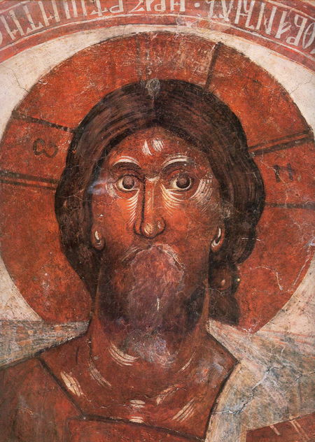
Theophanes the Greek. «Christ Pantocrator.» Church of the Transfiguration on Ilyina Street, Novgorod. 1378.
Feofan Greg worked in Novgorod in 1378 when he created the frescoes for the Church of the Transfiguration on Il’in Street. This work is the only reliably preserved monumental ensemble by the master, and it is here that his artistic method—which merges Byzantine tradition with the spiritual intensity characteristic of the Hesychasm era—is revealed most completely. In the dome of the Church of the Transfiguration, he places the half-figure of Christ Pantocrator—an image that becomes the semantic and compositional center of the entire church space.
Christ Pantocrator. Fresco fragments
The painterly style of Theophanes in this fresco achieves a maximal concentration of expressiveness. Christ’s face is rendered with large, confident brushstrokes; light and shadow clash sharply, without smooth transitions, creating an image devoid of comfort. This is not the Pantocrator that inspires trust—it is an image of power that simultaneously protects and judges. In this very solution, researchers find the programmatic embodiment of Hesychast ideas: the divine light does not pour out onto the viewer; it demands an internal effort from them—a «spiritual prayer, ” a readiness to meet it. Theophanes does not soften this image or make it more accessible; he builds the fresco on the contrast between Christ’s grandeur and human smallness, and in this contrast lies the primary visual meaning of the dome’s composition.
Andrey Rublev. Frescoes of the Dormition Cathedral in Vladimir. 1408.
Andrei Rublev’s frescoes in the Dormition Cathedral in Vladimir survive in fragments, which presents a certain complexity for visual analysis. However, even what remains allows us to see how a different type of canon functions—one that is softer, lighter, and more «human» than that of Theophanes the Greek. Fire and punishment are present, but they do not dominate; the main focus is not on retribution, but on justice that does not negate mercy. Rublev worked in Vladimir in 1408 alongside Daniil Cherny, and their collaborative painting became one of the key masterpieces of 15th-century Russian painting.
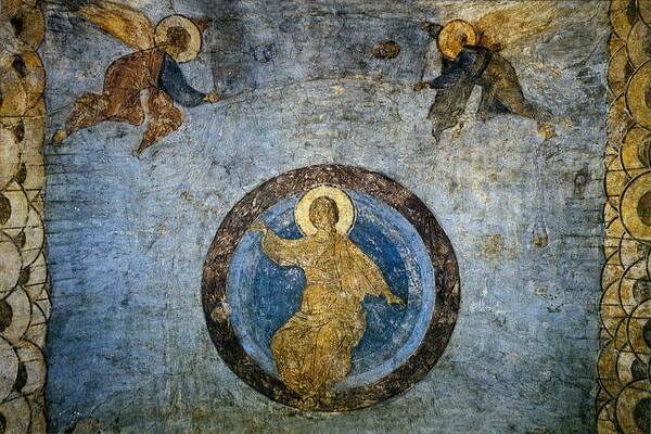
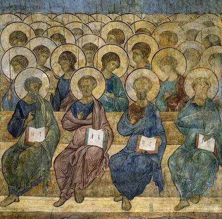
Andrei Rublev. «The Last Judgment.» Frescoes of the Dormition Cathedral in Vladimir. 1408.
In the Western European tradition, the Last Judgment is a drama of horror, depicting the separation of the righteous and the sinners. Rublev’s «Last Judgment» does not instill fear—Christ appears here more as a teacher than as a judge. The composition is built not on the contrast between hell and heaven, but on the concept of justice that does not negate mercy. The figures of saints and apostles are arranged rhythmically; their poses are serene, and their faces are luminous. Even the sinners do not look «annihilated”—they appear sorrowful rather than punished.Rublev’s use of color is a subject for separate analysis. His palette is lighter and calmer than Feofan’s: blue, light green, and golden. These colors do not „burn“; rather, they glow, creating a sense of tranquility instead of tension. The technique of painting is smoother: the master does not sculpt form through sharp contrast but dissolves it into light. The faces of the saints are not ascetic; they are „illuminated”—they possess a human warmth that does not undermine their sanctity but makes it accessible.
Christ and the Apostles. Fresco fragments
Within the context of Slavic painting from the 13th to 15th centuries, Rublev’s frescoes exemplify how a canon becomes its own. The Byzantine scheme is not discarded, but it is experienced anew. Rublev retains the iconographic structure but shifts the tone: the canon moves from one of «awe/fear» to one of «hope.» This is precisely what makes the Vladimir frescoes a key link in the project’s logic—after Feofan (tension), the viewer sees that the same language can sound softer and more human—and that, too, is a canon.
Serbia: Mikhail Astrapa and Evtikhij. Frescoes of the Church of the Virgin of the Protection in Ohrid. 1294–1295
Serbian painting of the first half of the 14th century is inextricably linked to the names of two artists whose signatures survive on the walls of churches—Mihailo Astrapa and Euthychius. It is known that Mikhail bore the surname Astrapa, which appeared in Thessaloniki in the early 14th century, suggesting the masters originated from that city or its sphere. The inscriptions bearing their names are written in Greek, which further confirms the Greek origin of the artists who worked for the Serbian king.The Church of the Virgin Perivleptos in Ohrid is the monument from which the «Palaeologan Renaissance» on the Balkans begins and simultaneously the point where Serbian painting at the turn of the 13th–14th centuries sharply changes course. Mikhail Astrapa worked here with Euthychius. It is in Ohrid that their style declares itself in its full power: classicizing, voluminous, with accentuated physicality in the figures and complex architectural backgrounds.
Mikhail Astrapa and Evtimius. «Dormition of the Most Holy Theotokos.» Frescoes in the Church of the Virgin of the Peplos in Ohrid. 1294–1295.
The fresco, «The Dormition of the Mother of God, ” located in Sopocani, covers the entire western wall of the Holy Trinity Church and stands as one of the most significant compositions of 13th-century Serbian painting.
The composition unfolds as a multi-figure narrative: At the center is a bier upon which the Theotokos rests. Above her stands Christ, holding Mary’s soul in the form of a swaddled infant. On either side are the apostles, angels, and saints. The figures are arranged in tiers, and this layering creates not so much spatial depth as a hierarchy of meaning—the higher one is, the closer to the celestial; the lower, the more earthly the event. The apostles surrounding the bier form a dense group, in which each character is endowed with a unique pose and gesture. Some lean toward Mary’s body, others raise their eyes toward Christ, and a third group is frozen in silent sorrow.
«The Dormition of the Most Holy Theotokos.» Fresco fragments
The faces of the characters in Gracanica are marked by what researchers call the «Serbian type»: they are rounder and fleshier than in the metropolitan Byzantine monuments. These are not «portraits» in the modern sense, but they possess a corporeality and substance that distinguishes the Serbian painting of the Milutin era from more ascetic Greek examples. The sorrow of the apostles is conveyed not through expressive grimaces, but through restrained gestures and head inclines—a language well understood by the viewer of that period.
For visual research, Gracanica is valuable because it allows us to see how the canon functions in the hands of high-level masters. There is no «violation» of the rules—only their execution with profound understanding. Michael and Eustathius (or their successors) do not «copy» the schema; rather, they articulate it in a language that brings it to life. This is precisely what makes the 14th-century Serbian fresco one of the most compelling objects for studying the visual language of the Middle Ages.
Bulgaria: Master Vasily (Boyanski Master). «Portrait of Desislava.» Boyana Church. 1259.
The fresco depicting Empress Desislava is situated among the iconographic portraits in the Boyan Church and stands as one of the most significant images of Bulgarian Medieval history. Her husband, Kaloyan, is portrayed nearby, but the literature almost always focuses on Desislava, because her portrait breaks the established canon: its softness, corporeal quality, and «pre-renaissance» gaze. Kaloyan, meanwhile, remains within the confines of a more traditional iconographic schema. While iconographic portraits in the Byzantine tradition were conventional and hierarchical, the master of Boyan created something different. Desislava does not merely «stand in waiting» as a sign of piety; she stands—with weight, volume, and a corporeal presence that is extremely rare in Eastern sacred painting.
Master Vasily (Boyansky Master), «Portrait of Desislava.» Boyansky Church. 1259.
Desislava’s face is the main argument for what researchers call the «pre-Renaissance.» It is not ascetic, not abstract, and not «iconic» in a strict sense. It possesses individuality: the softness of the oval, the specificity of the features, the calm dignity of the gaze. She does not stare directly at the viewer, nor does she gaze into eternity. Her look is directed to the side, and in that direction, one reads not a «prayerful reverie,» but a personal presence. Art historians do not call these portraits «the first Renaissance images in European art» by chance—not because they feature perspective or anatomy, but because they feature a human being.The technique of layered paint application creates soft transitions and the feeling of a living surface. The shadows are translucent, and the light does not «flash,» but rather «diffuses.» This makes the 1259 fresco a precursor by several decades to the turn toward the human that is typically associated with the Italian Trecento.