
Меня всегда привлекали идеи христианства, поэтому я сразу решил взять статистику по христианству в разных странах. Его я нашел на Wikipedia.ru Датасет содержит данные о численности населения и христиан и о процентном соотношении христиан к населению.

Обработка данных
Сначала я импортировал данные, затем проанализировал их из CSV-файла с помощью библиотеки pandas. После, для создания наглядной визуализации, мной используются библиотеки: matplotlib.pyplot для основных элементов графика, seaborn для улучшения внешнего вида

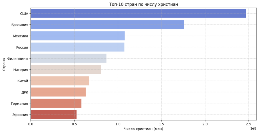
Потом были обработаны данные для барчарта, в котором говорится про топ 10 стран по числу христианства.
x='Число христиан' Определяет, что столбец ‘Число христиан’ будет отображен по горизонтальной оси. y='Преобладающее направление' Определяет, что столбец ‘Преобладающее направление’ будет отображен по вертикальной оси. Каждое уникальное значение в этом столбце будет представлено отдельной «скрипкой». data=df_directions Указывает DataFrame, содержащий данные для графика. palette='coolwarm' Задает цветовую палитру для скрипок. ‘coolwarm’ использует сине-красную цветовую схему, где синий обычно соответствует меньшим значениям, а красный — большим. hue='Преобладающее направление' Указывает, что скрипки должны быть окрашены разными цветами в зависимости от направления христианства. Поскольку hue совпадает с y, каждая скрипка будет иметь свой цвет. legend=False Отключает отображение легенды, так как она в данном случае избыточна (цвета и так соответствуют направлениям на оси y).
Затем я создал таблицу по количеству христиан в разных регионах мира.
Заключение
В процессе изучения датасета, который содержит информацию о христиан в мире, я сделал 4 графика. Итак, самое большое количество христиан наблюдается в 2020 году в Северной Америке.


