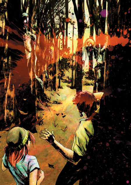
Concept
How can a comic truly frighten its reader? The obvious solution seems to be making the monster attacking the heroes scarier and the scenes more brutal. This is how low-quality horror works come to life, because masterful stories immerse the reader in the frightening atmosphere of an unfriendly world long before any monstrosities appear on the pages.
A successful approach can be seen in the comic «Wytches, ” created by screenwriter Scott Snyder and artists Mark Simpson (known by the pseudonym „Joke“) and Matt Hollingsworth. As the reader progresses through the comic, they can notice a prolonged and persistent feeling of anxiety and disorientation. The surrounding world in the comic feels hostile, resembling a nightmare in its chaos, ambiguity, and distortion.
As part of this research, I group these characteristics under the term «visual disorientation effect, ” because the concept of disorientation involves a loss of reliable understanding of the surrounding reality, which leads to anxiety and fear.
Anything that prevents the reader from correctly perceiving the image or forces them to perceive it in a distorted manner will fall under this effect.
Therefore, the research hypothesis proposes that the comic «Witchcraft» employs a series of graphic techniques designed to create an effect of visual disorientation—disrupting conventional image perception.
The relevance of this topic is highlighted by the declining interest in the horror genre and the countless existing techniques and devices used to evoke specific emotions in the reader. In «Witches,» graphic techniques enrich the established narrative and allow even a static image to become frightening or unsettling. Therefore, a careful analysis of the entire work to identify the specific devices that elicit an emotional response in the reader will always be valuable and productive for the genre as a whole.
So, the key research question is: through what graphic and compositional choices in the comic «Witches» is the effect of visual disorientation created?
The sources selected included academic analyses and fan studies of the comic to examine the work’s historical context, identify details I may have overlooked during reading, and learn what visual strategies and approaches other creators highlight.
The research is divided into three chapters, each examining different components of the comic. The first chapter discusses textures and lines, analyzing the use of spot patterns, line work, and overlaid textures. The second chapter focuses on light and color, analyzing the use of palette, contrast, and chiaroscuro. The third chapter addresses composition and space, examining the overall structure of the comic—including the arrangement of panels and the nature of the spaces within it. The analysis moves from minute elements, such as the quality of the line, toward a conclusion based on the comprehensive view of the spaces.
Chapter 1. Textures and Lines
Every line possesses a unique character, inherent in its material, density, and consistent execution. When these lines coalesce into a complete image, the possibility arises to evaluate them relative to one another. Spots and textures model the work more fully—all of this forms the foundation of the image, establishing its character from the very first touches of the pen. Let’s explore which graphic decisions at this stage allow the image to feel more anxious and convoluted.
«Witches,» screenwriter Scott Snyder, artists Mark Simpson and Matt Hollingsworth, 2014.
We will consider the witch, but we will not focus on her physical form, but on what she is composed of: torn, chaotic lines that seem to tremble across her slender body. The chaotic nature of the lines allows for the effect of movement and shaking—it seems the witch is about to spring into motion, brimming with frantic energy, which evokes a sense of anxiety and confusion. Comics often feature scenes of rain, like this one, which is also intentional—the lines cross the image, making it more unstable and ambiguous.
«Witches,» written by Scott Snyder, illustrated by Mark Simpson and Matt Hollingsworth, 2014.
Details are lost due to disorganized lines, preventing a clear examination of the image, which distorts the features of the objects and obscures their authentic representation. The reader perceives only general outlines and silhouettes, but the eyes are distinctly visible—the viewer understands that the monster sees them perfectly, unlike the viewer themselves.
«Witches, ” written by Scott Snyder and illustrated by Marc Simpson and Matt Hollingsworth, 2014.
Stains, like lines, are made by the artist—impulsively, with large, bold strokes, based on impression—and are softened, acquiring a rough, uneven texture at the edges. Just as with a line, this lends dynamism to the work, yet it blurs details, plunging the viewer instead into the aesthetics of dreams: fluid, ephemeral, yet unsafe.
«Witches, ” Screenwriter Scott Snyder, Artists Mark Simpson and Matt Hollingsworth, 2014.
Thus, the combination of a delicate, fractured line and rough black spots with a blurred edge creates a dark, high-contrast image built upon instability and a feeling of movement or tremor. The dense intertwining of branches and textured bark blends into an indistinct labyrinth, compelling the viewer to peer into the frame, searching for either danger or an exit—as if they themselves were the protagonist trapped in the forest.
«Witches, ” screenplay by Scott Snyder, art by Mark Simpson and Matt Hollingsworth, 2014.
Beyond lines and large silhouette masses, the comic features textures: in the fragment above, you can notice fine splatters of ink, which lend the image a sense of chaos. Even more prominently, an active texture of colored splatters is layered over the image. This works in tandem with the previous elements to create a disorienting picture—one that requires active examination to decipher its content beneath a layer of conflicting textures and rough lines. The reader feels as if they are viewing the image through a dreamlike haze or while in a delirium, causing visual static and making the image difficult to comprehend.
To summarize, all the graphic elements mentioned above—lines, spots, textures—all of this forms a complex visual labyrinth, hazy and blurred, overlapping one another, which makes the image difficult to read.
The impression is that the space breathes and moves, even if the frame depicts only a landscape rather than a living object, yet the reader perceives it as being in a state of delirium or nightmare.
Chapter 2. Light and Color
The next step in analyzing the drawing after the outline is undoubtedly color. Beyond interesting color solutions, let’s consider how the use of shadows and light affects the overall impact of the image.
«Witches,» script by Scott Snyder, artists Mark Simpson and Matt Hollingsworth, 2014.
Continuing the theme of textures, let’s also note that the paint splatters overlaid on the pages are colored in saturated, contrasting hues—primarily turquoise, violet, pink, and red. This color choice accentuates the unnatural nature of the event, especially since the scenes within the frames are executed in a warm palette of natural colors, and the introduction of these unnaturally bright spots disrupts the image’s coherence.
«Witches, ” written by Scott Snyder, with art by Mark Simpson and Matt Hollingsworth, 2014.
Beyond the saturation of the colors, consider how they interact together: often, they create a jarring clash—for instance, orange and turquoise—which distracts from the essence of the image.
«Witches, ” screenwriter Scott Snyder, artists Mark Simpson and Matt Hollingsworth, 2014.