RUBRICATOR
- General theoretical part: communication in the design field
- Presenting to the general audience
- Presenting to the professional audience
- Communication theory as basis of the project
- Conclusion
1. GENERAL THEORETICAL PART: COMMUNICATION IN THE DESIGN FIELD
Communication theory serves as the cornerstone of design excellence, enabling brands to transcend visual appeal and forge meaningful connections with their audiences. It provides a structured framework for understanding the intricate journey of messages — from conception through transmission to meaningful reception.
In design practice, this theory illuminates how visual, verbal, and symbolic elements resonate with audiences, revealing the pathways through which designers can craft communications that are both eloquent and unmistakably clear.
Integrating communication theory into design and branding transcends aesthetic considerations alone
It demands the creation of work that speaks with semantic precision and cultural authenticity—designs that honor both the eye and the mind, bridging the gap between visual beauty and meaningful substance.
At the heart of communication theory lies the linear model, which emphasizes a fundamental truth.
Successful messaging requires more than a compelling sender and a well-crafted message
Strategic impact emerges through the deliberate application of communication theory’s core principles—semiotics, the elaboration likelihood model, and contextual analysis—each offering unique insights into how meaning is constructed and shared.
A robust theoretical foundation elevates design from decoration to strategic communication. It transforms visual work into a powerful instrument for conveying intention, creating designs that captivate through beauty while persuading through clarity and purpose. This is where design becomes truly transformative.
2. PRESENTING TO THE GENERAL AUDIENCE
50 characters
Enjoy the diversity of the traditional tok-chok with NOMAD!
Want a sweet healthy snack? Try tok-chok by NOMAD — a traditional Altai sweet with a story spanning millennia!
Once reserved for select nomadic families, the recipe was a guarded secret passed down through generations as a form of ancestral memory.
Now, NOMAD remains the only brand in Russia preserving the traditional methods of crafting tok-chok
The name NOMAD is our main message. It points to ancient traditions, the continuity between generations, and to the idea of connectedness, the idea of family identity.
When you see NOMAD, you don’t just see a product; you see the national heritage of the Altai nomads. Our brand is a sign that carries a deeper meaning: not only «a dessert from Altai», but «a living tradition you can share today».
Banner
We at NOMAD take pride in our products and use only natural ingredients in our tok-chok
Our brand prioritizes our customers' health and happiness.
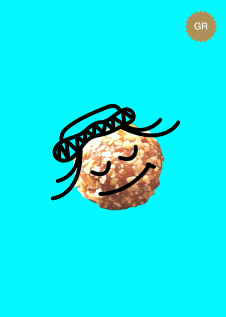
Each tok-chok package is not just a wrapper — it’s part of a collectible series featuring a unique character. Some labels include uplifting messages, offering a touch of warmth and connection that echoes the brand’s family-oriented values.
There is a collection of 50 illustrated characters wearing stylized traditional headwear. Together, they represent an extended family — united in spirit, yet each distinct in detail.
This is NOMAD, this is family, enjoy!
3. PRESENTING TO THE PROFESSIONAL AUDIENCE
NOMAD stands as a family-owned enterprise rooted in the heart of Altai tradition, celebrating a time-honored craft through its distinctive tok-chok—a wholesome snack steeped in heritage and reimagined for the contemporary palate. Every element of the brand, from packaging to presentation, reflects a commitment to authentic craftsmanship merged seamlessly with modern aesthetic sensibility.
The name NOMAD itself embodies the brand’s deepest values, evoking the boundless spirit of ancestral wanderers and the unbreakable bonds of kinship
It resonates with a specific cultural narrative of Altai nomadic legacy while simultaneously speaking to universal audiences as a powerful metaphor—one that captures freedom, the poetry of journeys undertaken, and the warmth of familial connection that transcends time and geography.
The visual identity of NOMAD finds its heartbeat in a remarkable collection of fifty meticulously illustrated characters
Each adorned with stylized traditional headwear that honors regional heritage. Far more than decorative elements, these characters form an interconnected ensemble—a visual representation of an extended family bound by shared spirit yet celebrated for individual distinctiveness in every hand-drawn detail.
The bright colors ensure noticeability of NOMAD’s advertisements and separate our product from its competitors
All characters
Poster
Design system:
Colors
Fonts
4. COMMUNICATION THEORY: SENDER-MESSAGE-RECIEVER-EFFECT
Sender:
A contemporary Altai family brand representing a broader nomadic heritage.
The message:
«We preserve and share an authentic, family-based cultural practice through a unique traditional dessert.»
The receiver:
- The consumers who are interested in healthy and authentic products.
- Professionals and opinion leaders (gastronomy, culture, tourism, branding) seeking credible, culturally grounded brands.
Effect:
- The general audience is emotionally engaged, perceives authenticity. Inspires brand affinity.
- The professionals recognize NOMAD as a reference case of culturally rooted, semiotically coherent branding.
The brand operates as a relational symbol: it does not only identify the product; it structures a relationship between past and present, local and global, family and community
The semiotic approach:
Visual signs which are automatically interpreted by the audience.
NOMAD’s visual language is based on illustrated characters which represent an extended family. The friendly faces of the characters translate a family-friendly product to the audience. Their design varies by facial expression and stylized traditional headwear, which provides cultural context.
In other words, characters act as icons, representing people in headwear, symbols signifying family warmth, and a cultural reference pointing to nomadic Altai tradition.
Merch
ELM
Central Route: NOMAD’s tok-chok is made with simple natural ingredients. For people who value healthy foods it is easy to confirm this fact, which can be a convincing argument to purchase from NOMAD.
Peripheral route:
NOMAD’s visual identity is bright and noticeable, utilizing bright colors and a bold font. Moreover, there is an aspect of emotional involvement. NOMAD’s brand revolves around preservation of nomadic culture and strong family based values, with the illustrated characters (mascots) symbolizing an extended family.
Lastly, NOMAD promotes their limited edition merch and includes collectables in their tok-chok packages.
Poster
Rational and Emotional appeals
In support of the ELM, we can view the brand strategy through rational and emotional appeals.
Rational (logos):
- Unique heritage product with preserved traditional method.
- Only brand in Russia specializing in traditional tok-chok production.
- Clear origin (Altai Republic) and transparent story of recipe transmission.
Emotional (pathos):
- Family, continuity, care, belonging.
- Visual warmth and playful diversity of faces.
- Mascot-characters as companions and tokens of support.
Narrative paradigm
NOMAD has a core story behind its main product: «Once reserved for select nomadic families, the recipe was a guarded secret passed down through generations as a form of ancestral memory. Now, NOMAD remains the only brand in Russia preserving the traditional methods of crafting tok-chok.»
Posters
Narrative coherence:
The story of a family preserving and transmitting a recipe over generations is consistent with regional history and brand behavior.
Narrative fidelity:
It resonates with widely shared values: family care, authenticity, rootedness. Tok-chok acts as a symbol of care and family warmth, not a simple sweet.
By turning tok-chok into a symbolic carrier of heritage, NOMAD transforms a local dessert into a medium of cultural transmission: each purchase and gifting act becomes a small reenactment of intergenerational sharing.
Channel and context for advertisement
Primary channel:
Product and packaging. Stylized characters create instant brand recognition.
Digital media:
A series of web banners for local online stores and social media was created, allowing the brand to reach its audience effectively. A telegram sticker pack featuring brand characters was designed to engage a younger audience.
Merch and physical spaces:
A limited-edition merch line, including branded delivery bags, was also developed. Visually distinct and recognizable from afar, these items extend the brand’s presence into the urban landscape.
Web banners for local online stores and merch
To engage a younger audience, a Telegram sticker pack featuring brand characters was designed. Minimalist animation and friendly phrases make the brand more relatable and recognizable in everyday digital interactions.
The modular identity system simplifies message encoding across formats: one visual and narrative grammar, many expressions. This directly supports efficient encoding/decoding in Shannon–Weaver terms, reducing «noise» and misinterpretation: wherever the audience meets NOMAD, they receive the same core message.
Telegram sticker pack
Dprofile
The NOMAD project was also published on the design platform Dprofile and received an award there, which further confirms that the visual system and the brand were carefully thought out.
5. CONCLUSION
NOMAD as a brand is constructed as a communication system, where product, story, and visual form are all aligned. NOMAD transforms tok-chok into a carrier of cultural memory and familial care.
Communication Theory: Bridging Academia and Practice. Online course.
Tahiri, R. (2025). NOMAD | Фирменный стиль с 50 персонажами [Digital branding case]. Dprofile. Retrieved December 15, 2024, from https://dprofile.ru/case/123075/nomad-firmennyi-stil-s-50-personazami


