Communication theory in the design field
Communication theory examines how meaning is transmitted between a sender and a recipient through signs, channels, and contextual environments. In design practice, this theory becomes a tool not just for creating objects, but for shaping the values and interpretations that audiences build around them.
Any design element — a logo, a package, a digital banner, or a physical object — acts as a message that the viewer decodes through their cultural experience, visual memory, and personal expectations. Semiotics allows us to understand which visual signs trigger the correct associations: color can serve as an emotional marker, form can indicate function, and typographic style can orient the audience toward a specific mood.
FruiSphere brand packaging
Communication theory also highlights the importance of the communication channel and the environment in which perception occurs. The same message will feel different on packaging, in a digital marketplace, on a billboard, or within a supermarket shelf. When designing a brand, it is essential to anticipate how attention, trust, and interest shift depending on the context.
Another crucial concept is «noise» — anything that distorts or complicates the intended meaning. Visual clutter, overly intricate symbols, mismatched styles, or excessive detail become forms of noise. A designer’s task is to reduce noise and strengthen clarity so the message remains readable across all media.
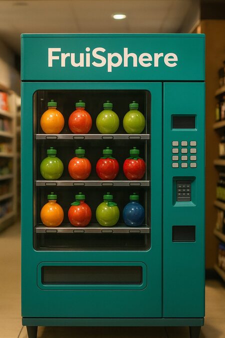
FruiSphere brand assortment in the store
Communication theory also highlights the importance of the communication channel and the environment in which perception occurs. The same message will feel different on packaging, in a digital marketplace, on a billboard, or within a supermarket shelf. When designing a brand, it is essential to anticipate how attention, trust, and interest shift depending on the context.
Presentation to the general audience
FruiSphere brand assortment
FruiSphere is a line of natural cold-pressed juices with packaging shaped like the fruits they come from. A spherical apple, a textured orange, a pear-shaped bottle — each package visually, tactically, and symbolically conveys the flavor inside.
The brand’s mission is to reconnect people with the sensory honesty of real fruit. When you pick up a FruiSphere bottle, you are not just choosing a drink — you are holding a small, playful representation of nature’s own design.
The visual identity uses bright, saturated colors taken directly from fruit skins, pulp, and juice tones. Typography is approachable and slightly bouncy, echoing the round silhouettes of the packaging. The logo features gentle curves inspired by the geometry of whole fruits, conveying juiciness and freshness.
FruiSphere brand packaging
The visual language revolves around light, friendly illustrations and clean compositions that highlight the tactile bottle shapes. Communication is simple and relatable — a reminder that healthy choices can be joyful rather than restrictive.
FruiSphere speaks to modern, active consumers who enjoy natural products, follow design trends, and appreciate everyday objects that feel engaging and delightful. The main message is «real fruit, real fun»: a refreshing drink that brings both flavor and aesthetic pleasure.
In stores, on social media, and in outdoor placements, the brand’s bright fruit-like silhouettes create instant recognition. Large hero images of fruit skins and juice splashes emphasize naturalness, while the playful packaging makes FruiSphere a perfect grab-and-go product for families, students, and young professionals alike.
Presentation for professional audience
The FruiSphere identity is built on semiotically transparent symbols and a tactile-centric packaging strategy. Each bottle is shaped like the primary fruit of the flavor, creating a direct, iconic association that requires no additional explanation.
The color palette is constructed from high-contrast fruit tones: apple red, citrus orange, pear green, berry purple, and tropical yellow. This approach provides both category clarity and shelf visibility, allowing the brand to dominate visually in competitive retail environments.
FruiSphere billboard
Typography is a customized geometric sans serif with rounded terminals and softened counters. These modifications reinforce the brand’s emphasis on softness, juiciness, and natural curvature. The lowercase «f» and «s» receive extended strokes that visually echo peel spirals, forming a recognizable motive used in both logotype and icon form.
FruiSphere billboard
Patterns are based on micro-textures taken from fruit skins — pores, stripes, gradients, pith structures — abstracted into repeatable graphic modules. They work as a unifying system across packaging, posters, and digital communications. The illustrative style includes soft shading and subtle gloss accents that amplify the tactile qualities of the packaging, further emphasizing the sensory concept of the brand.
FruiSphere brand poster
FruiSphere social media
In social media, the communication strategy is built around bold typographic headlines paired with simplified fruit-shape silhouettes and ingredient close-ups. The tone is vibrant and clear, focusing on immediate recognizability and emotional appeal.
FruiSphere brand merchandise
Thus, the brand system can be distilled into five core design principles: — iconic fruit-shaped bottles as primary semiotic anchors; — rounded adaptive typography; — texture-based modular pattern system; — high-contrast natural color palette; — communication that balances sensory emotion with rational product clarity.
How communication theory formed the basis of the project
FruiSphere brand packaging
Communication theory structured the development of FruiSphere from the conceptual level to the final visual system.
- Sender — Message — Recipient
The sender is the brand; the message is «real fruit in its most joyful form»; the recipient is the contemporary consumer who values natural products and playful aesthetics. This triadic model helped define the core meaning: each bottle must communicate the essence of the fruit instantly, which became the foundation of the packaging design.
- The semiotic approach
All visual signs were chosen for immediate interpretability: — fruit-shaped packages = transparency and authenticity, — rounded forms = softness and juiciness, — skin-inspired textures = natural origin, — bright fruit tones = flavor cues and emotional intensity. Semiotics ensured that the system remains stable across media and recognizable at a glance.
- Communication levels (emotional / rational)
Rational level: natural ingredients, cold-pressed, no added sugar, eco-friendly packaging. Emotional level: playful, joyful, colorful, sensory, child-like wonder. The dual-level structure creates a communication strategy that feels trustworthy while also engaging on a personal, emotional level.
- Channel and context
Packaging, digital marketplaces, social media, and outdoor installations each carry adapted visual messages.
Examples: — packaging emphasizes tactile shape and fruit texture; — social media focuses on bold headlines and bright ingredient visuals; — outdoor advertising uses large-scale fruit silhouettes for long-distance recognition.
Minimal composition, strong shapes, and a disciplined palette eliminate noise and keep the message clear across all contexts.
All these principles formed a system where visual form directly follows the communication task, making FruiSphere a coherent and theoretically grounded brand.
FruiSphere brand store
Materials from the Communication Theory course.
images generated using Chat GPT AI https://chatgpt.com


![[афро.гард] синтез культур](https://files.mediiia.ru/projectimages/1840/b10300e999984ba8806ed34212786c13/726d2ccb4c1b4e00ba2ed9940065ea75220x314.jpg "[афро.гард] синтез культур")