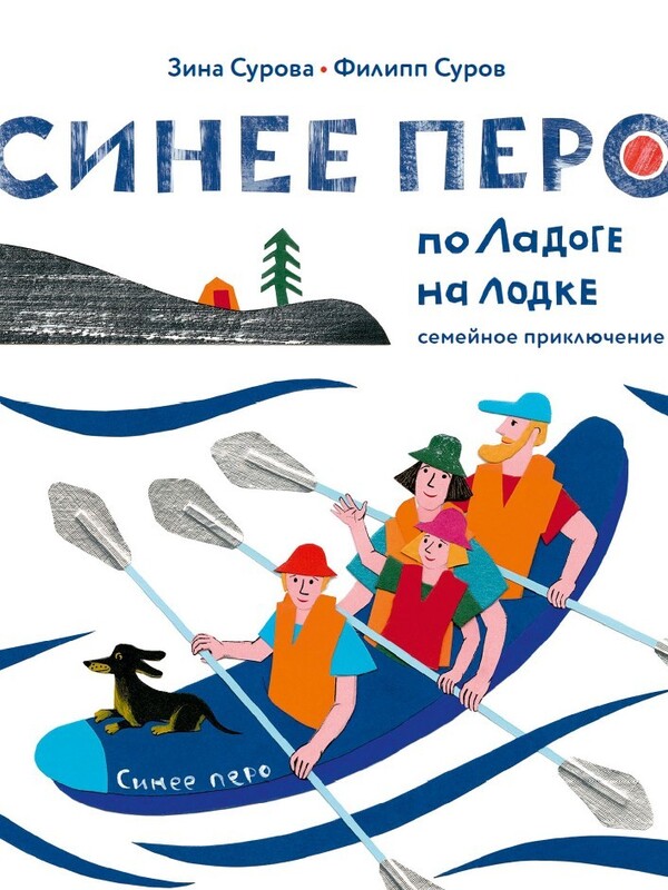
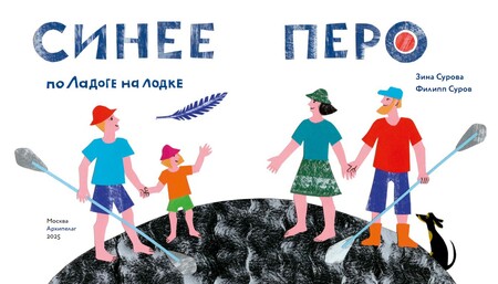
Синее перо — это книга для семейного чтения.
Над книгой работали Текст: Зина и Филипп Суровы Иллюстрации: Зина Сурова Дизайн, вёрстка и цветокоррекция: Филипп Суров
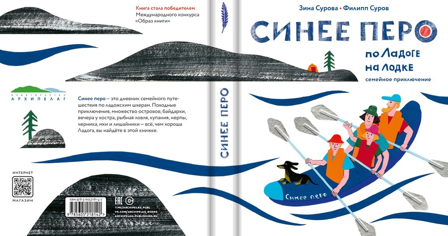
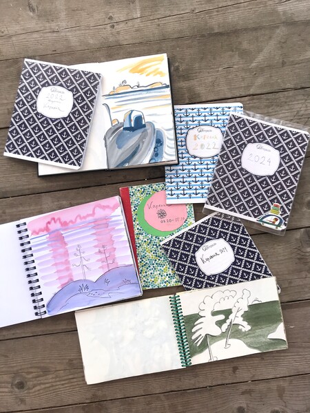
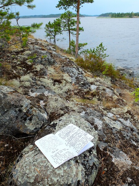
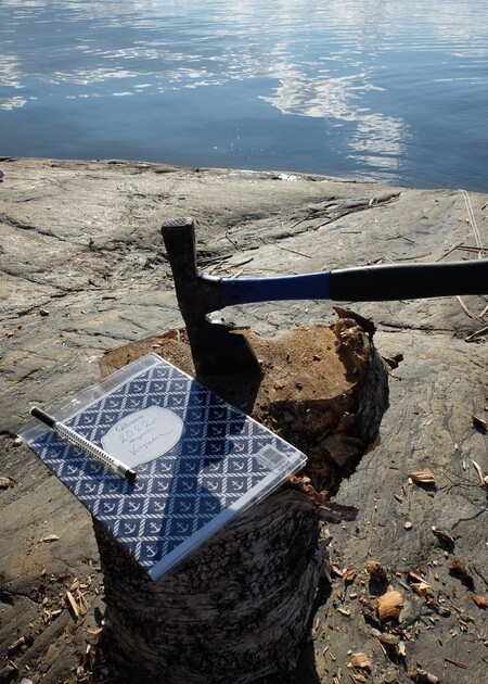
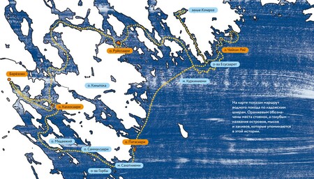
Синее перо — это книга о семейном походе на лодке по Ладоге. Поэтому сначала надо было «скомпоновать» четыре длинных похода и «прорисовать» путь лодки на листе Ладоги, таская за пазухой блокнот для рисунков и записей в непромокаемом пакете. Рассказы писались прямо на необитаемых ладожских шхерах. Там же было сделано много рисунков с натуры.
Если понимать композицию не только как расположение на странице, но и как возможность соединить в изображении пространство и время, то именно она помогла собрать под одной обложкой ветер, волны, мхи, штормы, туман, острова, нерп и чаек…
Цель композиции этой книги, как литературной, так и изобразительной, — дать возможность читателю увидеть вместе с нами луну-поплавок, алые паруса, бусы-черники и на время чтения и рассматривания книги погрузиться в загадочный мир карельской природы.
Ключевые, кульминационные моменты выделяются: количеством белого на развороте (есть очень светлые и наоборот тёмные иллюстрации), цветовыми акцентами (есть очень яркие и наоборот спокойные развороты), используется композиция с активной диагональю, демонстрируется низкий или высокий горизонт. Есть разворот, где Ладога показана как планета. В книге использованы и другие варианты построения пространства изображений.
Особенно внимание уделено «входу» в книгу. Последовательность: переплёт, форзац, авантитул, титул, первые развороты, — решены как единый путь, который ведёт читателя. Активно используется белое, оно чередуется с синим, это создает настроение водного похода.
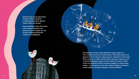
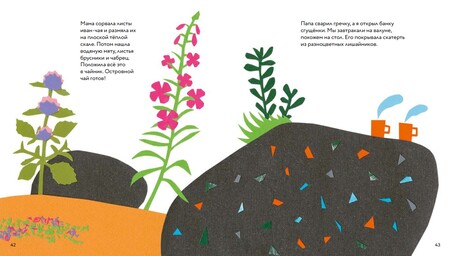
Синее перо — это визуальная книга, где авторы сами рисуют иллюстрации и пишут тексты. Текст и коллаж в этой книге составляют единую ткань повествования: словесного и изобразительного. Ни одна редактура не проводилась без соседства иллюстраций.
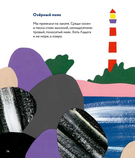
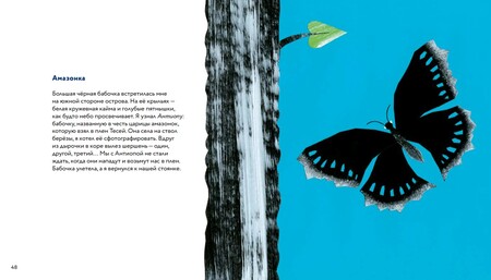
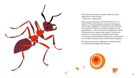
Главное впечатление всего похода — это округлые гранитные валуны островов. Именно их природная поверхность, покрытая лишайниками, дала возможность выбрать коллаж как основную технику иллюстрации. Для передачи поверхности камней и деревьев была подобрана фактура: листы цветного картона тонировались сухой кистью. В зависимости от содержания и настроения разворотов меняются цветовые акценты, фактуры.
Для основного набора был выбран шрифт Circe Rounded студии Паратайп (начертания Regular, Alt Extra Bold). Его округлые чёткие буквы перекликаются с пластикой иллюстраций. Цветность жирного начертания заголовков становится поддерживающим иллюстрации акцентом.
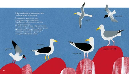
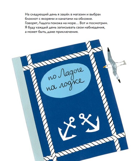
Для оформления переплёта, титула и концевой иллюстрации использованы вырезанные вручную названия. Этот рукотворный акцидентный шрифт закрепляет связь между шрифтовым оформлением и иллюстрациями. Также в книге есть рукописные надписи. Например, на развороте, где герой подписывает виды встретившихся ему чаек. Этот приём отсылает нас к дневникам путешественников.
Эта книжка предназначается для домашнего семейного чтения и рассматривания. Для этого выбран удобный формат 210×240мм, он позволит читателям оценить визуальную часть книги. Пропорция страницы 7/8 создаёт красивый формат, который художники иногда называют «активным квадратом». Иллюстрации воспроизведены в оригинальном размере, без уменьшения.
Коллажные иллюстрации созданы вручную, используется цветной матовый картон, цветные бумаги для рисования, акрил.
Для печати этой книги выбрана мелованная матовая бумага, потому что она хорошо передаёт цветовую палитру коллажных иллюстраций. При этом не создаёт чрезмерно глянцевой поверхности, которая бы противоречила настроению и содержанию книги. Обложка 7бц, белая, под матовой плёнкой, а цветные элементы иллюстрации и шрифт названия выделены УФ-лаком. В печати форзаца используется синий пантон.
Выход книги планируется на апрель 2025 года.


