Оригинальный проект
LU — бренд уходовой косметики, который позволяет побыть наедине с собой и со своим телом, почувствовать настоящий момент, осознать его и посмотреть вглубь себя. Послания на продуктах превращают рутинный процесс ухода за собой в осознанное времяпровождение, тем самым повышают настроение и дарят вдохновение и мотивацию.
Проект на старом портфолио: https://portfolio.hse.ru/Project/219331
Изображения продукта из оригинального проекта
Изображения продукта из оригинального проекта
Изображения продукта из оригинального проекта
Ребрендинг с помощью AI
Design a premium, minimalist, and typography-only logo for the skincare brand «Lu,» consisting exclusively of a custom-drawn wordmark using only the letters «L» and «u» in a strict black-and-white color palette. The logo must convey the brand’s feminine, elegant, calm, and premium essence solely through bespoke letterforms—smooth, fluid, and modern with soft curves and refined details. The elegant flow and connection between the letters should subtly abstractly evoke the gentle drape of a ribbon, while the use of negative white space within or around the characters should hint at the delicate, airy quality of lace, creating a balanced, light, and sophisticated composition. The final logo must be a self-contained, highly legible, and scalable typographic mark that embodies understated luxury, meticulous craftsmanship, and feminine authenticity, aligning perfectly with the brand’s refined aesthetic and working effectively in both black-on-white and white-on-black applications.
Логотип
Цветовая палитра
Шрифт
Create a realistic wide-angle front-view photograph of a minimalist and elegant retail boutique for the premium skincare brand «Lu,» embodying the brand’s feminine, calm, and authentic identity through a light and natural material palette. The interior should feature light wood tones, such as ash or oak, for the flooring and a central low-profile display table holding 4-5 simple apothecary-style frosted glass bottles with black typography, complemented by clear and frosted glass elements for showcases or partitions. Incorporate the «Lu» logo as a delicate metal sign or glass engraving, with the signature lace ribbon motif subtly echoed as a texture on a lacquered panel or fabric. Introduce softness through neutral textiles in white, cream, or light gray for upholstery or tester towels, alongside matte black metal accents for slim shelving frames. Lighting should be abundant, soft, and natural, flooding the space through a large window, enhanced by subtle warm LED strips or a single minimalist pendant light with a linen shade, evoking a calm, alive, and welcoming oasis-like atmosphere. For realism, include an elegant potted plant with organic shapes in a simple ceramic pot, a tester station with a marble tray and neatly folded linen towel, a simple fabric-upholstered stool, and a natural sisal rug beneath the main table. The shot should be balanced and symmetrical, facing the main display directly, rendered in a hyper-realistic 3D or photographic style emphasizing material textures and clean lines. The color palette should be rooted in whites, creams, and light wood tones, accented by the brand’s black and gray logo colors, ultimately conveying a sense of understated luxury and a thoughtfully curated sensory experience that reflects mindful self-care.
Торговая площадка
Create a series of premium minimalist advertising posters and banners for the skincare brand «Lu» that embody the brand’s serene, feminine, and elegant identity by prominently featuring its new custom black-and-white typography-only logo within a clean aesthetic inspired by the brand’s boutique. Each visual should focus on subtle texture, light, and refined simplicity, balancing ample white space with delicate, tactile elements through hyper-realistic, softly lit still-life photography or minimalist 3D renders of a single textured frosted glass product bottle resting on light wood or against draped neutral fabric, alongside abstract close-ups of textures like ceramic curves, water droplets, linen folds, or light wood grain to evoke purity and care. Use a calm, luminous atmosphere with soft natural lighting and gentle shadows to emphasize form, complemented by minimal supporting text in a clean modern serif or elegant sans-serif typeface in black or dark gray with succinct taglines such as «Pure Calm. Lu.» positioned secondary to the imagery and logo. Maintain a strict color palette of white, cream, and light natural tones accented only by the logo’s black and subtle shadows, and adapt the layout into format variations including a vertical poster for print, a horizontal website banner, and a square social media ad, all conveying an overall mood of understated luxury, quiet confidence, and mindful self-care to form a visually cohesive and compelling extension of the brand’s essence.
Вывеска
Create a series of premium, minimalist product packaging and shopping bag designs for the skincare brand «Lu,» fully embodying its serene, feminine, and elegant identity by featuring the new custom black-and-white typography-only logo as the central, defining graphic element. The packaging should reflect the brand’s tactile and calm aesthetic through a focus on refined materiality, subtle texture, and impeccable craftsmanship, using a clean and light visual language inspired by the brand’s boutique. For primary packaging—such as frosted glass bottles, jars, and dropper bottles—employ simple, apothecary-style forms with a matte finish, where the only decoration is the delicate «Lu» wordmark debossed, screen-printed in matte black, or subtly etched onto the surface to create a quiet, haptic luxury, complemented by minimal black typography for product names and descriptions on a separate, text-only label in a clean modern serif typeface. Secondary packaging, like outer boxes, should use high-quality, textured matte cardstock in soft cream or white, with the logo elegantly foil-stamped or blind-embossed in black or a matching cream for a tonal effect, and a layout emphasizing generous negative space and a physical unboxing experience that feels calm and deliberate. Shopping bags should be crafted from sturdy, natural-finish paper or soft, unbleached cotton canvas, featuring a simple and striking application of the logo, either printed in a matte black that respects the material’s texture or as a subtle woven label, with design details like matching cotton rope handles or a discreet internal structure that reinforces durability and elegance. Maintain a strict, serene color palette of white, cream, and natural material tones, accented solely by the logo’s black and the subtle shadows of textures, ensuring every touchpoint—from the smooth coldness of the glass bottle to the soft grain of the paper bag—communicates an overall mood of understated luxury, authenticity, and mindful self-care, creating a cohesive and tactile brand universe that extends seamlessly from the logo to the unboxing ritual.
Вариация тестера в магазине AI
вариация упаковки AI
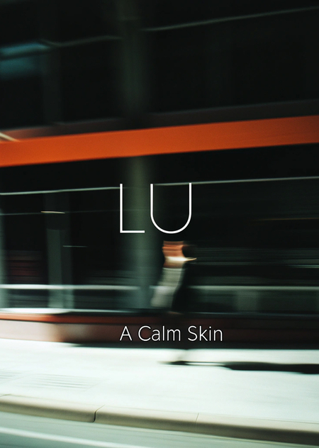
Create a series of premium, minimalist promotional materials—including a large-format billboard and a vertical poster—for the skincare brand «Lu,» utilizing its signature custom typography-only logo. The core visual concept centers on radical simplicity and sensory calm, where the most powerful element is the brand’s elegant black «Lu» wordmark dramatically centered against vast, textured fields of serene, light-toned backdrops. For the billboard, imagine the logo resting on a softly textured surface of light grey linen or finely grained, pale cream stone, bathed in soft, directional natural light that casts a delicate, elongated shadow, creating depth and a palpable sense of tranquility and weightless presence; the only copy is a single, small tagline like «A Calm Skin» set in a matching clean, minimalist typeface below. For the companion poster, employ the same principle of scale and simplicity but focus on tactile intimacy: the logo is placed on a background of subtly textured, warm white matte paper or a close-up of softly folded cream fabric, with the same minimalist typography and a focus on the exquisite materiality and quiet confidence the brand embodies. The color palette is exclusively monochrome, using only shades of black, white, cream, and light grey to evoke purity and sophistication. The overall mood across all assets must be one of understated luxury, silent confidence, and mindful authenticity—striking in its restraint and powerfully cohesive with the brand’s boutique, packaging, and overall serene universe.
Промо-материал
Промо-материал
Были использованы:
- DeepSeek—для написания промптов и коррекции генераций;
- Recraft—для генерации фотографий;
- Adobe Colour—для цветовой палитры бренда;
- WhatTheFont—для определения и распознавания шрифта.


