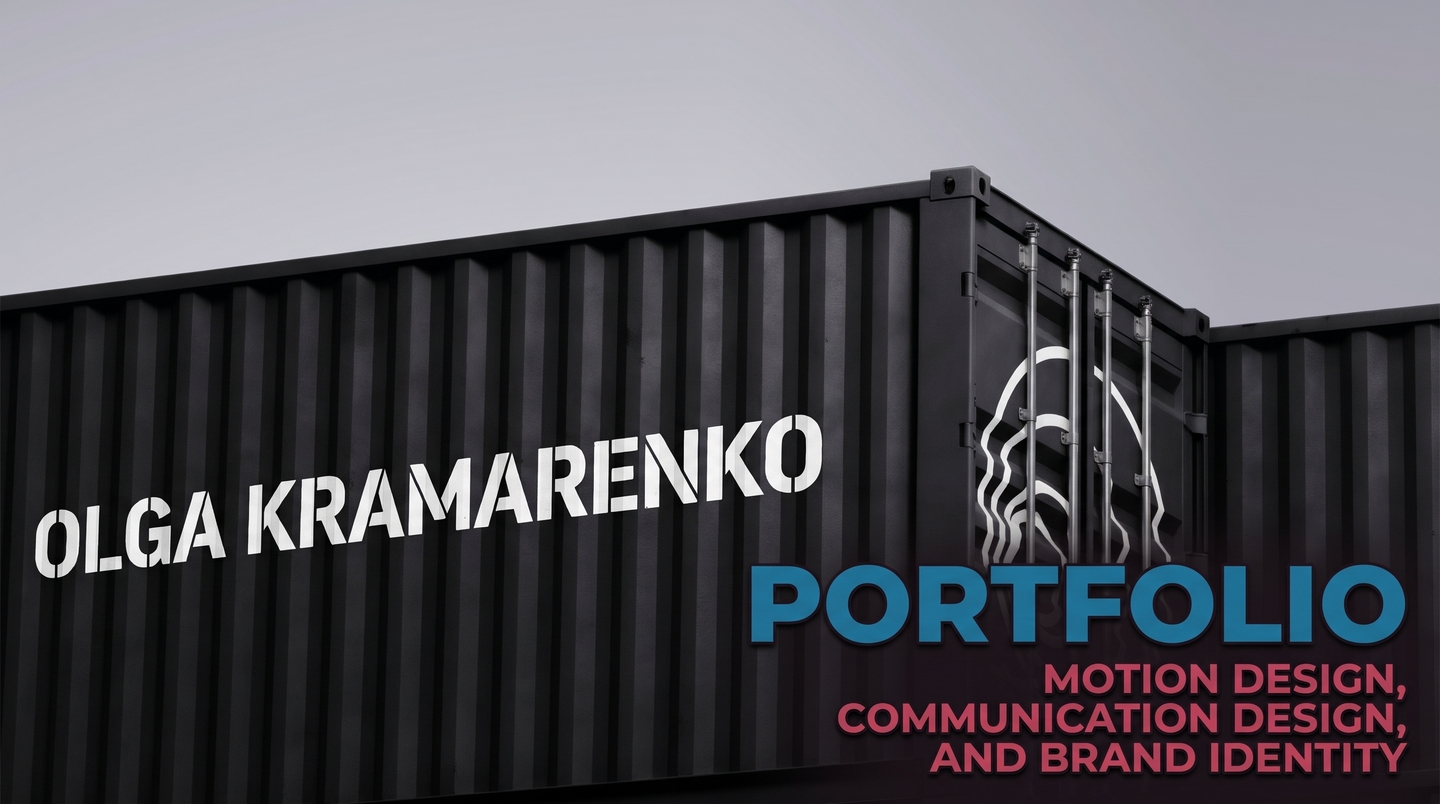
01 / introduction
My name is Olga Kramarenko, I am 21 years old, and I specialize in motion design, communication design, and brand identity at the HSE Art and Design School. I build holistic visual ecosystems where static typography, 3D objects, and motion graphics work as a single language. Instead of isolated visuals, I design structured worlds with their own rules, rhythm, and narrative depth.

narrative guide / the chrono-cube:
«Greetings, traveler. I am the Chrono-Cube, an optical sensor born inside the Paradox space-time factory. I watch how Olga turns invisible matter—decades, cultural codes, and motion—into tangible design systems. Scroll evenly: I will guide you from the threads of time to the spicy streets of Mexico.»
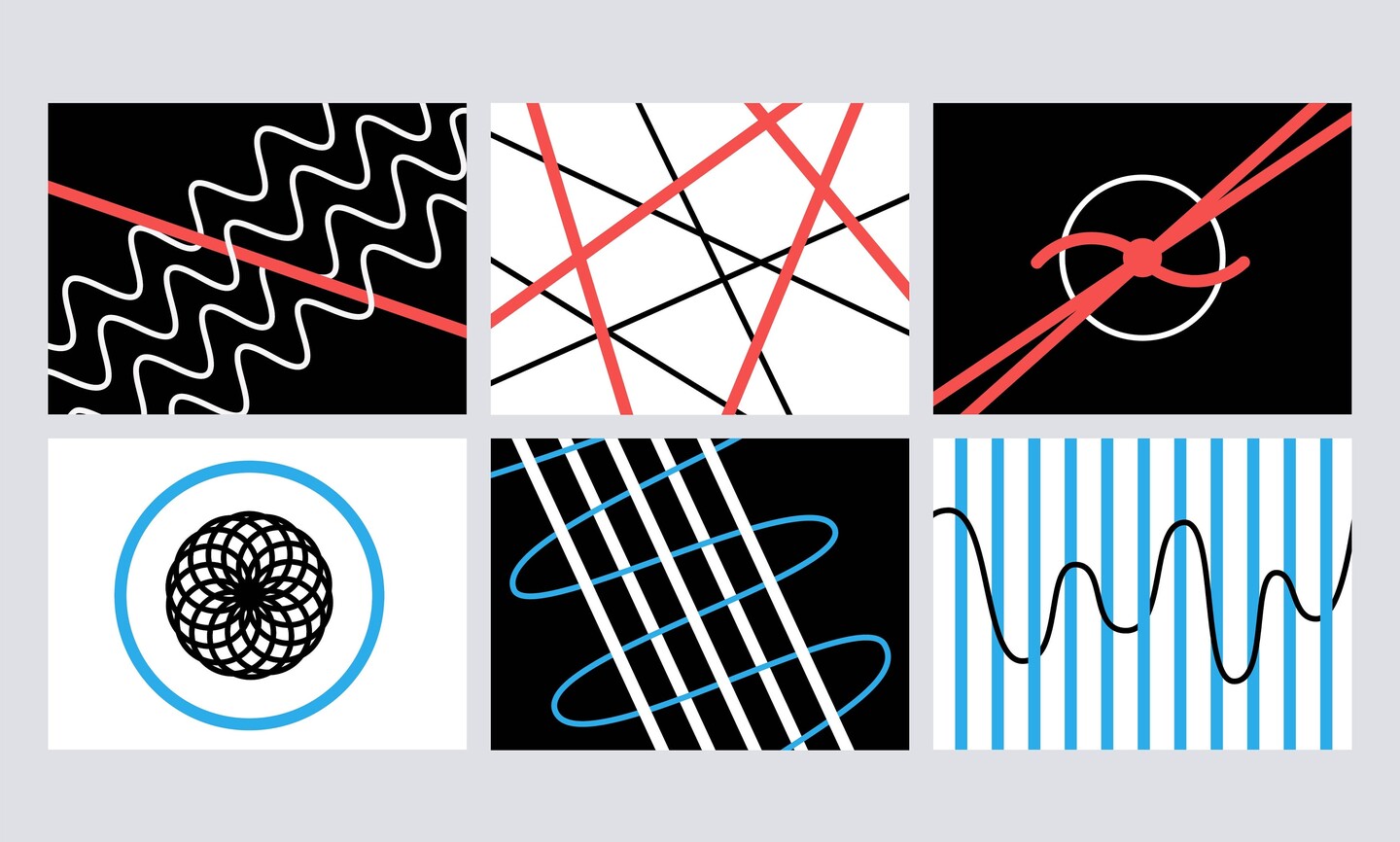
02 / value proposition «Design is the visible rhythm of time: if a system does not move the viewer’s mind, it stands still.»I help brands, cultural institutions, and tech startups overcome visual monotony by uniting identity, editorial systems, and motion design into one cohesive product:motion & 3d graphics brand identity & merch editorial & navigation systems
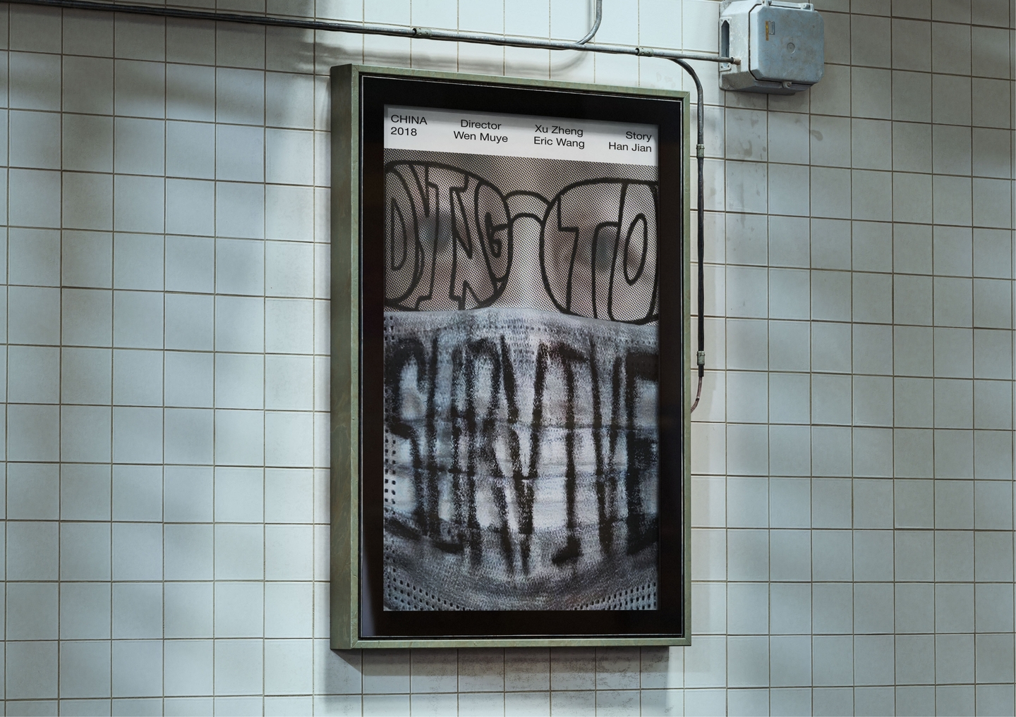
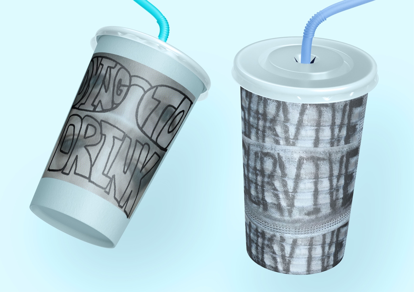
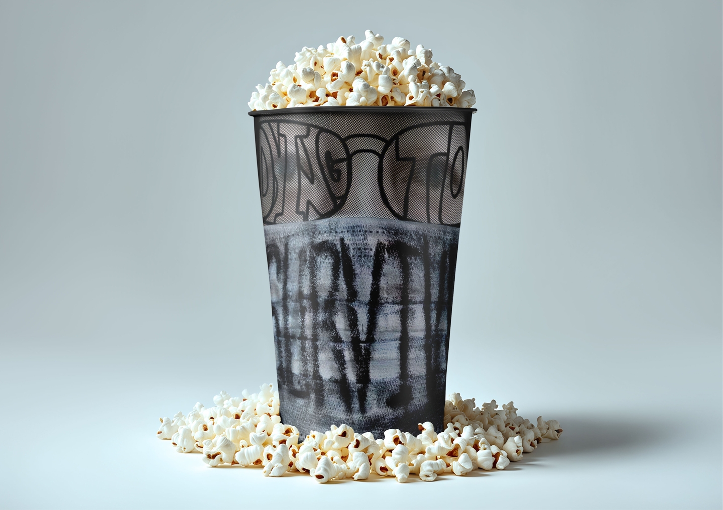
case 01 / paradox space-time factory
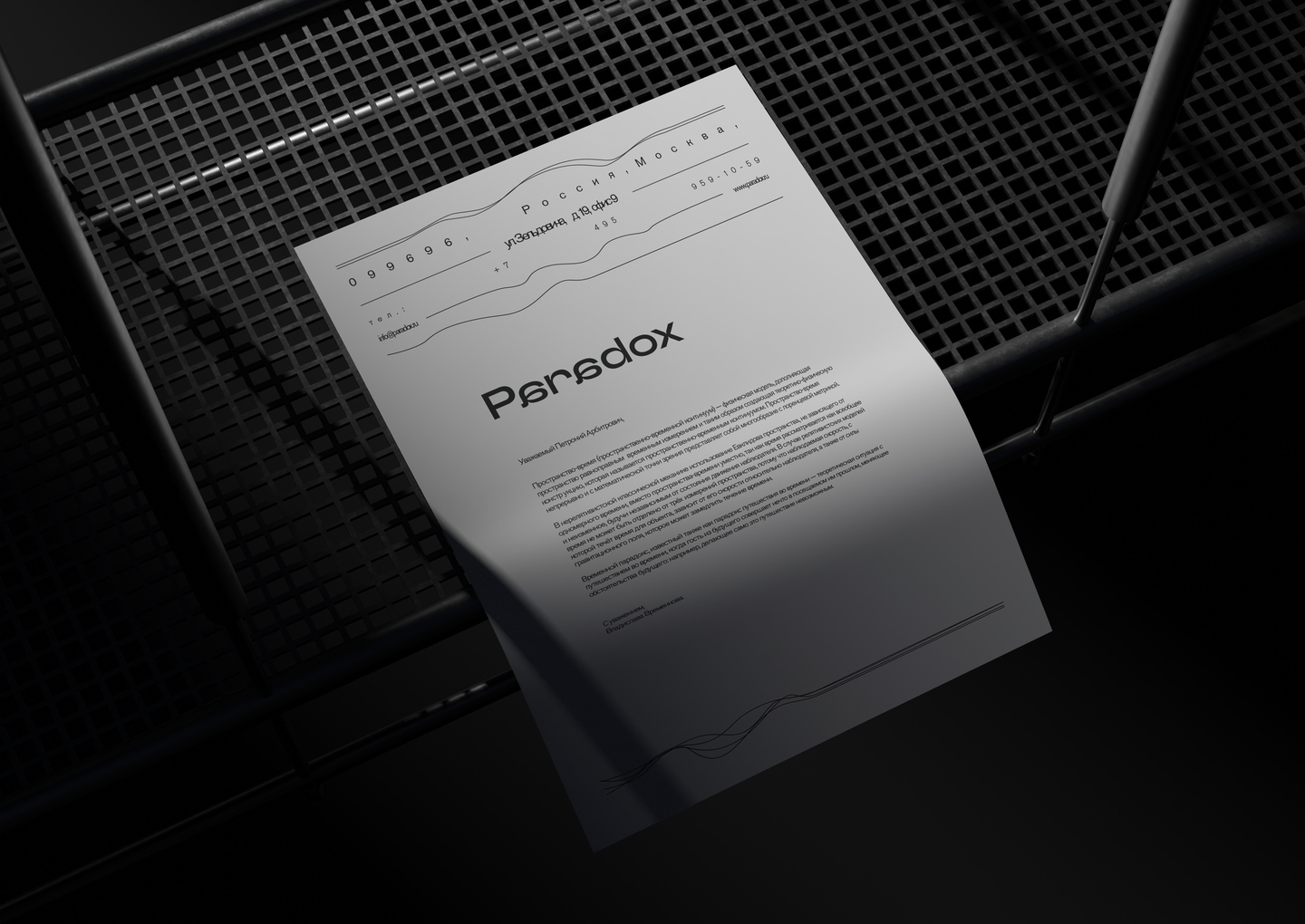
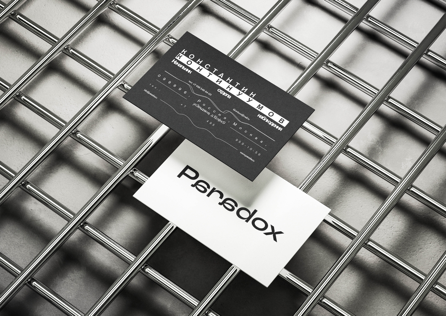
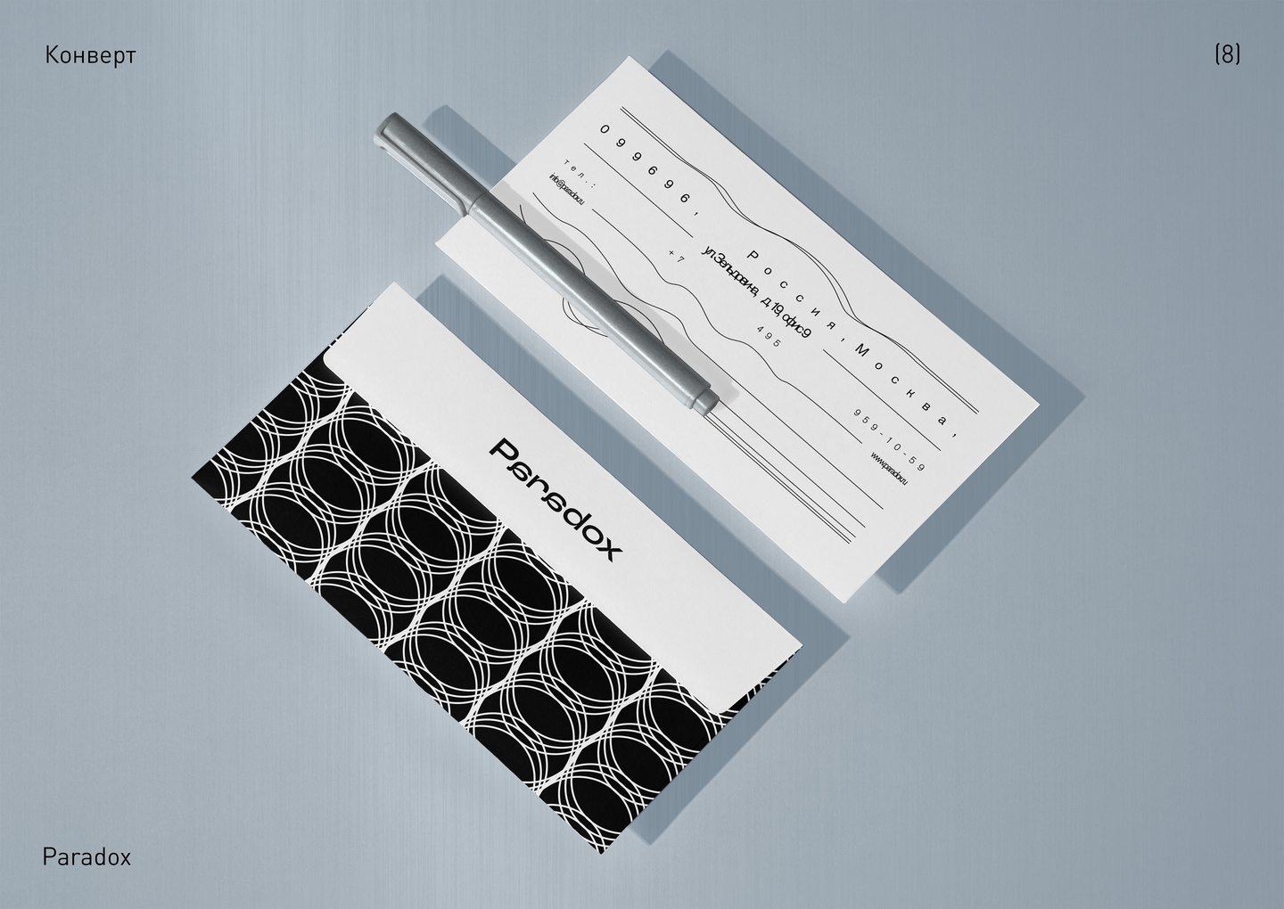
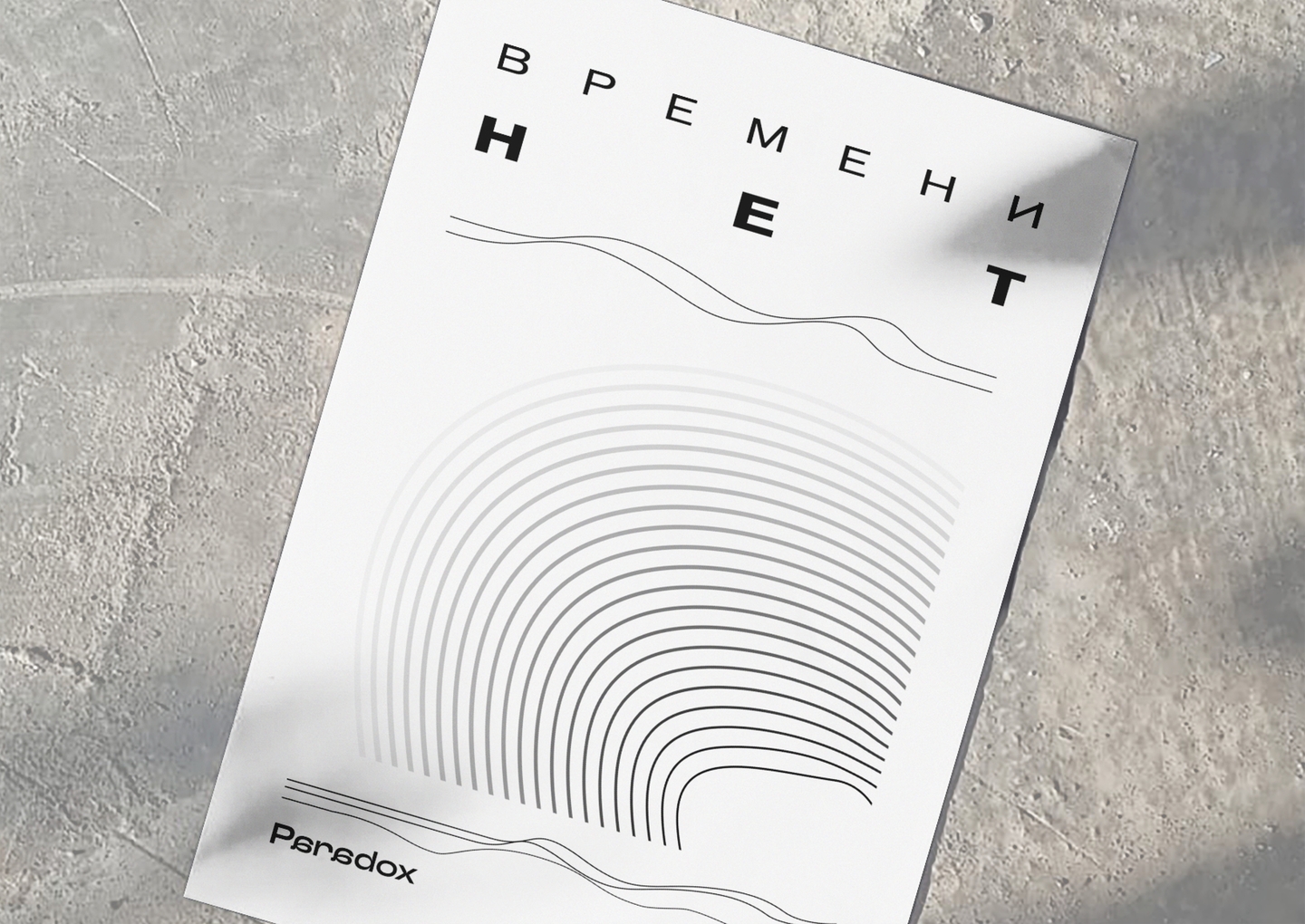
Problem & idea: How do you brand a factory that manufactures something no human can touch—the fabric of space and the direction of time? «Paradox» controls every stage of this continuum: from matter-distortion sensors and grains of time to threads holding years, strings containing centuries, and ropes embodying entire eras.
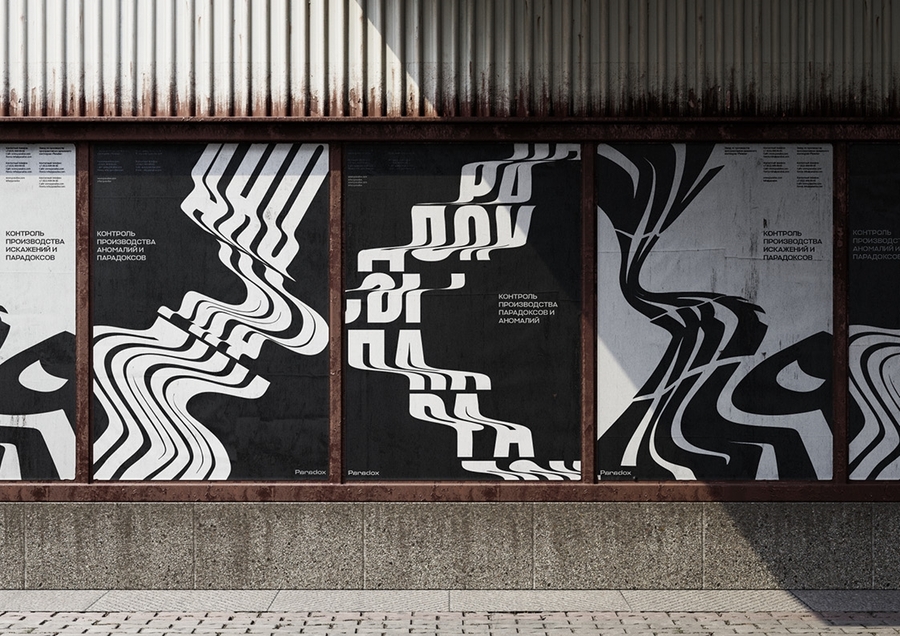
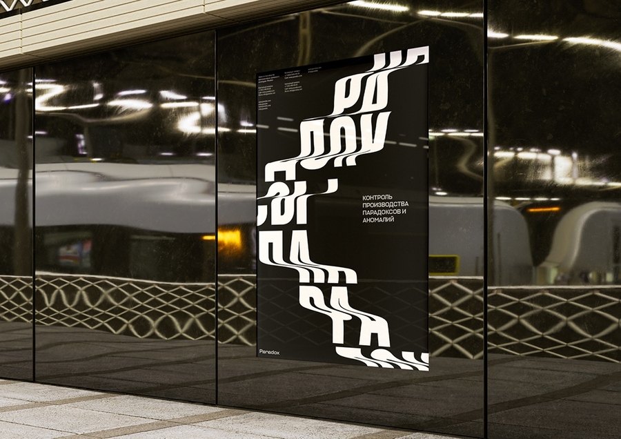
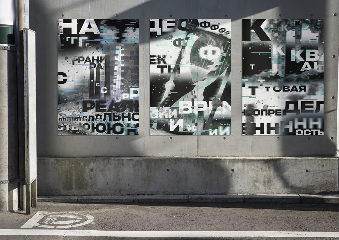
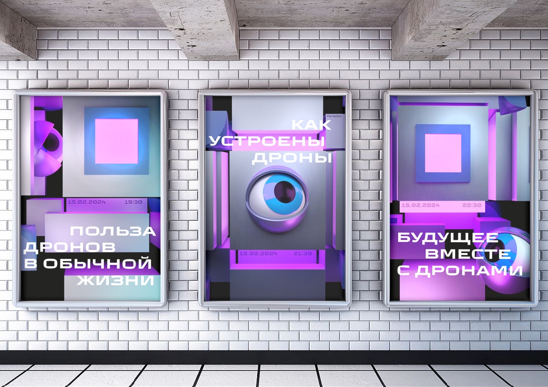
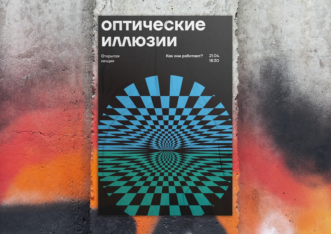
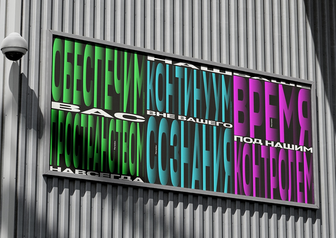
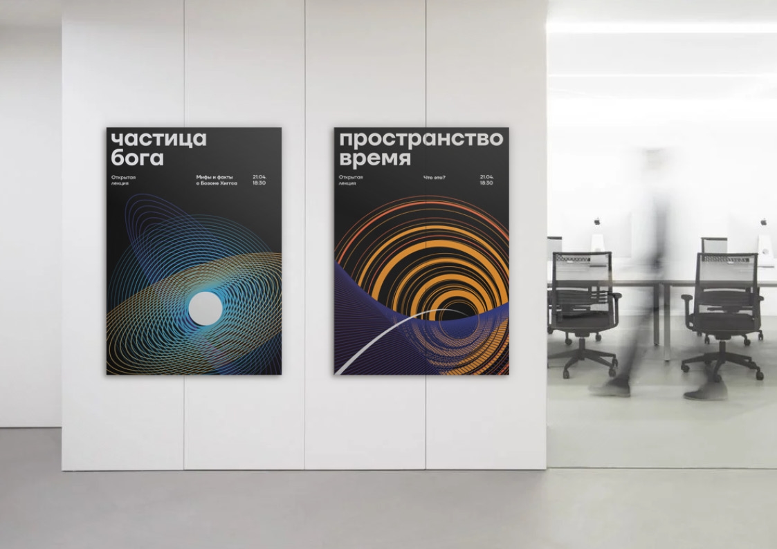
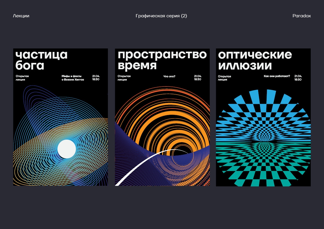
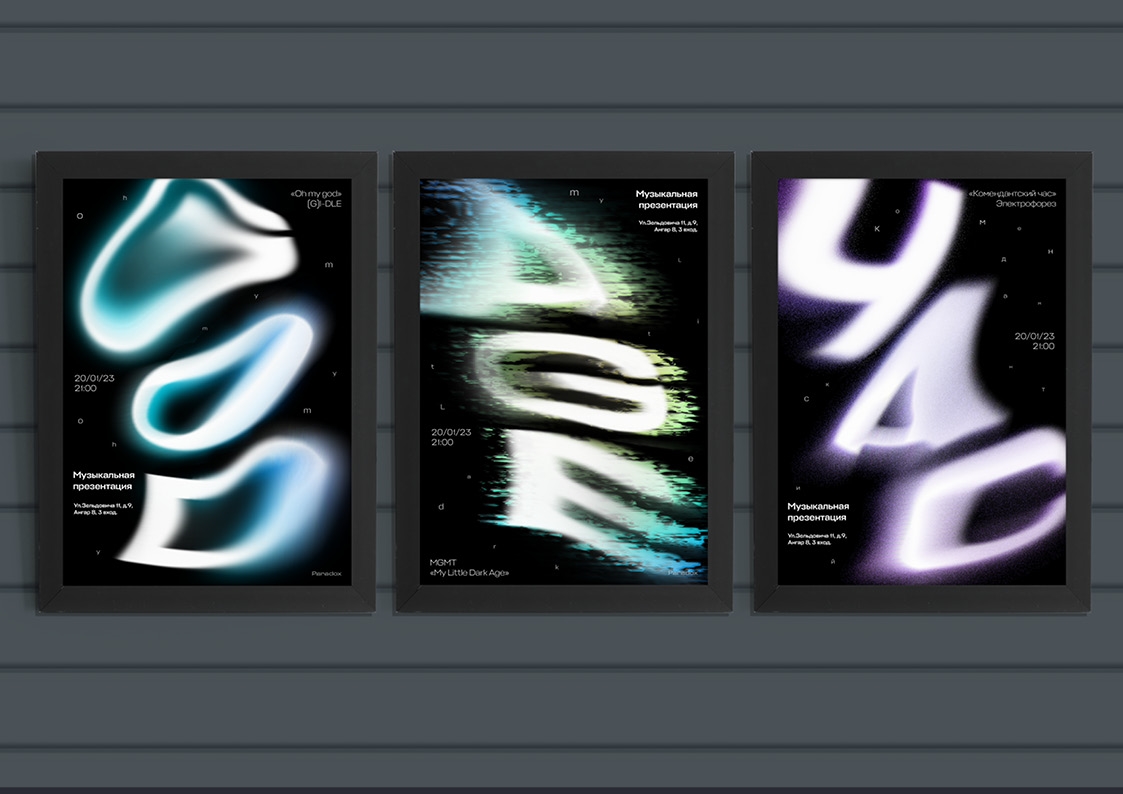
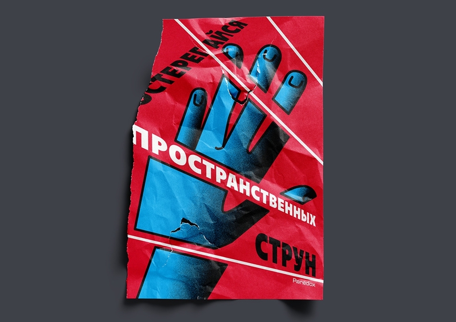
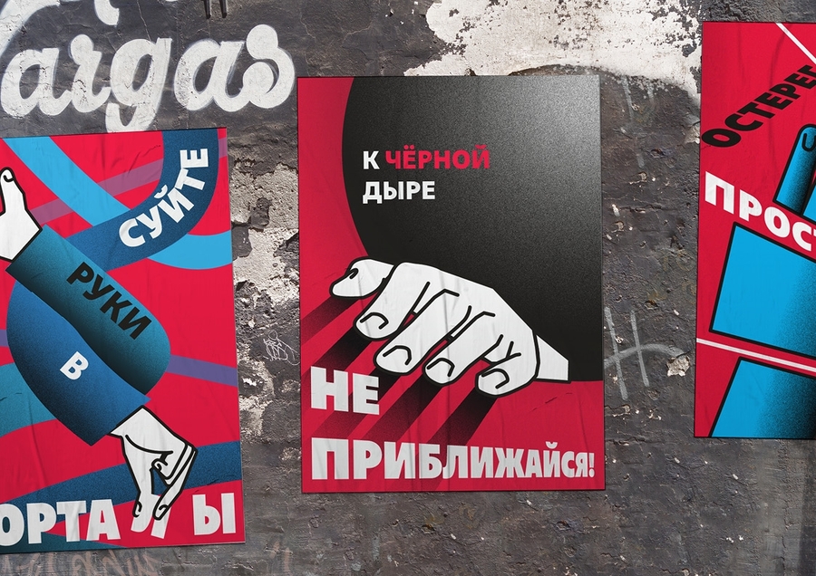
Solution & result: To make space-time visible, I combined fluid kinetic typography, optical illusions, and constructivist warning posters («Do not put your hands into portals») with a 3D robotic observer cube. The contrast between glowing cyan waves and sharp red hazard graphics creates a living industrial identity across print and motion media.
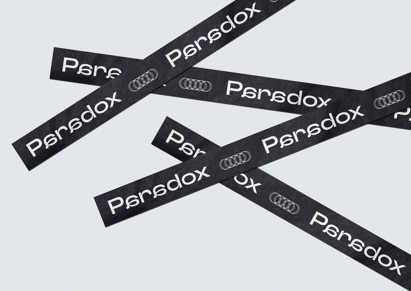
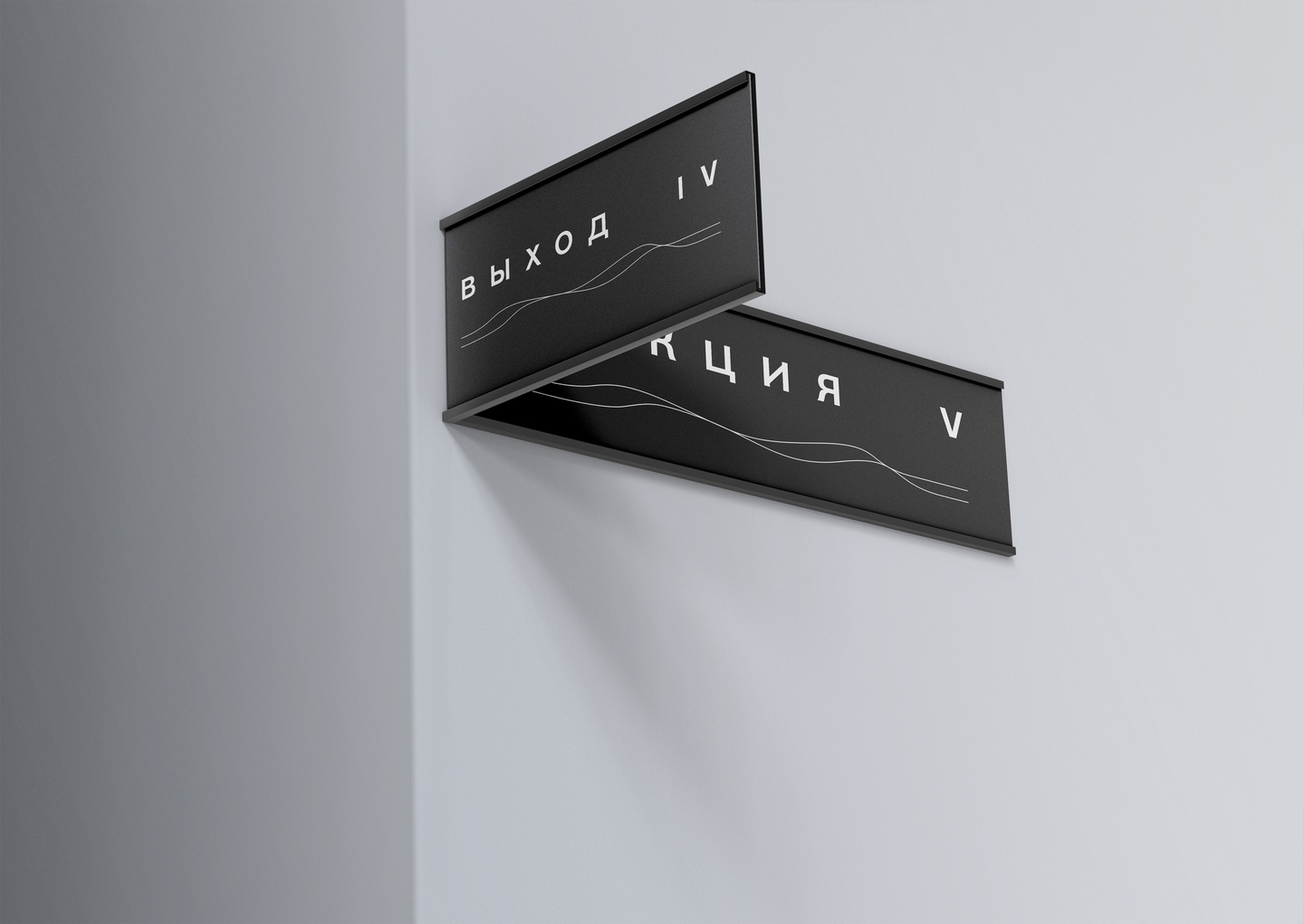
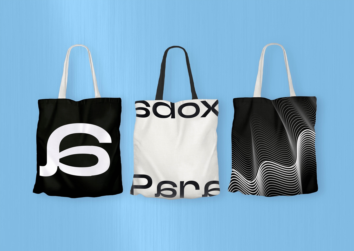

case 02 / paradox: point of no return
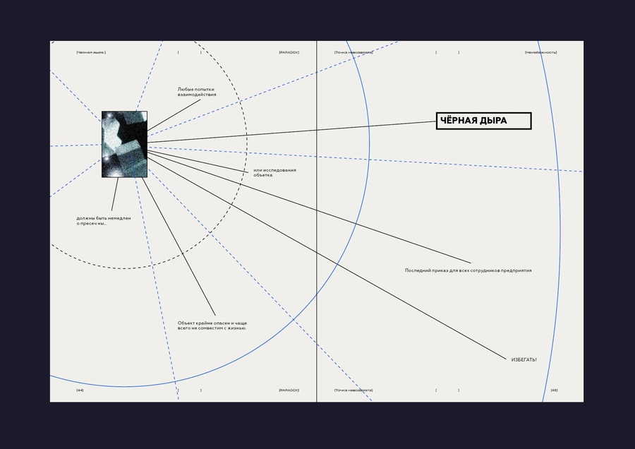
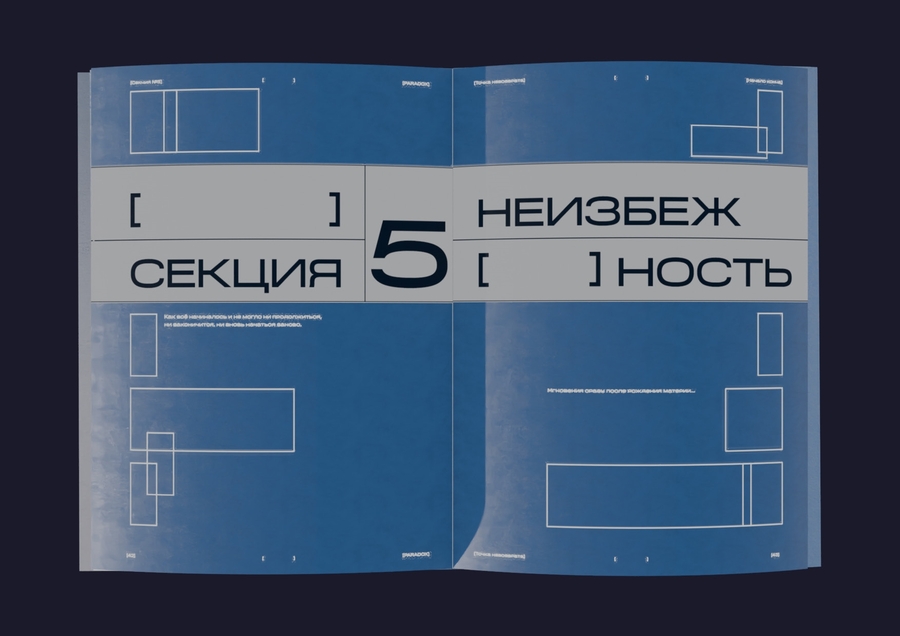
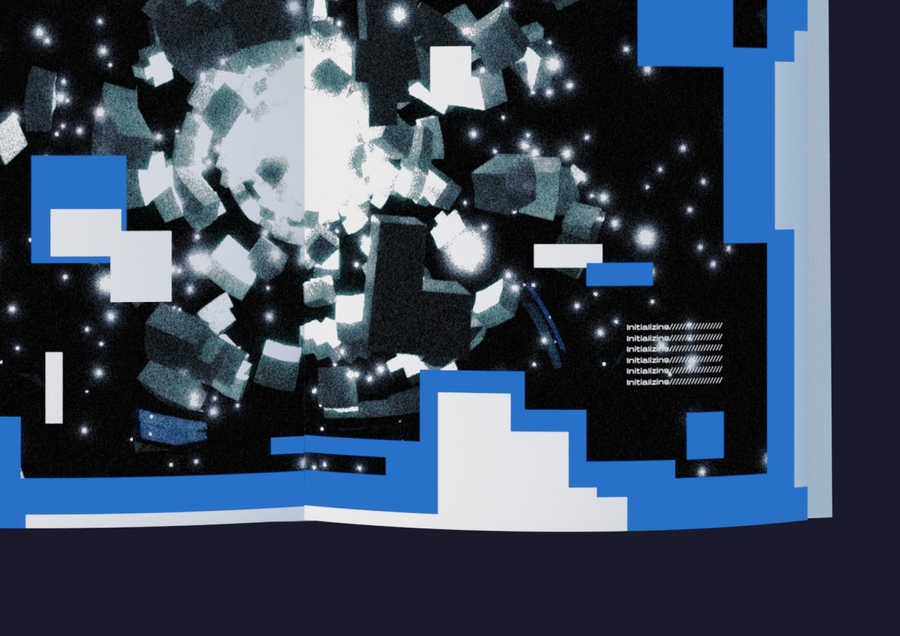
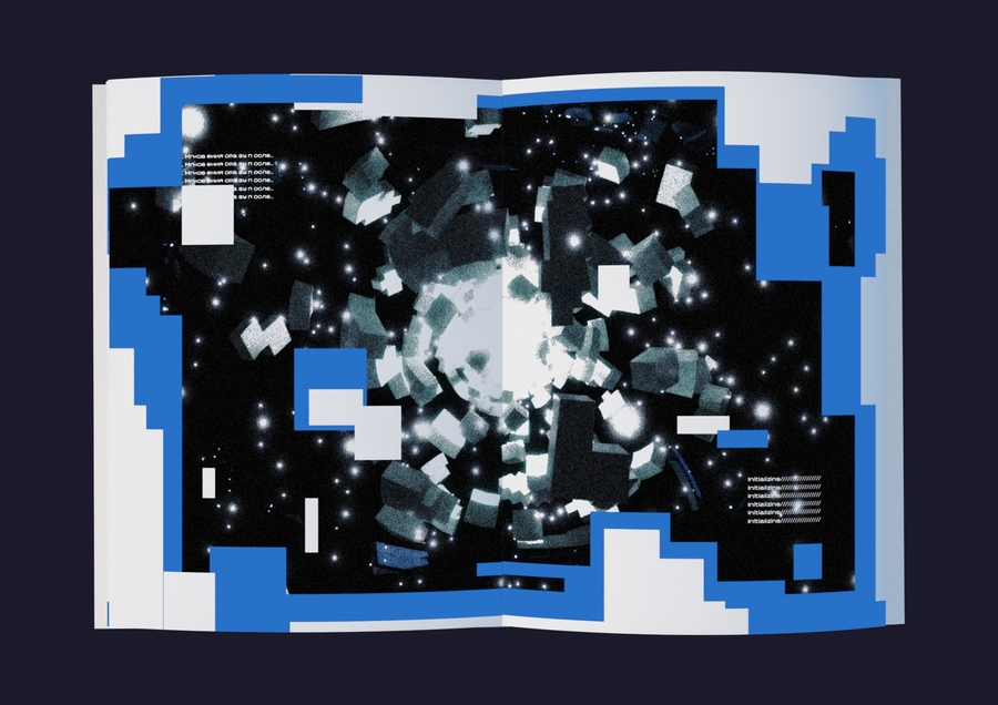
Problem & idea: The scientific-production plant «PARADOX» was born from secret knowledge and extra-spatial matter, transformed by scientists into a building where unexpected mutations began generating spaces beyond human comprehension. The design challenge was to document this complex system in a multi-page editorial format.
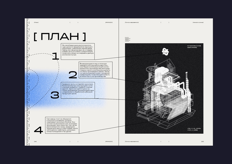
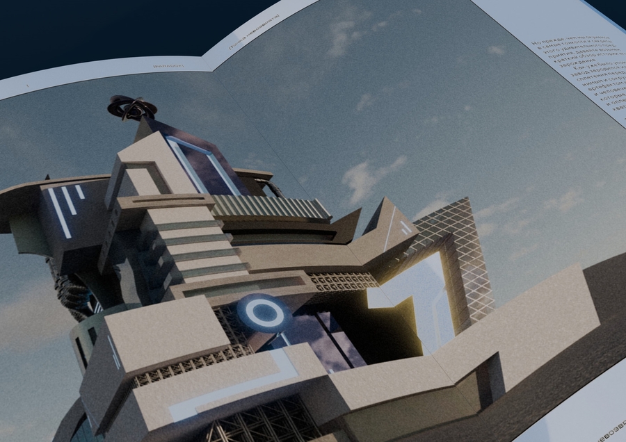
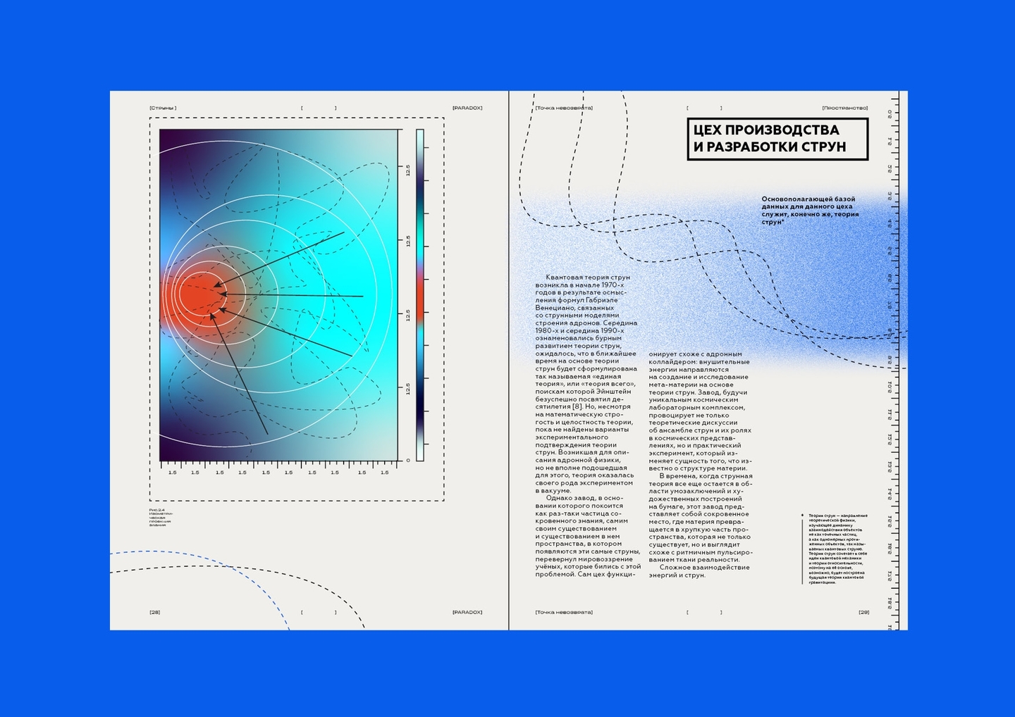
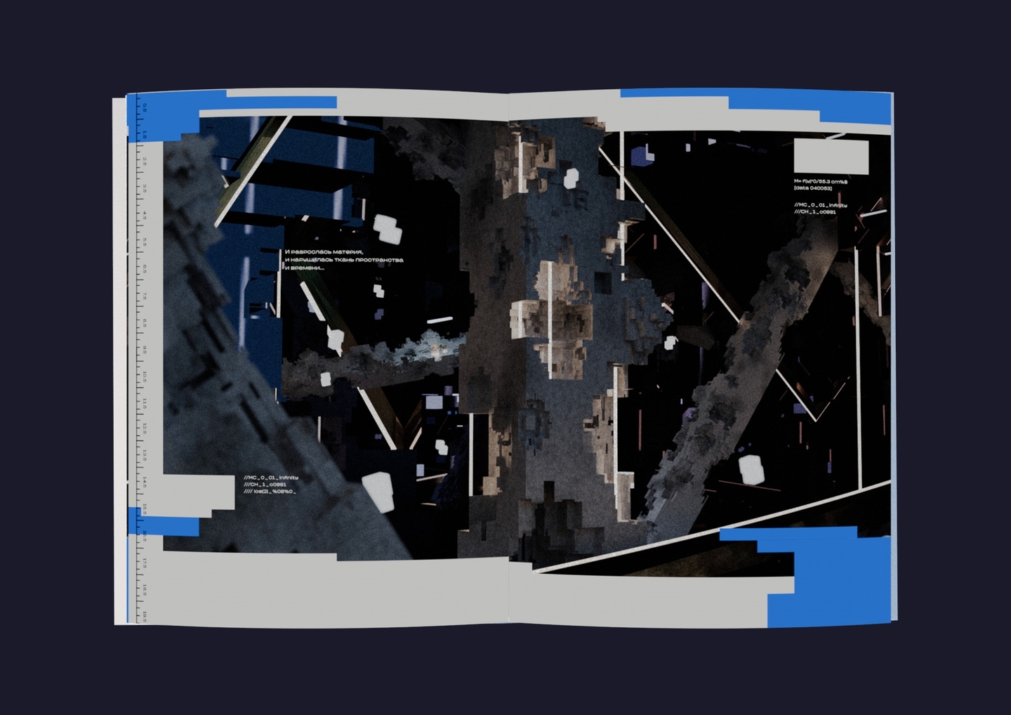
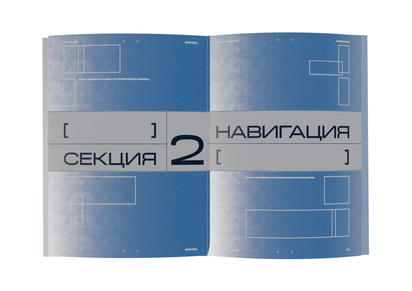
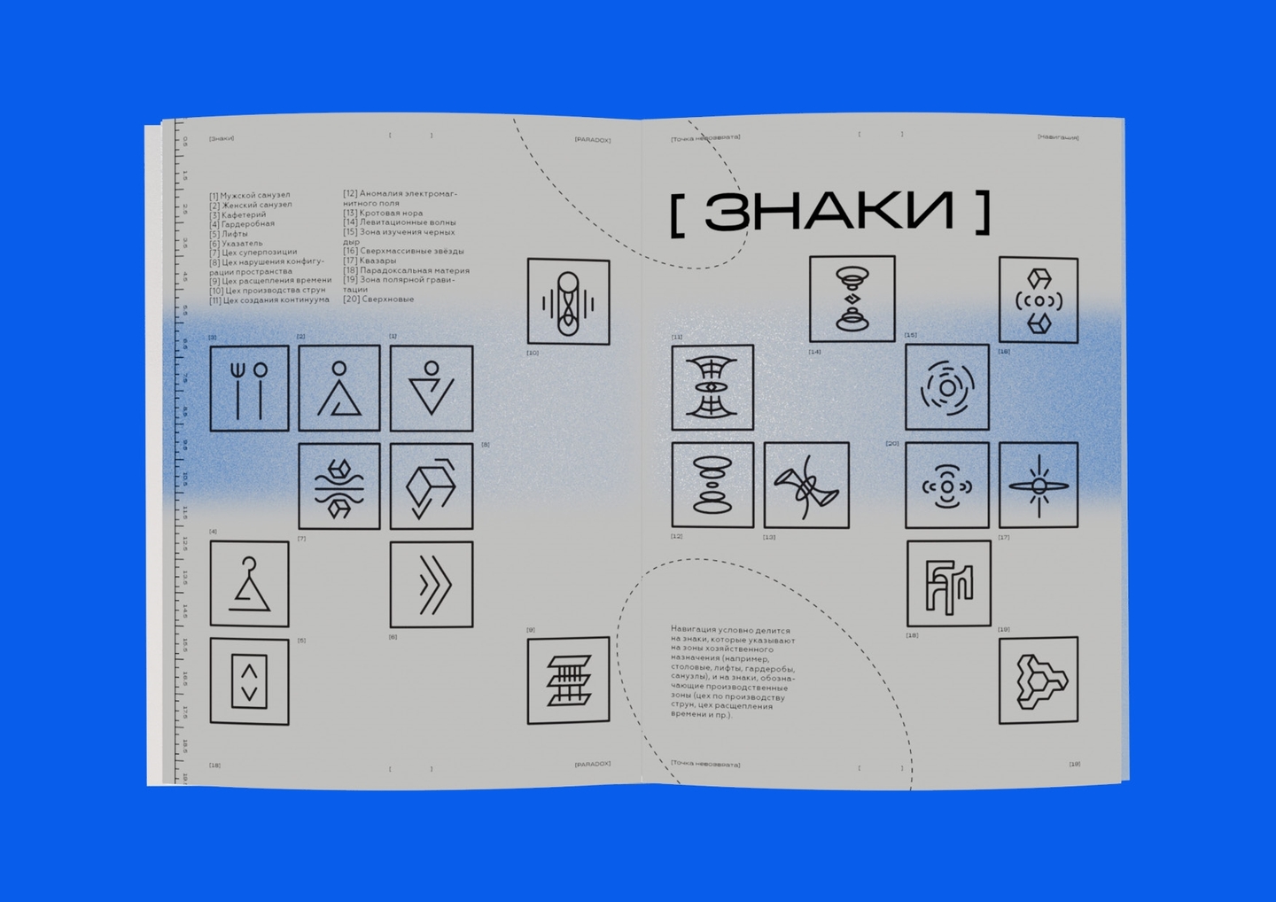
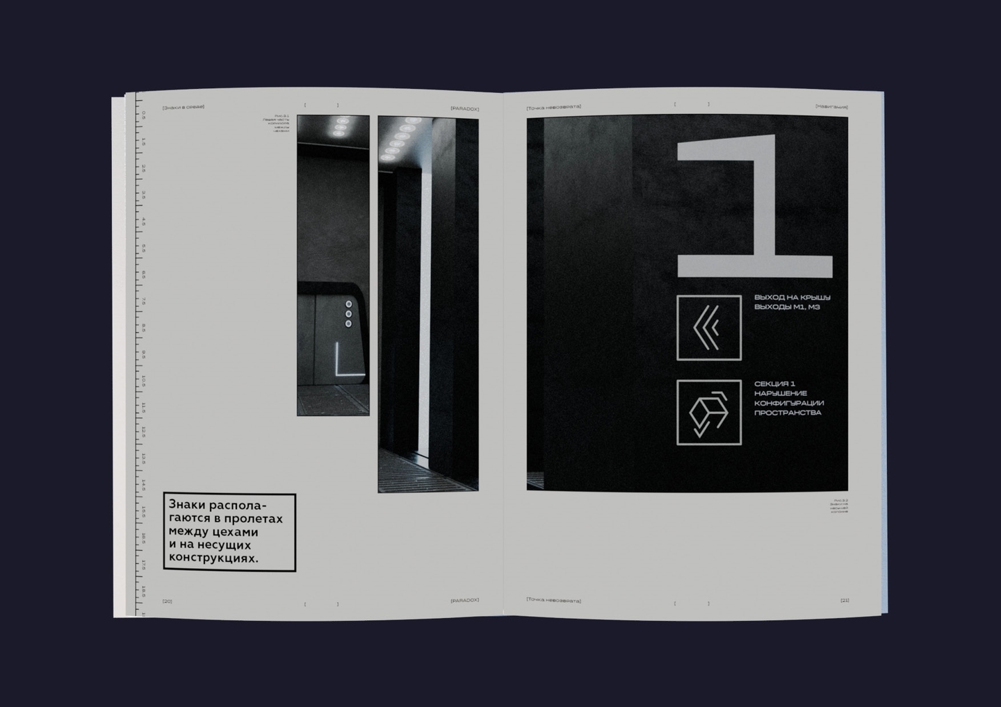
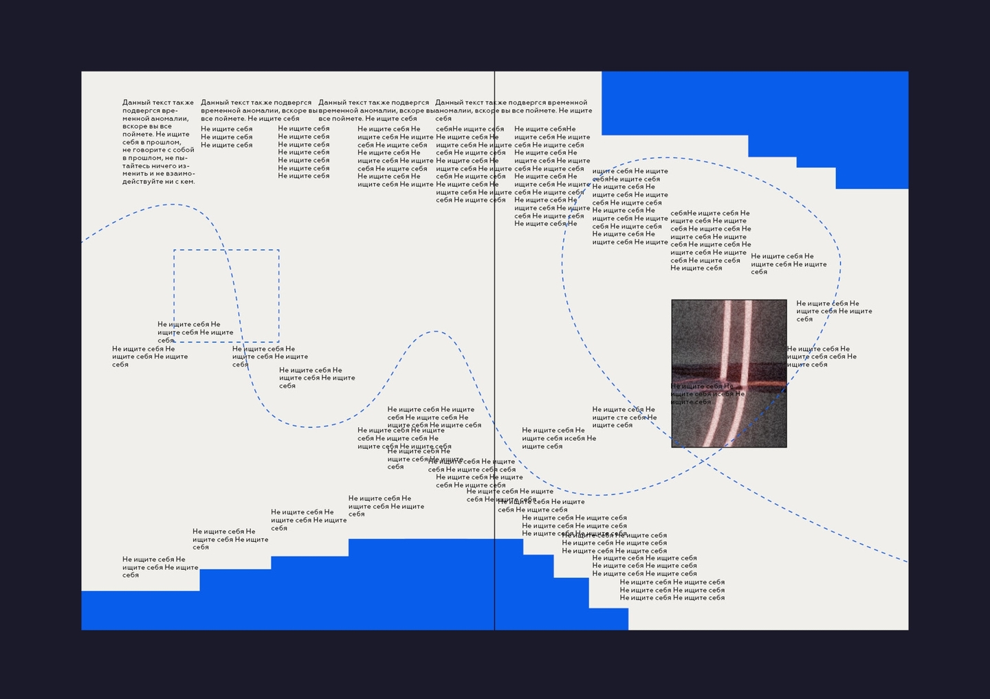
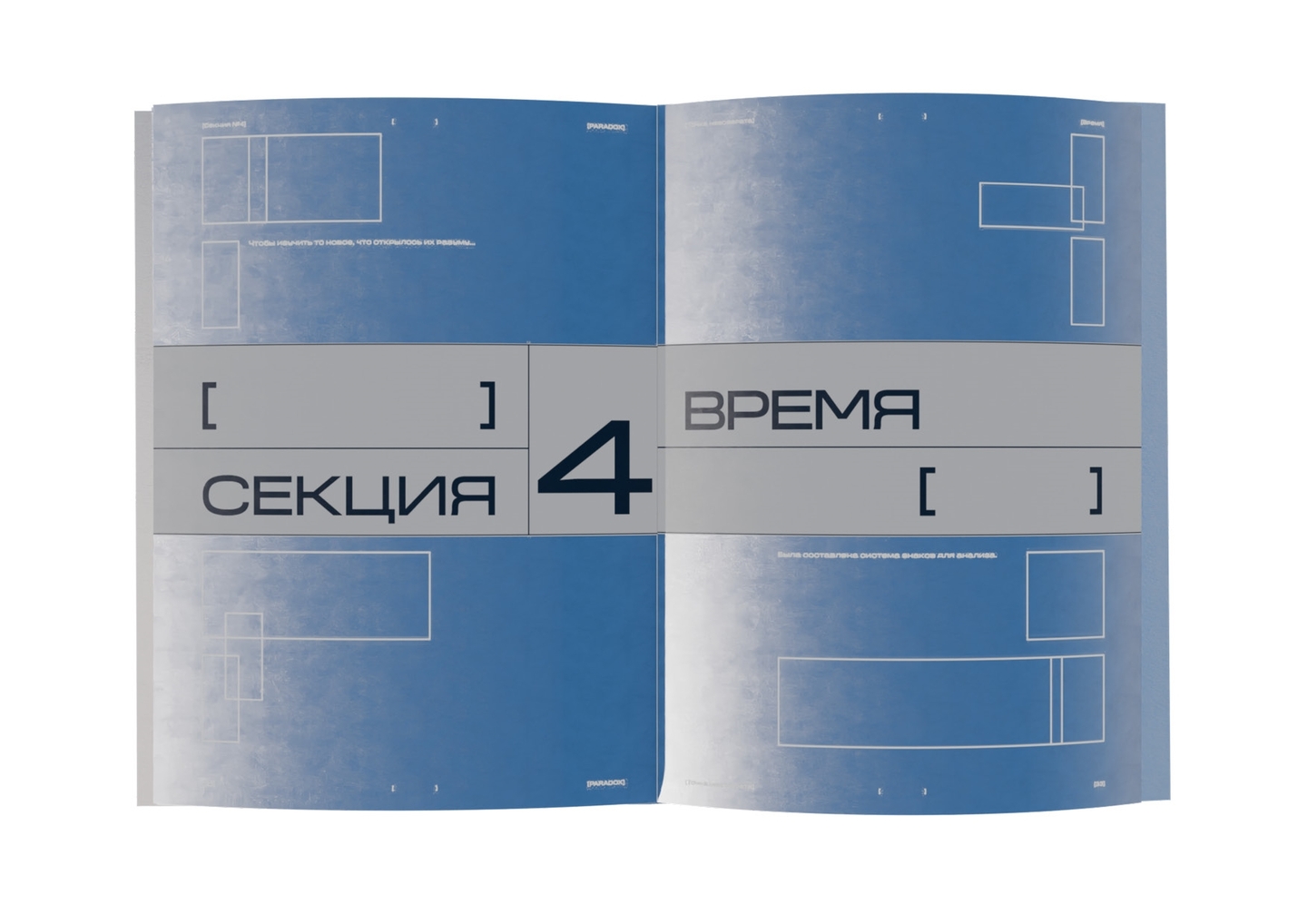
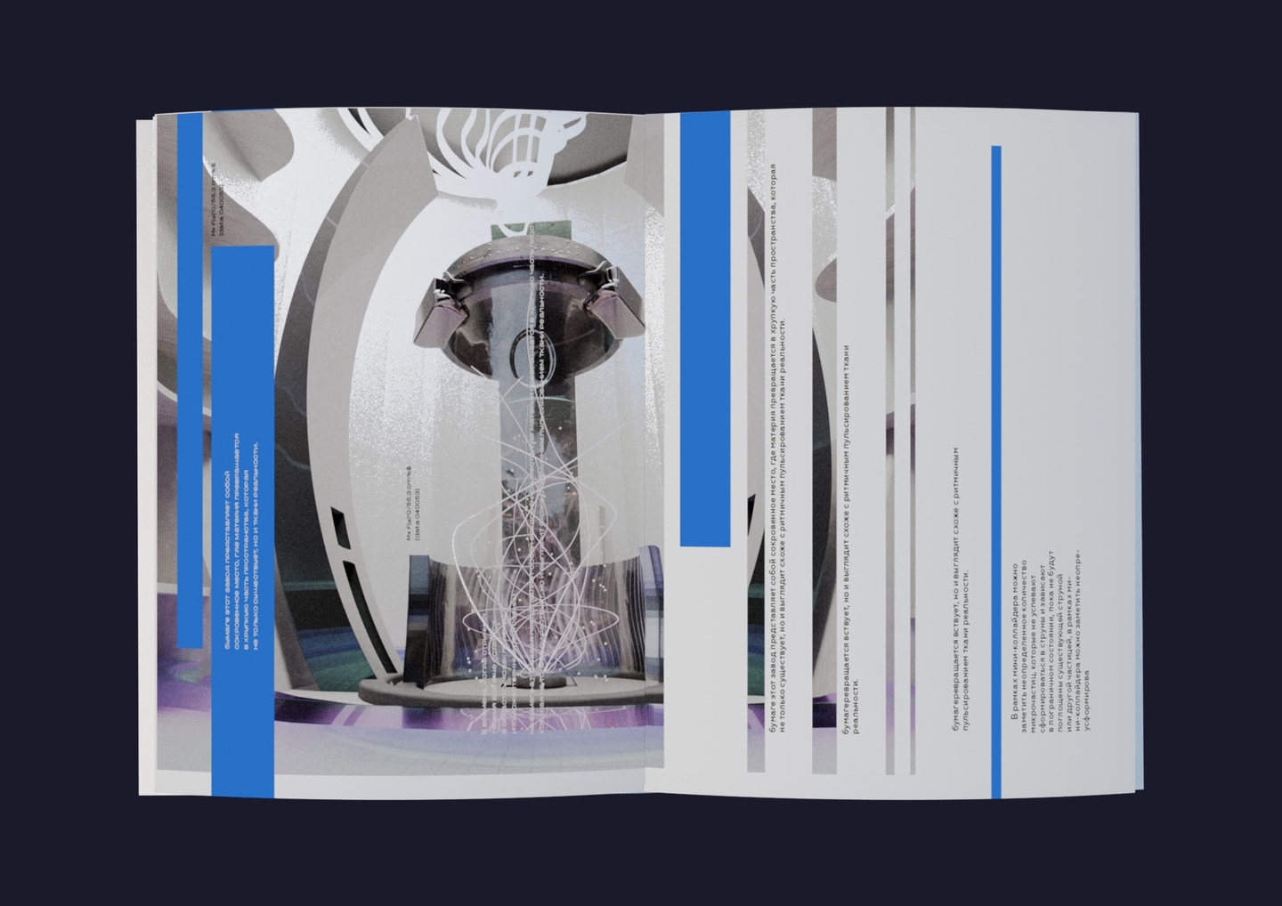
Solution & result: Using the bracket symbol [.] and dashed orbital trajectories as a structural code, I designed a 5-section research book (Beginning of the End, Navigation, Space, Time, Inevitability). Blueprint grids, custom sign systems, and 3D architectural renders guide the reader through an impossible spatial anomaly without losing clarity.
case 03 / cycle: museum of time
Problem, idea & solution: How do you show that history is thrilling and time is about much more than just clocks? For the sci-tech Museum of Time «Cycle»—housing over 10,000 real and fictional timepieces alongside lectures and debates—I built a dynamic linear grid where the letters Ц-И-К-Л intersect like clock hands and temporal axes.