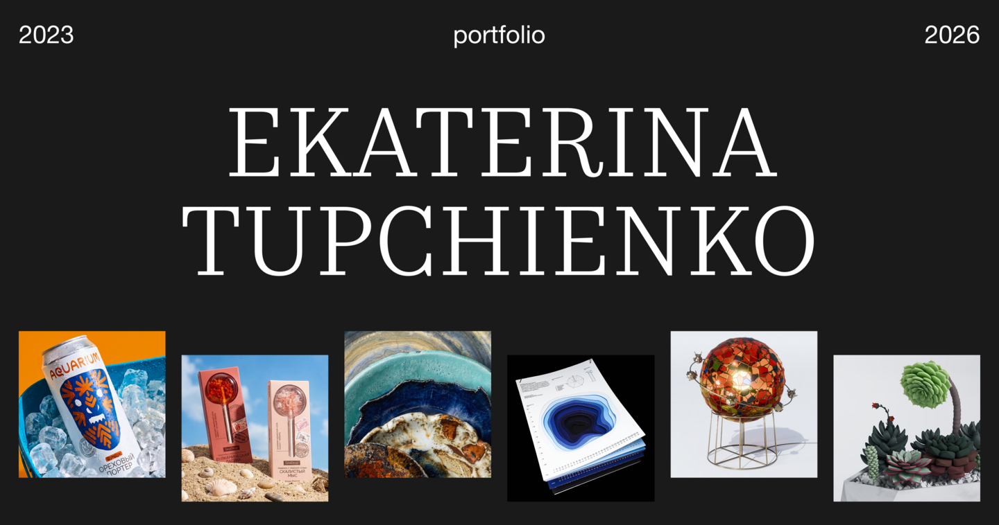
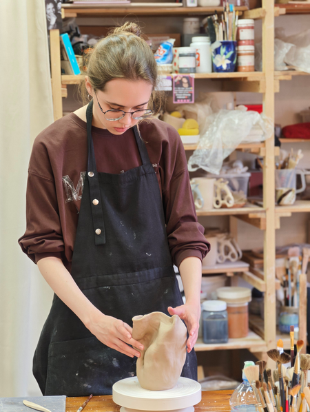
My name is Ekaterina Tupchienko. I’m a communication designer working in branding, packaging and object design.
Every project starts with a question: what is this really about, beyond the brief? I look for the answer in the material, in local history, in craft. Most often it comes from comparison — two things that seem unrelated but share the same logic. A planet and a plate. A coastline and a postcard. A calendar and a descent. Once that logic is found, everything else follows: how the object looks, how it’s made, and why it should exist — and the project becomes a system where every part carries the same idea.An idea holds when it’s built on something real.I often find inspiration outside design itself — in nature, in art, in history, in craft, in music. A coastline, an old mask, a planet’s surface, the structure of a melody: these are the things I start from. I look for the logic inside them, and then build the whole project around it.
How the work gets done
1. Research and brief. What is needed — the format, the client, the limits, the material.2. Ask. What is this really about, beyond the brief?3. Compare. Two things that seem unrelated but share the same logic — that’s where the concept might come from.4. Build. Sketches, 3D, tests. I turn the logic into form: the object, the material, the name, the brand.5. Check. Every part has to carry the idea.6. Final. Visuals, layout, presentation — the project finished and shown.By the end, nothing in the project should feel accidental — each part is there because the idea needed it. The project has to carry the idea itself, not a caption explaining it.
The projects below are grouped by what the comparison starts from — nature, art, place and history, and game. Each project shows the brief/the problem, the question, the insight, and the result. Research, sketches and tests stay behind the scenes.
Selected projects
When nature becomes an object
Cosmos in Texture: what if a planet could fit on your plate?
Space in the interior usually looks the same: glowing planet lamps for kids, or flat prints and stickers. Even in ceramics, planets are just painted with glaze on smooth plates. But planets aren’t flat. They have size, weight and a surface. Mars is rough. Saturn is pearlescent. Venus is dense, matte, wrapped in clouds.The idea came from a simple observation: a stack of plates standing one on top of another looks like planets lined up in space.The collection turns that difference into the main idea: eight plates, eight planets. No drawings — only size and texture.
Each plate is hand-moulded from dense pottery clay. The textures — craters, bands, waves — are modelled by hand, then covered with glossy, matte and pearlescent glazes. After double firing, every plate is checked against the planetary reference: texture, scale, colour. Then it gets a number and a certificate of authenticity.
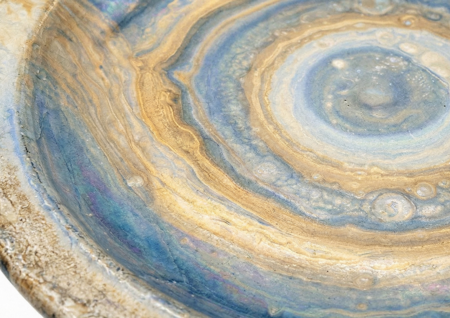
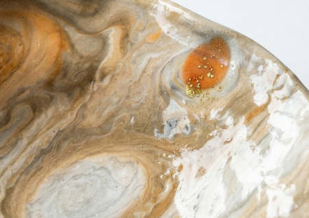
A planet is no longer flat — it has its own size and texture. The planets become everyday objects, and the solar system becomes part of the table.
*The plates shown are visualisations. This is a concept project: the images are renderings, and the production method is attached to each piece
Mariana Trench: a year, measured in depth
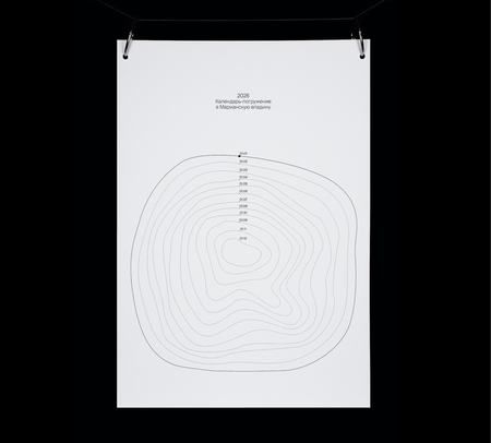
The calendar is dedicated to 150 years since the Challenger expedition discovered the Mariana Trench and started modern oceanography. It turns the year into a descent: every month takes you one level lower, with its own depth, pressure and life. January starts at the surface, and December brings you to the deepest point.Each page combines the days of the month with information about the level you’re at, so the calendar works as a deep-sea adventure.
The year stops being just a grid of dates — it becomes a journey, and you live through the descent month by month.
*The calendar is available for purchase and can be produced as a custom print run
When art becomes an object
Stained Glass Symphony: a universe of symbols, light as a story