Communication theory in design
Throughout the theoretical components of this course, a fundamental insight crystallized: narrative-driven visual strategy constitutes the core mechanism of effective design communication. Initially, communication appeared to function as straightforward information transmission—a one-directional flow of content from sender to receiver. However, engagement with course materials revealed a more sophisticated reality: communication operates fundamentally as meaning construction. The sender’s role transcends simple information delivery. Instead, senders function as architects of interpretive worlds, deliberately constructing experiential spaces through symbolic systems—both linguistic and visual. These constructed worlds subsequently undergo interpretation and sense-making through receivers' unique contextual frameworks, personal experiences, and cultural backgrounds. The meaning emerges not from sender intention alone but from the intersection between encoded message and receiver’s decoding process. As communication theorist Em Griffin (2009) articulates in her comprehensive examination of communication models, the transmission model—which positions communication as linear information flow—represents only one limited framework among numerous theoretical approaches. Griffin’s typology reveals how different theoretical traditions conceptualize communication fundamentally differently: as social process, as meaning-making activity, as power negotiation, as cultural reproduction. This theoretical pluralism indicates that communication cannot be reduced to simple sender-receiver models; rather, it operates through complex social, cultural, and semiotic processes.

Presentation for general audience
Who we are?
MilkPro is made for people like you—people who train hard, care about nutrition, but don’t have time for complicated fitness culture or expensive supplements. We’re not a gym fantasy or a status symbol. We’re the real thing: quality protein that actually works, honest ingredients, convenient format, fair price. We started because we got tired of choosing between expensive premium imports and cheap mass-market options that don’t deliver. So we built MilkPro: professional-grade nutrition that fits into your actual life, designed by people who understand what it’s like to balance training with a packed schedule. No marketing hype. No hidden agenda. Just protein that supports your goals without demanding extra complexity.
Who the brand is for?
— Age: 18-28 years — Income: Middle to upper-middle class — Behavior: Regular gym attendance (3-5 times weekly), fitness-tracking, social media active — Motivation: Performance optimization, body composition management, energy maintenance — Media consumption: YouTube fitness channels, Instagram fitness accounts, fitness community platforms — Decision-making: Information-intensive, values peer recommendations and community validation — Price sensitivity: Moderate; willing to pay premium for authentic fitness products
In the framework of communication theory applied to MilkPro, the audience is treated as an integral part of the communicative situation, not as an external add‑on: the meanings our brand generates always emerge in relation to specific social and cultural contexts in which people encounter MilkPro.
Why choose us?
MilkPro is the only Russian RTD protein beverage combining professional-grade nutrition with accessible pricing and mass-market distribution. Our product is the ready-to-drink protein beverage for active, health-conscious people who refuse to compromise between quality nutrition and convenience. Unlike expensive premium imports targeting elite athletes, or mass-market beverages that sacrifice nutrition for taste, MilkPro delivers accessible premium-quality supplementation seamlessly integrated into everyday active lifestyle.
When you buy a bottle of MilkPro, you are guaranteed to receive: — Confidence in pursuing personal fitness goals — Sense of empowerment and control over health — Community belonging (joining fitness-aware demographic) — Modern, sophisticated approach to wellness — Self-care integration into daily routine
Brand message
Your move. Your time. Your MilkPro. We’re not here to transform you into someone else or promise miracles in a bottle. We’re here to support the choices you’ve already made—to fuel your training, power your day, keep you consistent when life gets chaotic. MilkPro is 30 grams of protein, zero excuses, one thousand possibilities: recovery after your morning gym session, energy for your afternoon meeting, fuel for your weekend run. We don’t complicate nutrition or gatekeep quality behind premium prices. We make professional-grade supplementation accessible because commitment to health shouldn’t demand sacrifice or complexity. Trust the process. Trust the product. Trust yourself. This is your energy. This is your choice.
This is MilkPro.
Presentation for professional audience
MilkPro communicates through deliberate semiotic architecture where every visual element functions as meaningful sign within interconnected system:
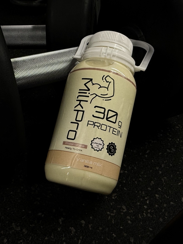
— Bottle Form (Kettlebell Reference): Iconic association with strength and disciplined training; indexes direct connection to fitness practice; symbolizes commitment and professional rigor through geometric restraint
— Minimalist Aesthetic: Symbolizes contemporary premium positioning, confidence in product quality, rejection of marketing excess; indexes scarcity and abundance simultaneously (minimal visual elements indicate abundant resources devoted to quality control)
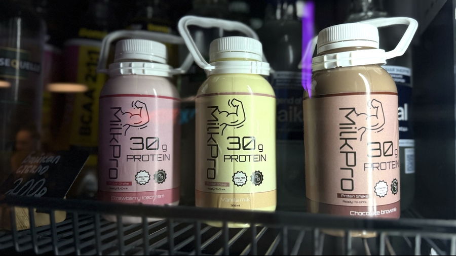
Flavor-specific color palettes (vanilla: neutral creams, chocolate: warm browns, strawberry: berry tones) create rapid shelf identification while maintaining premium aesthetic consistency. Unlike competitor approaches using brand-primary colors across all variants, MilkPro’s system allows each flavor individual expression while maintaining visual coherence.
— Flavor-Differentiated Colors: Vanilla (neutral comfort/universality), Chocolate (richness/indulgence), Strawberry (vitality/freshness) operate as cultural codes enabling rapid flavor recognition through learned color-flavor associations
— Information Hierarchy: Primary facts (30g protein, zero sugar) positioned as signs of efficacy and professional-grade standards; absence of exaggerated claims symbolizes honesty and respect for consumer intelligence
Sociocultural layer (Craig/Griffin)
From the sociocultural tradition, communication is seen as the production and reproduction of social reality: everyday interactions, habits, and language construct what feels «normal» in food and fitness culture. Applied to MilkPro, this means:
MilkPro participates in constructing the norm that ready‑to‑drink protein is a routine part of an active urban lifestyle (gym → fridge → grab‑and‑go bottle as a taken‑for‑granted practice).
The brand’s minimalist visual language, flavor coding, and distribution in fitness clubs and premium supermarkets help naturalize a specific image of the «good» consumer: health‑conscious, time‑poor, design‑literate, and comfortable with functional foods.
In Griffin’s terms, MilkPro exemplifies how communicative practices (packaging, shelf presence, social media content) enact shared cultural scripts about self‑care, productivity, and «smart» consumption rather than just sending neutral information about nutrients.
So in the sociocultural frame, MilkPro is not just describing a lifestyle—it helps enact and stabilize that lifestyle as a social reality.
Communication theory representation
«MilkPro» is a multi-layered communication system that uses clear symbols, persuasive visual rhetoric, embodied experience, identity-building messages, and strategic framing to create a simple and powerful meaning: energy, discipline, and efficiency in everyday life.
Semiotics: how MilkPro communicates through signs
Semiotics studies how meanings are created through visual and verbal symbols. MilkPro uses very direct and easy-to-read signs:
- the large word PROTEIN immediately tells the consumer what matters most
- clean background communicates purity, simplicity, and control
- minimalism reduces visual noise and makes the message fast to understand
- the form inspired by a kettlebell subtly connects the product to strength and training
Nothing in the design is decorative. Every element functions as a sign that reinforces the idea of strength, discipline, and efficiency. Even before reading anything, a consumer already understands: «This is a product for active people with a clear purpose.»
Phenomenology: the product as an experience, not just an object
Phenomenology focuses on how things are experienced in real life. MilkPro is designed for the everyday physical routines of an active person.
When someone picks up the bottle, the communication continues through experience:
- the bottle is compact and easy to hold during a workout
- the ready-to-drink format removes the effort normally required to prepare protein
- the minimalistic design doesn’t demand attention — it supports a fast lifestyle
MilkPro makes the consumer feel that being healthy can be simple, fast, and natural.
Rhetoric: how the brand persuades
Rhetoric explains how communication influences decisions. MilkPro persuades the customer on two levels:
The first level is rational: 30 grams of protein, no sugar, natural ingredients, immediate, ready-to-use format — these points appeal to logic and are communicated clearly and honestly.
The second level is emotional: clean visual language, trust-forming minimalism, sporty associations, — a tone of voice that feels energetic but not aggressive
This combination makes the product convincing even for people who don’t read the label carefully. MilkPro positions itself as a reliable, straightforward solution in a world full of complicated choices.
«Communication Theory: Bridging Academia and Practice» online-course
Craig, R. T. Communication Theory as a Field.
Griffin, E., Ledbetter, A., Sparks, G. A First Look at Communication Theory.


