Concept
The topic, «Kinfolk Magazine: The Aesthetics of Minimalism as a Media Tool, ” was chosen because it provides an interesting example of how a magazine’s visual language can form the basis of its existence and its method of promotion in media. Today, amid a constant flood of information, magazines compete for the reader’s attention not only through their content but also through the way that content is presented. This makes publications that offer a mindful visual experience particularly noticeable—those that do not clutter the page with numerous elements, do not try to capture attention through bright headlines or complex graphic design, but instead utilize negative space, a subdued color palette, and carefully constructed composition.
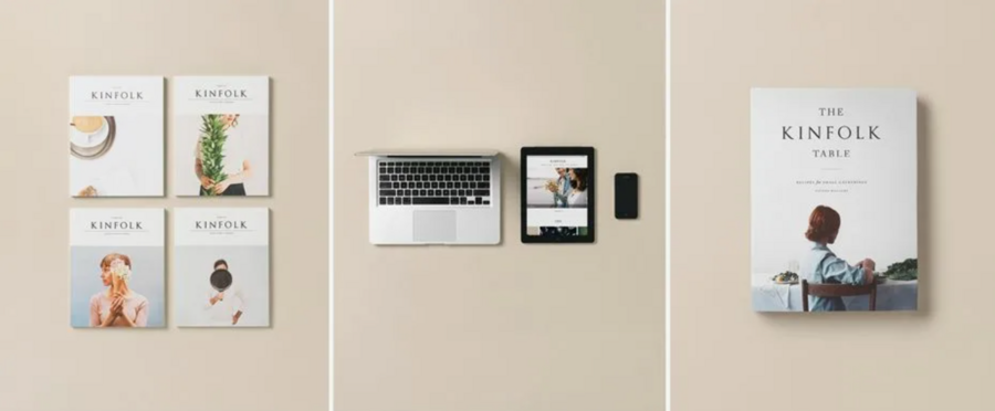
Kinfolk launched in 2011 as an independent magazine initially focused on themes of everyday life, connection, home, and culture. Over time, it evolved into an international media brand that integrates a print publication, a website, social media presence, and book projects. On its official website, the editorial team describes Kinfolk as a lifestyle publication that operates across both print and digital formats. The magazine is released quarterly and distributed in over a hundred countries. Therefore, its visual language does not exist within the confines of a single print product but functions as a unified communication system across various platforms.What interested me specifically was this transition—from designing a magazine to cultivating an entire media identity. Kinfolk is often associated with minimalism, Scandinavian design, natural lighting, neutral tones, and visual simplicity. However, for the scope of this study, it is crucial to examine these characteristics not merely as aesthetic preferences of the editorial team, but as deliberate tools for managing audience attention.
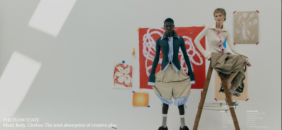
Image from the Kinfolk official website
Another reason for choosing this topic is that Kinfolk has gradually evolved beyond the conventional understanding of a magazine. This aesthetic has become recognizable outside of the printed publication—it is used in digital editions, books, and various commercial projects. This allows us to examine the magazine not merely as an information carrier, but as a media brand that disseminates its own visual language across diverse communication channels.
Principle for Material Selection for Research
For the core of my research, I plan to utilize covers and spreads from various issues of Kinfolk, photographs from the official archive, as well as elements from the website and digital publications. This material will allow me to examine the design techniques employed in the magazine and the consistency with which those techniques are applied across different formats. Initially, I will analyze the covers. They serve as the reader’s first point of contact and largely determine the initial perception of the magazine. When reviewing them, it is crucial to focus on the relationship between the image and the title, the placement of the logo, the scale of the photography, the color palette, and the use of white space. This will help understand what details allow Kinfolk to maintain its recognizable identity without overwhelming the covers with extra elements.The second group of materials will consist of the interior spreads. Analyzing these will allow me to examine the peculiarities of typesetting, the use of a modular grid, the combination of text and images, and the organization of page transitions. Special attention will be paid to spreads where the photograph occupies the majority of the space. These examples can reveal the role an image plays in conveying the mood and meaning of the content.The third group will comprise materials from Kinfolk’s digital platforms. In this case, the primary objective is to determine how the design principles of the print magazine translate into the digital environment. The analysis will utilize the website’s homepage, navigation, publication cards, and accompanying imagery. This will allow for a comparison of how information is presented in print versus digital formats.When selecting materials, I will base my choices not only on their visual impact but also on how well they serve the research objectives. Each example must reveal a specific aspect of Kinfolk’s visual system: covers will help study the formation of its recognizable image, interior spreads will illustrate composition and layout characteristics, and website materials will show methods for adapting the overall style to a digital format.
Image from the official Kinfolk website
Research Structuring Principle
The research will consist of several thematic chapters. This structure will allow a gradual progression from studying the individual elements of a print magazine to examining Kinfolk as an integrated media entity where all visual and communicative decisions are interconnected. The first chapter will explore the visual language of the print publication: format, cover design, typography, color palette, and layout specifics. The second chapter will focus primarily on photography and its role in establishing the magazine’s overall visual identity. The third chapter will address the digital environment of Kinfolk—its website, online publications, and how the characteristics of the print design are adapted for screens. The fourth chapter plans to review content distribution methods, audience engagement, and the formation of the media brand.
This division is necessitated by the fact that each of these elements serves a distinct function, yet they are all linked. The covers, photography, layout, website, and social media complement one another, collectively forming the recognizable image of Kinfolk.
Image from the official Kinfolk website
Principle of Selecting Textual Sources
Textual sources will serve as an additional foundation for analyzing the visual materials. Primarily, I plan to consult official Kinfolk materials: the project description, the archive of issues, subscription information, and the architecture of the digital platform. These will help provide a clearer understanding of how the publication operates, how its content is distributed, and the makeup of its contemporary media structure.Furthermore, I will examine interviews with editorial staff and the magazine’s designers. These are valuable because they offer insight into the goals set when developing the visual style and the rationale behind specific design decisions. This will also allow me to trace how the approach to the magazine’s layout has evolved as the project has developed.
Image from the official Kinfolk website
Key research question and hypothesis
Key research question: How does the minimalist aesthetic of Kinfolk function as a media tool—assisting in establishing the publication’s brand recognition, guiding audience attention, and unifying various communication channels?
My hypothesis is that Kinfolk’s minimalism is not merely a design quirk but one of the fundamental instruments in building a media brand. Thanks to recurring techniques in composition, photography, typography, and color palette, the magazine develops a distinctive visual style. This style allows the audience to associate not only print issues with Kinfolk, but also its website, books, and individual digital publications.
Therefore, through this research, I aim to demonstrate that Kinfolk’s visual simplicity is not a random selection of design elements, but the result of a consistent approach to layout and audience communication. Here, minimalism serves more than just an aesthetic function: it helps organize the page space, highlight key elements, and create a specific impression of interaction with the publication. This is why the visual style can be considered an independent media instrument.
I. Print Publication: Minimalism as a System of Visual Organization
The cover: your first point of contact with the audience
The magazine cover is one of the primary communication tools of a print publication. It must simultaneously serve to identify the publication, capture the potential reader’s attention, and convey the character of the product itself. In the case of Kinfolk, this process is built somewhat differently than in mass-market magazines, which often employ numerous headlines, teasers, and striking graphic elements.
Image from the official website of the magazine
Upon examining the covers of Kinfolk, one notices that the journal’s title often functions as the primary typographic element. It does not compete with a multitude of secondary texts; instead, it becomes integrated into the overall composition. Photography occupies a central position and effectively forms the main visual message.This approach alters the very principle of capturing attention. Rather than presenting the reader with several reasons to purchase the journal at once, the cover offers a specific visual image. Attention is drawn to the image—its color, texture, lighting, and the arrangement of its objects.
Particular attention should be paid to negative space. It is not perceived as empty area but rather as a compositional element. It allows individual components to stand out, preventing the cover from looking cluttered. This creates a sense of visual balance that sustains the publication’s overall identity.
However, it would be incorrect to claim that all Kinfolk covers follow a single template. The visual system evolved across different periods. The changes become particularly noticeable around the magazine’s tenth anniversary, when the editorial team reassessed the conventional cover design. This demonstrates that brand recognition does not necessarily require the complete repetition of the same decisions. More important is maintaining the overall character of the visual communication while allowing for evolution.
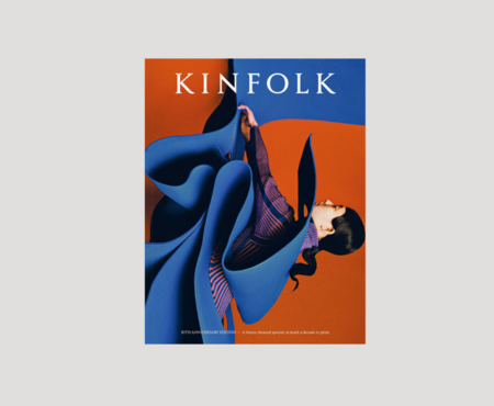
The anniversary issue is interesting because it allows a comparison between an earlier visual system and the updated approach. The change in design demonstrates that minimalism is not a rigid set of rules. It can incorporate richer color palettes, large imagery, and unconventional compositional techniques while maintaining a general focus on visual integrity.
In a media context, the cover of Kinfolk functions as a recognizable identifier. Even without extensive promotion, it allows the magazine to be distinguished from other publications and cultivates an expectation of a specific visual experience.
(Cover of the Kinfolk No. 40 anniversary issue.)
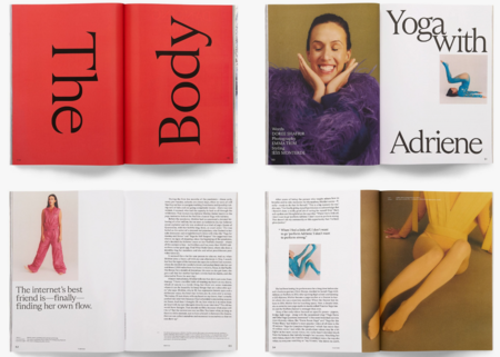
The internal layout of Kinfolk continues the principles established on the cover. One of the most notable features is the way white space is used. The margins surrounding text and images are often significant and are not treated as secondary design elements.
When analyzing spreads, it is important to pay attention to the ratio between the photograph and the text block. They may appear on different pages, occupy unequal amounts of space, or be separated by substantial areas of negative space. This creates a specific reading rhythm: the reader is not confronted with a continuous sequence of identically laid-out pages.
White space also helps manage hierarchy. If a single, large image occupies a page, it automatically becomes the primary element. If the photograph is accompanied by a small text block, attention is distributed between two objects. In this way, the composition predetermines the sequence of material reception.
Typography and Color System
The Kinfolk typography serves two purposes: it ensures readability and defines the visual character of the publication. In the journal’s early issues, the Garamond typeface played a notable role, lending a more classical, bookish feel through its serifs.Combined with generous margins and a restrained composition, this typography fostered a sense of calm, consistent reading. The text did not attempt to compete with the photography; instead, it became an integrated part of the overall visual system.The color palette is also crucial. Kinfolk’s early visual language often featured pastel shades, muted tones, and neutral backgrounds. These elements helped unify the content, even when the images themselves differed in subject matter.
II. Photography as a Primary Tool of Visual Communication
Photography and the Formation of Visual Mood
One of the main characteristics of Kinfolk is its strong emphasis on photography. The visual material here doesn’t just accompany the text; it often becomes an independent part of the media message. A photograph might take up an entire spread, be used on the cover, or serve as a connecting element between several pages.
When examining the photographs, you can notice recurring techniques: natural lighting, soft shadows, muted color palettes, serene compositions, and an attention to texture. The frames frequently feature natural materials—wood, ceramics, textiles, plants, and everyday objects.