The visual study examines the role of color in 12th–15th-century French church stained glass. Using four monuments as case studies, it explores how individual colors combine to form a palette, interact with one another, and structure the window’s composition. By comparing overall views, details, and analytical diagrams, the research moves from the colored fragment to the perception of the interior. The concluding section is dedicated to the integration of elements from different time periods within a single stained glass panel.
«The main qualities of colored glass are color and light transmission.»
Льюис Форман Дэй. Windows: A Book about Stained & Painted Glass, 1897. С. 22. [8]
«The first and foremost qualities in colored glass are color and translucency.»
Concept
Color allows the stained glass to be perceived even before its narratives become discernible. From a distance, figures and objects merge into large fields of color, repeating patterns, and luminous surfaces. Therefore, color can be viewed not just as a property of individual details, but as a means of organizing the entire image. This study focuses on the stained glass of Saint-Denis, Chartres Cathedral, Notre-Dame de Paris, and Sainte-Chapelle from the 12th to the 15th centuries. The core question is: how does color connect an individual fragment to the whole window and the space of the church? The theoretical starting point is drawn from Françoise Perrot’s article, «La couleur et le vitrail.» The discovery of traces of medieval polychromy, according to the researcher’s observation, necessitates a reassessment of the stained glass’s role in architecture. The window emerges not as an isolated artwork, but as part of the building’s chromatic scheme. (1, p. 211) The research hypothesis is that the expressive quality of the stained glass depends not only on the palette of hues, but also on their area, adjacency, repetition, and placement. These relationships help to delineate forms, unite scenes, and maintain the integrity of the interior space. The work is constructed upon a functional visual analysis—a comparison of the tasks that color performs in the selected works. Photographs of the overall views alternate with close-ups, allowing one to trace the effect of color at various scales. Historical information refines the dating and helps distinguish medieval solutions from later modifications.
Navigation Menu
- The Origins of the Stained Glass Color Language
- The Evolution of the Color Palette
- Color Relationships and Contrasts
- Color in Stained Glass Composition
- Color and Light in the Sanctuary Space
- The Stained Glass PalimpsestThe structure is organized from individual elements of the color language to their collective interaction. Initially, the material and the role of individual colors are examined, followed by shifts in the palette, contrasts, and methods of image organization. Subsequently, the focus moves from the window’s composition to its interaction with the light and space of the sanctuary. The final section on the stained glass palimpsest reveals how historical layering influences contemporary perception of color. This sequence allows one to test the hypothesis: the expressiveness of stained glass is determined not only by the set of hues but also by the relationships between them, the architecture, and the work’s history.
The Origins of Stained Glass Color Language
Цвет как часть материала
«The Annunciation.» 12th-century stained glass panel from Saint-Denis. At the feet of the Virgin Mary is depicted the praying Abbot Suger. Photo: © LRMH. Source: (2).
Medieval stained glass is constructed from colored and painted pieces of glass, held together by lead cames. Metal compounds were added to molten glass for coloring. Painting refined details such as faces, gestures, drapery folds, and more. (8) This construction defines the artistic language of the image. Color forms the main areas, line defines their boundaries, and painting renders the details discernible. The figure emerges from the combination of these elements, rather than from a single continuous layer of paint. The stained-glass windows of Saint-Denis, created under Abbot Suger before 1144, were incorporated into the church’s religious program. Their narratives connected events from the Old and New Testaments. The colored window simultaneously participated in illuminating the architecture and conveying its content. (2)
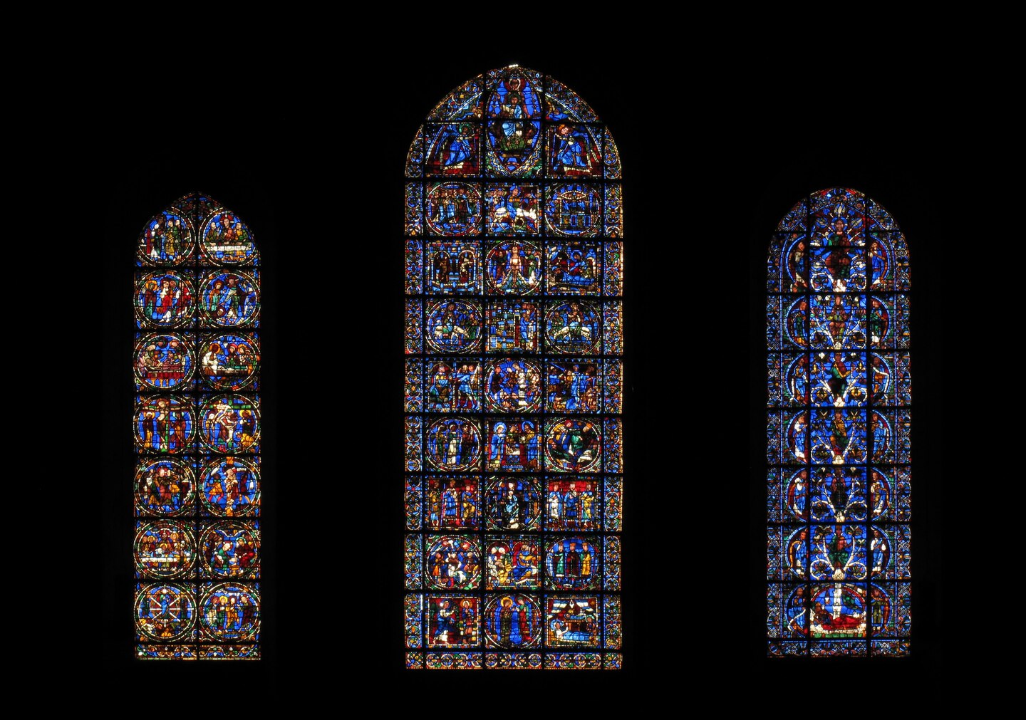
Chartres Cathedral. Notre-Dame de la Belle Verrière — «The Virgin of the Beautiful Glass.» The central 12th-century panels are incorporated into a later window. Photo: © Gaud fonds. Sources: (3; 4).
A large color area
The blue in the Virgin Mary’s robes occupies a substantial, cohesive space. Despite the division of the glass and the internal pattern, the figure maintains a unified color silhouette. Here, color unifies form. Its function is related not just to hue; area and placement are critical: a large blue section in the center differs from the small blue details surrounding it. Therefore, the role of color is defined by the relationship between the part and the whole.
Red and Blue: The Contrast of Adjacent Shapes
The juxtaposition of red and blue accentuates the boundaries between color zones. This contrast is further emphasized by the dark connecting lines. Color and contour work together to divide the surface into legible shapes. Red can function as a local accent, but its repetition across different parts of the image also creates a unifying effect. A single hue is capable of fulfilling diverse roles depending on its placement.
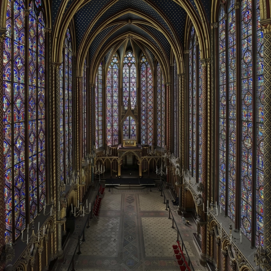
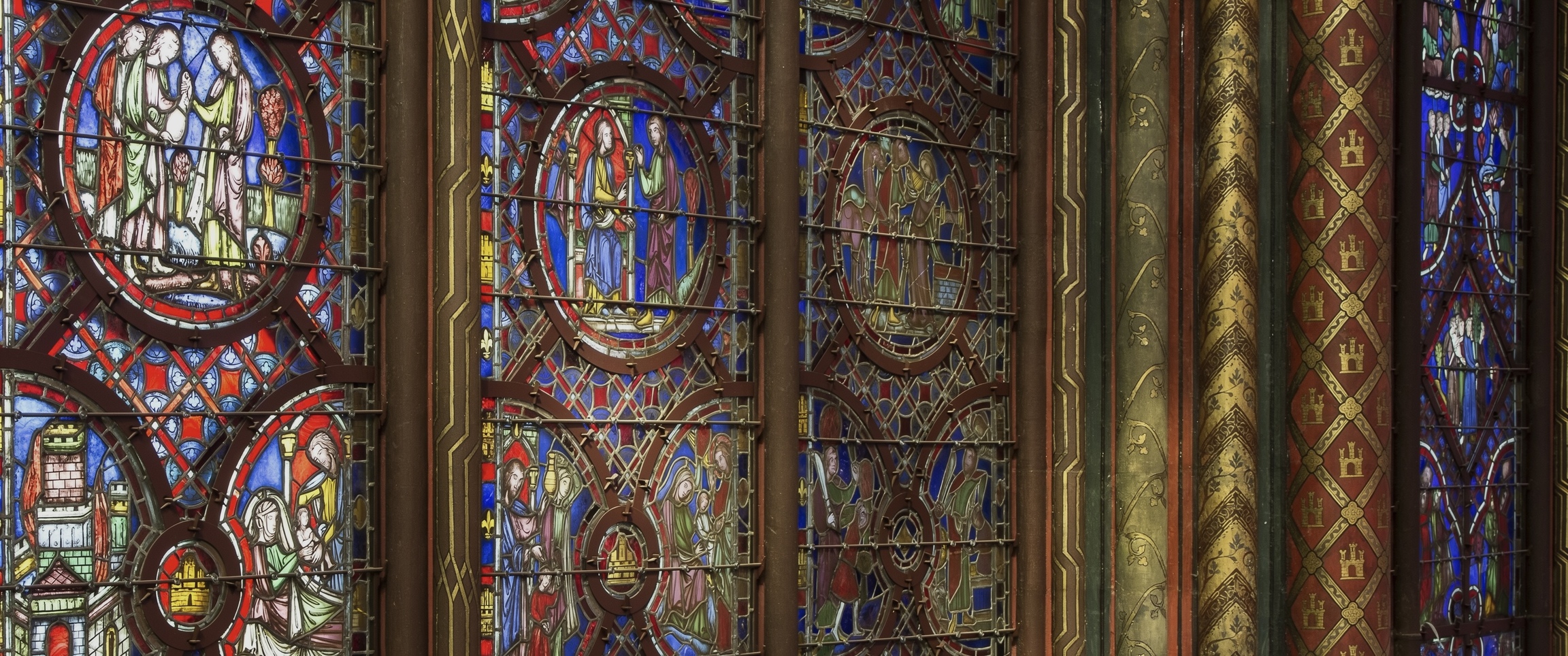
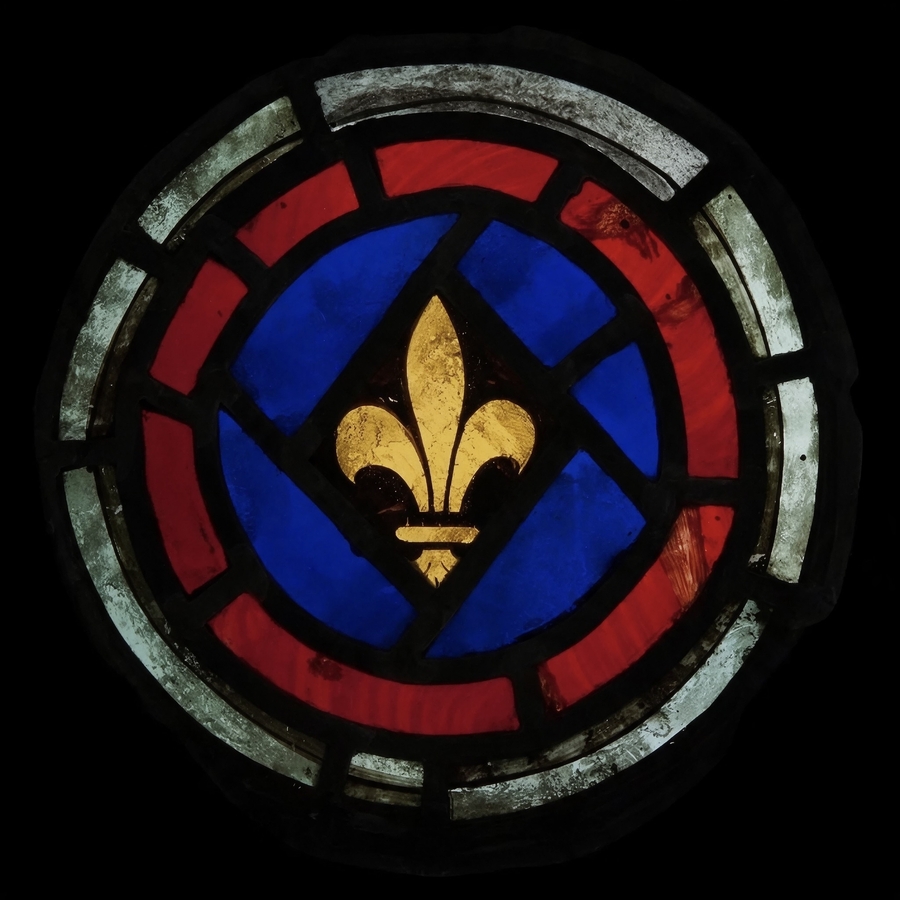
Light and secondary tones
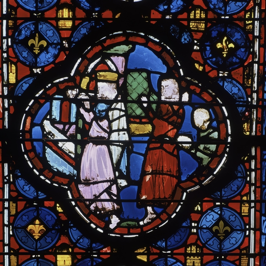
The Sainte-Chapelle palette includes red, blue, two greens, two purples, yellow, and individual translucent panes. This set was used to harmonize a large number of narrative medallions. [sainte-chapelle]
Small, light areas contrast with the large, saturated masses, giving the surface a more fractured quality. The secondary tones allow for the differentiation of adjacent garments, objects, and ornamental elements without disrupting the overall coherence.
Therefore, a specific color does not receive a singular meaning in the study. Its function is established according to the specific image: what it unifies, what it separates from, and where it is repeated.
The color language of stained glass arises from the interplay between the glass, the design, and the leading lines. At the detailed level, color shapes individual areas of the image. At the holistic level, its impact depends on the palette and the distribution of hues.