Navigation
1) Concept 2) Early Work (1970s) 3) Work from the First Half of the 1980s 4) Later Work (Second Half of the 1980s — 1990s) 5) Conclusion 6) Sources
Concept
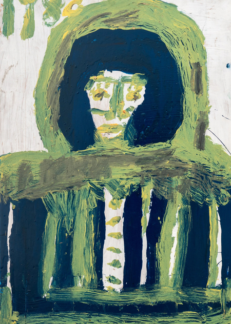
In Mary T. Smith’s painting «Untitled» from 1976, three human figures are constructed from large, contrasting patches of color. Their faces are reduced to a few signs, and their bodies are barely separated from the plane. In her late self-portrait from 1988, the color treatment is different. The figure is so tightly connected to the background that the eye does not immediately discern the boundary between them. The difference between the two works provides grounds to investigate how the artist, who worked outside of established professional art institutions, changed her methods of image construction.Mary Tillman Smith lived in Hazlehurst, Mississippi. Beginning in the early 1970s, she displayed painted metal and wooden panels on the grounds of her home, which overlooked a busy highway. The painting existed here in an open courtyard setting, amidst fences and outbuildings. The large silhouettes and short texts were intended to be perceived from varying distances. Arnett compares their expressive quality to the visual structure of roadside advertising. Smith was characterized by significant hearing impairments. Biographical information helps to explain the significance of the written notations, but in itself, it does not prove the origin of a specific graphic technique.

The concept of outsider art requires clarification. Anna Suvorova shows that in the American context, it intersects with the categories of folk art and self-taught art. When applied to Smith, it is particularly useful to consider the tradition of decorating one’s own yard, which American researchers call «yard show.» Her works were created in an environment where an individual painting could simultaneously serve as an element of a fence and an independent image. Following its move to the museum, the former placement of many of the works was lost; therefore, this paper primarily examines the preserved panels and archival descriptions of their original use.
The material selected for analysis follows a chronological approach. The first chapter examines a work from 1976 and four pieces from around 1980. The second chapter is dedicated to the first half of the 1980s, a period where the interplay between the figure and written elements is particularly evident. The third chapter includes paintings from 1986–1989, showcasing a more active use of color fields and geometric structures. This periodization serves as a comparative framework. Arnett points to a general trend in stylistic evolution but does not establish three distinct stages with fixed boundaries. Given the many approximate dates among the surviving works, any chronological conclusions will be cautious.
The analysis is structured around the artworks themselves. In each case, we examine the scale and the relationship between figures and the background, followed by the role of the inscription or geometric motif. Changes in one element are cross-checked against other works from the same period. The concluding example of each chapter features an artist from the American tradition of self-taught practitioners. Comparisons with Gertrude Morgan, Pervis Young, and Joe Light were chosen based on specific formal characteristics; these do not imply documented influence of one master upon another.
The primary written sources include William Arnett’s essay, «Her Name Is Someone, ” available on the Souls Grown Deep website, and Brooke Wyatt’s museum publication on Smith’s art. Arnett draws on interviews with the artist and her relatives conducted in the 1980s and 1990s. His text is particularly significant regarding the development of style. Wyatt describes the materials and characteristics of the painting techniques on works housed in the American Folk Art Museum collection. Anna Suvorova’s articles are used to establish the terminological and museum context. Dating and titles are cross-referenced with records of specific works.
The research question explores how the relationship between the figure, the color background, and the written text evolved in the paintings of Mary T. Smith from the mid-1970s to the late 1980s. The hypothesis suggests that the artist gradually shifted from imagery based on sharp silhouettes to compositions where the background becomes an equal participant in the construction of form. While the letters maintain a connection with addressing the viewer, they increasingly function as graphic elements. This hypothesis can be tested by comparing dated works and identifying exceptions to the general trend.
Early Creativity (1970s)
One of the few confidently dated early examples is «Untitled» from 1976 (Fig. 1). Three frontal figures stand on the plane. Yellow and black are distributed so that each figure is readable from a distance, and internal details yield to the overall form. The middle figure differs from the outer figures in its relationship between light and dark. This shift enhances the rhythm of the group. The viewer does not need to examine gestures or facial expressions to perceive the repetition of human imagery. Smith’s main compositional device is already evident here—a device that will remain recognizable in the next decade.
Mary T. Smith, «Untitled, ” 1976.
The piece «Untitled (Three Figures)» from 1980 (Figure 2) maintains its group composition. The image is applied to a long metal surface. The horizontal format necessitates placing the characters side-by-side, so the spacing between them and the repetition of outlines are more critical than any illusion of depth. A comparison with the 1976 work shows the persistence of the frontal image, although the size and texture of the substrate now alter the viewer’s gaze. The curves of the metal become part of the perception of the painted surface. This is particularly significant for a work originally intended for display outside of a residential interior.
Mary T. Smith, «Untitled (Three Figures), ” 1980.
Mary T. Smith, «Untitled (Three Figures), ” 1980.
In «Untitled (Figure on Yellow Background)» from 1980 (Fig. 3), a single character replaces a group. The large mass of color draws attention to the head and upper body. The shift to a single image alters the compositional relationship between the figure and the plane. Where previous works distributed attention across neighboring characters, here it converges around one silhouette. The simplified facial features function as signs of human recognition. The artist does not require detailed drawing, as the figure’s scale relative to the surface already dictates its significance.
Mary T. Smith, «Untitled (Figure on Yellow Background), ” 1980.
Mary T. Smith, «Untitled (Figure on Yellow Background), ” 1980.
«Untitled (Two Figures)» from the same year (Fig. 4) returns the composition to a paired image. In this instance, one can compare two forms of human presence. Contrasting masses define a separate area for each character, even though both are rendered on a common metal base. The sharp boundaries between the colors enhance the perception of the figures as large graphic signs. Compared to the solitary image, the juxtaposition of two characters once again makes comparison the primary principle of the composition. The differences between the images arise within a single artistic language, not from a change in technique.
Mary T. Smith, «Untitled, ” 1980.
Mary T. Smith, «Untitled,» 1980.
Assemblage «He, ” circa 1980 (Fig. 5), expands the perception of early work. The board features assembled metallic elements, including a circular object and a fragment with the inscription HE. Here, a Christian image is constructed from found objects. The letters remain legible, but the work’s meaning is not reducible to the word alone. The object labeled with the inscription gains meaning through its proximity to the circle and the overall organization of the elements. This composition helps to understand why Smith’s boundary between writing and image was fluid from the very beginning—a technique that existed alongside her planar painting.
Mary T. Smith, He, circa 1980.
Comparison with Gertrude Morgan’s «New Jerusalem,» created around 1970–1974 (Fig. 16), clarifies the nature of Smith’s early work. Morgan places a schematic illustration of the celestial city and written references to a religious theme on a single page. Her text explains a specific biblical vision. While Smith’s religious references may be brief and difficult to read, her imagery is built upon a monumental silhouette. Both artists share a confidence in the power of simple graphic forms, although their approaches to page organization differ. Morgan guides the viewer’s eye through the details of her narrative, whereas Smith more often draws the gaze to a single, large figure or group.
Sister Gertrude Morgan, «New Jerusalem, ” circa 1970–1974.
Early works demonstrate a consistent silhouette and high-contrast color patch. Their artistic expressiveness stems from the figure being easily recognizable as a human sign, even though facial details are minimized. The assemblage «He» confirms that Smith’s interest in letters and symbolic religious imagery existed parallel to these figural solutions.
Creativity of the First Half of the 1980s
In the 1982 painting «Do You Know Me?» (Fig. 6), the written address shifts the viewer’s position. The interrogative form implies a specific addressee, although the image does not guarantee that a passerby will read the inscription immediately. The inaccurate spelling is also significant. The English word «no» sounds like «know,» so the inscription maintains a comprehensible question, creating a subtle reading difficulty. Unlike the early group image, here it is impossible to separate the visual image from the textual message without losing part of the content. The viewer must consider the work both as a painting and as a text directed toward them.
Mary T. Smith, «Do You Know Me? , ” 1982.
«We all want a job, ” dating back to the early 1980s (Fig. 7), shows a different function for the inscription. The statement concerns the social position of people and extends beyond a personal address. Because it was applied to an elongated metal fragment, the form of the base itself approaches that of a street poster. A comparison with „Do you know me?“ reveals a difference in the scale of the message. In the first case, the viewer encounters a question about familiarity and recognition; in the second, the words take on the character of a collective demand. The graphic presentation remains sharp and non-academic, but the rhetorical gesture becomes more public.