Navigation
- Research Concept
- Deformation and Silhouette
- Spectacle and Emotional Response
- Portraiture and Makeup
- Diversity of Threat Imagery
- Composition and Advertising Message
- The Hero as Series Foundation
- Conclusion
- Bibliography
- Image Sources
Concept
Justification for Theme Selection A horror film poster builds an anticipation of fear even before the screening begins. Distorted space, unusual appearance, tense gestures, color, and text help convey danger on a static surface. Examining these elements allows us to understand how graphic design communicates a film’s character and captures attention for an unknown narrative.
The period from 1920 to 1939 encompasses silent and early sound cinema, the emergence of recognizable screen characters, and the development of sequels. European and American materials demonstrate a diversity of promotional approaches. Reviewing different studios and markets allows us to trace several developmental trajectories of the movie poster.
Criteria for Selecting Material for Visual Study The foundation of this study consists of European and American film posters and examples of advertising graphics from 1920–1939. When selecting materials, we considered the origin and dating of the pieces, as well as the quality of the reproductions, which must allow for close examination of composition, drawing details, and typography.
The selection includes works that demonstrate various ways to present threat and spark interest in a film. In some posters, anxiety is created through deformed space and silhouette; in others, the character’s reaction, portrait, makeup, or advertising tagline is emphasized. Examples were chosen to allow for a comparison of how these techniques function across different compositions.
The study also incorporates several posters from a single film. Comparing the teaser and the feature poster reveals how much information about the character and the plot each version conveys. Sequels posters help trace how a familiar name or distinctive look connects a new film to its predecessors.
Principle of Research Structuring The structure combines thematic analysis with a chronological progression. The research begins with space, silhouette, and gesture, then moves to spectacular composition, emotional response, and close-up portraiture. It subsequently examines various representations of threat, methods of information disclosure, and the thematic connection between the films in the series.Within the sections, independent description is combined with comparative analysis. Comparisons reveal specific distinctions: the source of the danger, the volume of information, the function of the text, or the method used to maintain recognizability. The sequence of analyses is structured like a narrative, where observations of individual posters gradually build toward a general conclusion.Principle of Selecting and Analyzing Textual Sources To understand the historical context, we utilize Dmitry Komma’s book alongside articles by Leonid Trauberg and Oleg Kovalev on early horror and German cinema. Museum catalogs and film archive materials help to clarify the authorship, dating, format, and origin of the images.The analysis progresses from observation to interpretation: first, the poster’s organization is examined, and then its promotional function is determined. Film information aids in explaining the image but does not replace the visual analysis. The presumed impact of the poster is separated from the documented audience response.
Key Research Question and Hypothesis Key Question: How do 1920–1939 horror film posters represent fear, and how do composition, text, and character recognition help manage audience expectation?Hypothesis: The evolution of the poster is linked to changes in the functions and combinations of expressive elements. Spatial distortion, silhouette, and ambiguity persist alongside large portraits, makeup, and actor names. Recognition allows for the shortening of explanation, maintaining intrigue, and linking sequels, even as composition and the central image change.
Deformation and Silhouette
In a horror film poster, the goal is to convey an experience that the viewer has not yet encountered. To achieve this, the image might depict a dangerous event, highlight an unusual character, or create a sensation that the surrounding world has ceased to obey familiar laws.In advertising from the early 1920s, these possibilities are closely intertwined. Distorted space continues into human figures; a tense gesture transitions into the contours of letters, and the title becomes part of the anxious atmosphere. This interaction is particularly evident in the «Caligari’s Cabinet» campaign, where a unified graphic language is used to represent the film’s world and address the viewer directly.
Space and Gesture A dark figure in the poster for «The Cabinet of Dr. Caligari» towers over a reclining woman. The disparity in the figures' positions establishes an imbalance, while the outstretched arms and slanting torso intensify the scene’s tension. Broken architecture mirrors the characters' movements. The sharp forms, slanted walls, and uneven letters of the title are all subjected to a general distortion. The entire depicted world creates a sense of unease—a space where it is difficult to find a stable point of support.
«The Cabinet of Dr. Caligari.» 1920. Germany. Decla. Erich Ludwig Schäfer, Otto Arnopp (excerpt)
The advertisement «Du musst Caligari werden!» replaces a plot scene with two hands and a cryptic invitation. The name becomes the central focus, even though the message explains almost nothing about the film. This motif was utilized in the pre-premiere campaign.
Irregular lettering and tense fingers lend insistence to the address. The phrase is directed straight at the viewer, yet it proposes an action of unknown meaning. The advertisement creates a question—an answer that lies beyond the ad itself.
«You must become Caligari!» 1920. Germany. Film campaign advertisement. Erich Ludwig Stahl, Otto Arnke (excerpt)
The overarching visual language unifies the materials yet directs them in distinct ways. A poster presents the world of the film, while an announcement draws the viewer into a mystery. A detailed scene and a concise call to action become complementary parts of a single campaign.
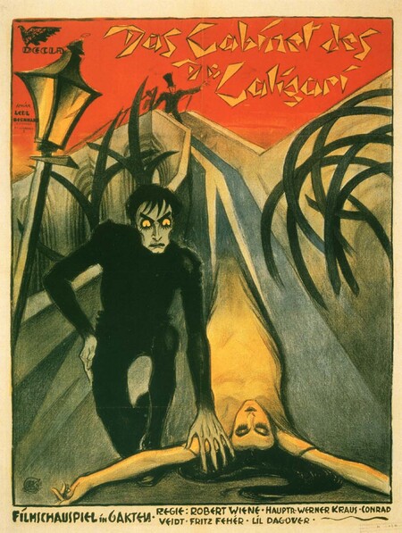
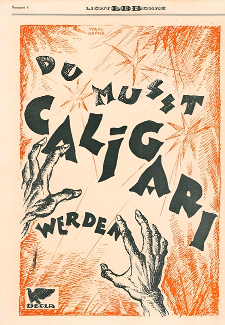
Two campaign pieces for «The Cabinet of Dr. Caligari»: presenting the film’s world and a mysterious address to the viewer
Space and Form In the «Golem» poster, a small figure is enveloped by dense, dark masses. The lighter area allows the figure to be discerned while simultaneously emphasizing the heaviness of the surrounding space. Attention moves from the overall expanse toward the presence within it, making the environment the primary source of tension.The curved lettering of the title continues the movement of the surrounding forms. Reading becomes integrated into viewing, and the text becomes a part of the depicted world. The horizontal format reinforces the impression of a vast, densely packed space.
«Golem, How It Came into the World.» 1920. Germany. Hans Pelzig. Lithograph. Published by UFA
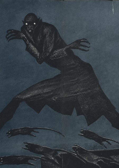
Silhouette Expressiveness The advertising graphic for «Nosferatu» focuses on a stretched figure with long fingers and distorted human proportions. Its alien nature is recognizable by its outline. Rats expand the space of danger, and the spaced-out letters support the horizontal movement of the composition.
«Nosferatu. Symphony of Horror.» Circa 1922. Germany. Advertising graphics by Alban Grau
Spectacle and Emotional Response
A poster can establish an atmosphere through distortion and ambiguity, or it can present a film as a densely packed spectacle of events. In the latter case, it unites characters, architecture, individual scenes, and actor names. Their scale is determined by their significance within the advertising message.
The human figure takes on various functions. An enlarged character dominates the entire sheet, while a frightened face conveys the experience the story promises. A choice arises between the source of the threat and the reaction to it: the advertisement can direct attention to who is frightening, or to who is experiencing the fear.
Scale of the Spectacle A colossal figure of «The Phantom of the Opera» looms over the city, while a small stage featuring other characters is situated below. The contrast in size dictates the advertising significance of each element. The red cape and dynamic movement establish the hero as the primary focal point.The name Lon Chaney connects the fantastic image to the performer. Supplementary episodes expand the film’s promise by intertwining makeup, dramatic relationships, and the scale of the action. An actor’s recognizability contributed to the advertisement even in silent film.
«Phantom of the Opera.» 1925. USA. Universal Pictures
Face and Experience A frightened female face from «Cat and Canary» is surrounded by dark hands. The reaction is clearly shown, while the source of the threat remains fragmented. The advertisement suggests experiencing the story through the character’s feelings, barely revealing the circumstances of the danger.The open space above the image is related to the window card format. It was intended for information regarding the cinema and the showing, making it a functional part of the sheet and influencing its proportions.
«The Cat and the Canary.» 1927. USA. Universal Pictures. Window card (fragment)
A prominent figure in the «Old Dark House» also becomes the emotional focal point. However, around them appear the house itself, a small male portrait, and inscriptions. The sense of fear connects to a more specific set of narrative elements. Architecture suggests a potential location of danger, while another figure expands the circle of participants. Attention gradually shifts from the reaction to the circumstances, transforming the emotional impression into a narrative.
«Old Dark House.» 1932. USA. Universal Pictures (excerpt)
General admission is maintained between 1927 and 1932, varying in the degree of explicitness. «Cat and Canary» conveys a sense of immediate intrusion, while «The Old Dark House» provides more context. The fearful face remains a sustained way to denote the promised experience.
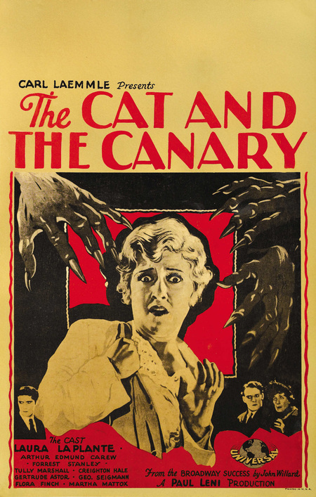
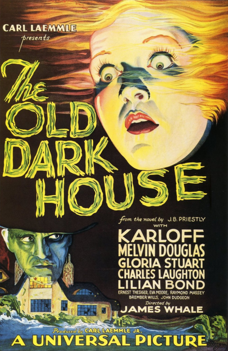
«The Cat and the Canary, ” 1927, and „The Old Dark House, ” 1932. The frightened face as the emotional center of the advertisement.
Portrait and Makeup
In the early 1930s, the large portrait emerged as a prominent way to present a film through a single character. The actor’s appearance, makeup, and gaze converged into an image distinct from the narrative setting. Various materials from a single campaign showcase the potential of this technique.