Navigation
Concept
Concept
Victoria’s Secret is an American lingerie brand founded in 1977. In its advertising, lingerie becomes a means of feeling more attractive, more confident, and more desirable. Valentine’s Day is a perfect occasion for this image, as the holiday is associated with romance and anticipation for a date. It allows the brand to present its products as part of a personal narrative where feelings and one’s perception of beauty are paramount.
The advertising for this holiday is interesting because, while it returns to themes familiar to us each year, it can unfold them in different ways. Color, lace, fabric texture, and the model’s name all help to create a specific atmosphere. Furthermore, it is important to consider the intended audience—whether the advertisement is aimed at the person buying a gift for a partner or the woman purchasing lingerie for herself.
This visual study tracks how Victoria’s Secret advertising has evolved from 1995 to 2026. The starting point is a found print publication from 1995 featuring model Heather Stuart-White and the Miracle Bra. This is the earliest material in the collected sources, but it does not prove that the brand first launched Valentine’s Day advertising at that time.
Valentine’s Day connects the brand’s product with festive habits, such as choosing a gift, preparing for a date, or buying for personal enjoyment. The main focus will be on the color palette, composition, and model styling. Attention will also be paid to the product’s role—specifically, whether it is the primary focus of the image or part of a broader narrative. We will examine various advertising formats, including how the brand presents its advertisements in magazine spreads and in video content. Unusual storylines, such as Love Cards and football campaigns, will also be considered to see how these ideas expand the conventional romantic scenario while maintaining a connection to both the product and the holiday. This research will help understand how Victoria’s Secret maintains recognition while changing the way it speaks to its audience, and how lingerie in holiday advertising becomes a symbol of romance, allure, and self-regard.
Objective
To trace the evolution of visual tropes in Victoria’s Secret holiday advertising and understand what has remained constant over three decades versus what has changed along with communication formats.
Hypothesis
Lingerie, sensuality, and romantic transformation remained central themes in advertising, although the visual codes and media platforms evolved. Visual codes refer to recognizable colors and imagery. Print advertisements and catalogs were gradually supplanted by video and social media content. There became a more pronounced focus on promoting comfort, self-love, and acceptance of diverse female appearances.
Let’s start with the early Victoria’s Secret catalogs from 1995 and 1996. They share a similar approach: a dark background, a large model image, red lingerie, and gold lettering. The main focus is placed on the model’s appearance and the product itself. The connection to Valentine’s Day is established through the text «Valentine’s Day» and a slogan that can be translated as, «Give her your heart and something that will make it beat a little faster.» The advertisement can be read as an appeal to the person selecting a gift for a loved one.
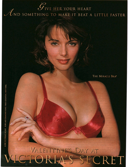
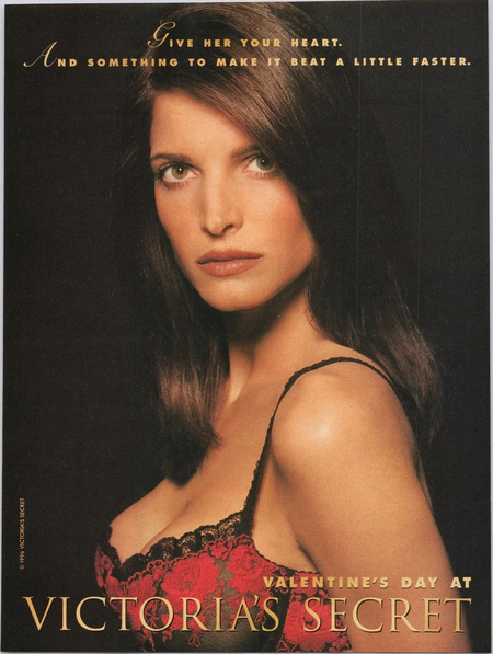
In the center of the 1995 magazine, 90s model Heather Stewart-White wears a Miracle Bra push-up bra. The red color and glossy texture of the fabric stand out against an almost black background. The brand name, The Miracle Bra, is placed to highlight the specific product. The word «Miracle,» meaning «wonder, ” can be interpreted as a promise of enhanced attractiveness. The 1996 magazine retains the same colors, slogan, and brand name placement at the bottom of the page. The model’s face and hair take up most of the image, while the lingerie is shown partially. The first magazine appears more focused on a specific item, whereas the second focuses on a general feminine image. There is no celebratory mood on the covers of these catalogs. The red color might evoke love and Valentine’s Day, but without any text, the images are easily perceived as ordinary lingerie advertising.
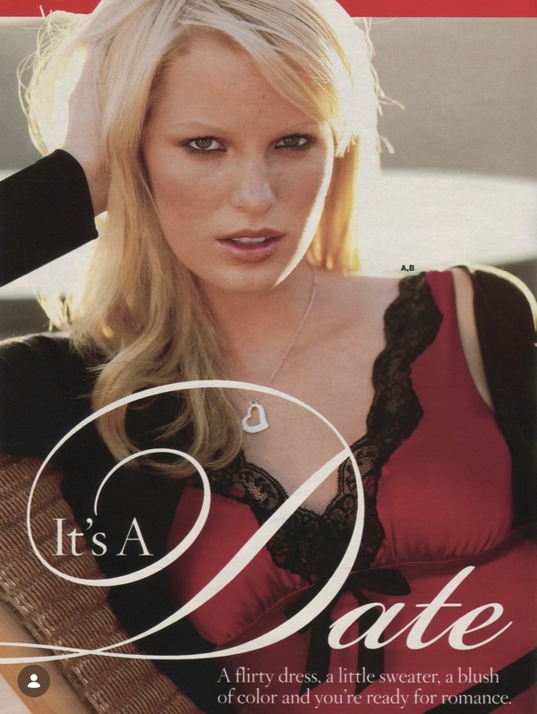

On the 2005 catalog pages, attention is once again drawn to the large model image, her gaze, and the advertising copy. Red might bring to mind Valentine’s Day, but here it emphasizes passion more than a festive mood. The first image—red clothing with black lace and soft lighting—creates a romantic atmosphere. The heart pendant might allude to the holiday, though it is a general symbol of love. The caption «It’s a Date» sets the theme of a meeting without a specific occasion. In the second image, the holiday is denoted by the text «Valentine’s Day, February 14th.» The slogan «Give Me Sexy» can be interpreted as an address to a partner with a hint toward a gift. The product itself is barely shown; the model’s face is the main focus here. Without the captions, the connection between both pages and Valentine’s Day would have been unclear.
chapter title
Beginning in 2010, Victoria’s Secret advertising expanded beyond magazine pages. Behind-the-scenes shoots, online videos, and direct appeals from models to the audience emerged. Interactivity was introduced into the advertising; viewers could not only watch the videos but also, for example, send virtual Valentines. The lingerie and fragrances are now showcased as part of holiday preparation.


In the 2010 advertisement, the connection to the holiday becomes more apparent. The brand incorporates red and pink hues, lace, and translucent fabrics. A heart print appears for the holiday, directly supporting the theme of love. The core concept of the advertisement remains the same: a bright and appealing young woman is the focal point. The model’s poses accentuate the silhouette and help showcase the fit and details of the outfits.
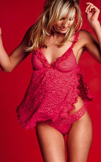
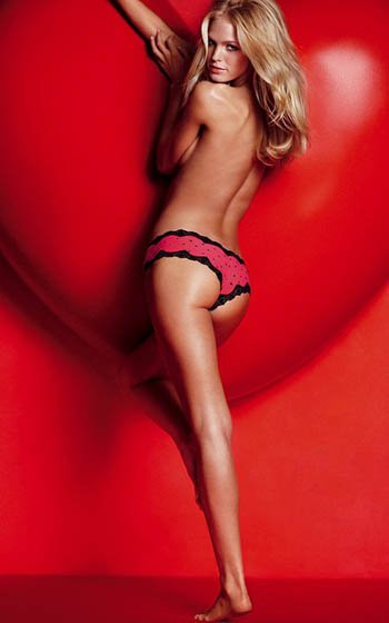
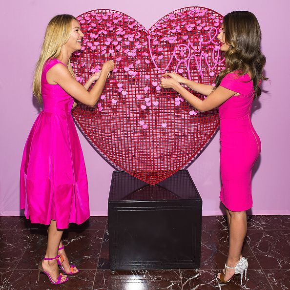
Festive decor complements this image but does not overshadow the model herself. The red background intensifies a feeling of passion, while the pink softens the imagery, making it more delicate and playful. A large red heart in one of the shots further signifies the celebratory occasion. The connection to Valentine’s Day is evident without any text. The holiday is conveyed not only through color but also through the hearts on the lingerie and the heart-shaped decorations. Nevertheless, sensuality and the focus on the female form remain the foundation of the advertising concept.