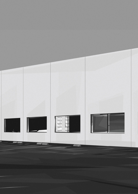
Concept
Grant Riven Yun is a contemporary American digital artist of Korean descent who works in a style he terms «Neo-Precisionism.» His work consists of minimalist, geometrically precise landscapes and scenes of everyday life, created using vector software, yet inheriting the visual language of American Precisionism from the 1920s and 1930s.
A key characteristic of Yun is that his method emerged not from a desire to create «digital art, ” but from limitations. He didn’t have the money for paint or space for canvases in his apartment, so he started working in Microsoft PowerPoint—a program that was readily available. It was this forced constraint that shaped his style: working with simple forms, minimal layers, and foregoing complex effects. Later, he moved to vector editors, but the principle remained the same: he draws not with a brush, but with Bézier curves and fills.I became interested in exploring how a technical limitation can become an artistic method, and how a digital tool can become a carrier of memory and nostalgia. The artist operates at the intersection of illustration, photography, and painting. His vector landscapes don’t just „show“ a place—they trigger a mechanism of memory within the viewer. The limited palette, geometric shapes, and added grain create a paradox: a smooth digital surface feels like an old photograph, and the minimalism demands active participation.
Navigation Menu
[01] PowerPoint as a First Tool
[02] Vector and Precisionism
[03] Grain and Texture
[04] Memory as Co-Author
Material Selection Principle
The study is based on interviews, descriptions of works on auction sites, and critical notes regarding the artist’s style. The focus is not on direct quotation, but on comparing what the artist says about their method with what is visible in the image. Words help clarify exactly how the «camera-less photograph» effect is achieved and why vector graphics are perceived as painting.
Every textual source is viewed as a commentary on the visual object, not the other way around. For instance, when Yoon states that she uses a limited palette to «do a lot with little, ” it helps illustrate how color functions in a specific work to create a sense of place. Similarly, when she describes the „Midwest“ series as a „romanticization of life in the Midwest, ” it helps us understand why the geometric fields feel nostalgic rather than cold.
- Only the works of Grant Reven Youn. The research focuses on a single author to trace the evolution of his methodology.
- Chronological principle. Chronology helps illustrate how a forced constraint develops into a deliberate style.
- Priority on the «trace of method.» Works are selected where it is evident how the tool (PowerPoint, vector, grain) shapes the image.
How did a technical constraint shape the visual language of Grant Reven Yun and persist in his mature works?
What techniques does Jon transform a vector illustration into a vehicle of memory and nostalgia?
Hypothesis: Grant Reven Yun’s method was born out of constraint, not freedom. PowerPoint, with its simple shapes and minimal layers, forced him to reduce the image to a silhouette. This reduction became not a temporary measure, but the foundation of his style. Yun continues to work with a minimal set of forms and colors, compelling the viewer to complete the missing parts using their personal experience.
Furthermore, Yun’s works function as textless illustrations. They do not accompany a narrative—they are the narrative itself, which the viewer constructs for themselves by looking at the image. In this sense, the author continues the tradition of illustration, but inverts it: the image does not serve the text; rather, the viewer creates the text while viewing the image.
[01] PowerPoint as the first tool: the birth of the method. 2016–2017.
As mentioned previously, Grant Raven Young began pursuing digital art not out of a love for technology, but out of practical necessity. He lacked the funds for paints and space for canvas, so he used Microsoft PowerPoint—a program that was readily available.
The «Early Works» series (2016–2017) represents his initial experiments: compositions created in PowerPoint utilizing a single layer and the «Shapes» tool to form object silhouettes.
As the artist himself recalls: «I started illustrating in Microsoft PowerPoint, using the shape tool—literally layering them on top of each other. It was extremely rudimentary, but it worked.»
Yuna’s first work. S&I Fencing. 2016.
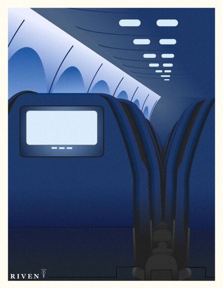
Seats. Silhouettes of chairs assembled from simple shapes in PowerPoint. One layer, minimal color. Yoon uses the «Shapes» tool to create recognizable outlines, but this isn’t drawing in the traditional sense; it’s a construction from geometric primitives. Each shape exists separately, like a building block. The technique is assembling an image from parts.At this stage, Yoon is not yet working with Japanese or American subjects. However, the principle of «less"—using minimum means for maximum effect—will become the foundation of his mature style.
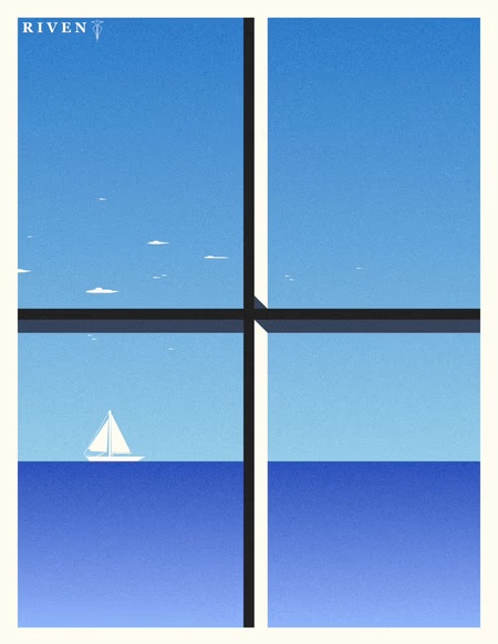
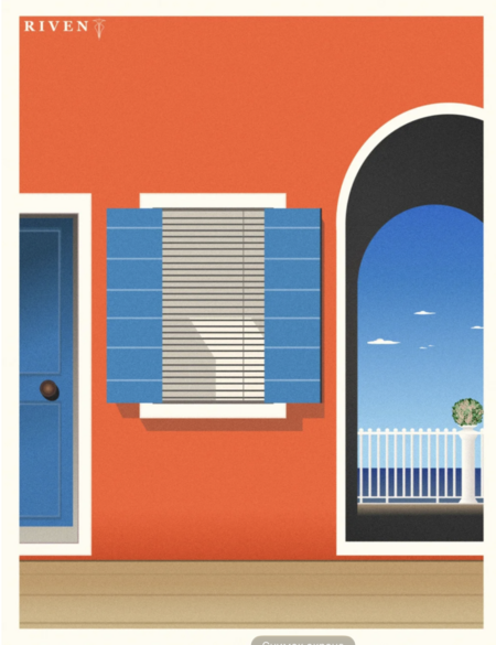
Ocean View. Casa Roja. 2017.
Yoon utilizes a minimal color palette: blue, orange, white, and black. Each panel consists of a configuration of rectangles and arches. The window and arch function as a frame within a frame—the viewer looks at the sea through an opening that is itself part of the image. This technique is about looking through a frame.It could be argued that this piece is about the act of seeing. Yoon does not show the sea itself, but rather the way we look at the sea—through a window, through an arch, through a frame. The PowerPoint technique (rectangles and arches) becomes conceptual here: the frame is not merely a form, but a theme.
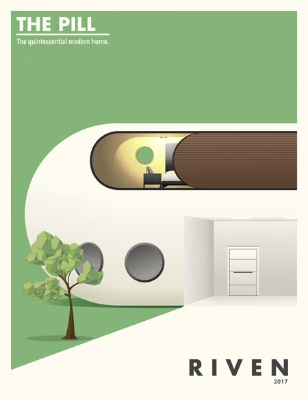
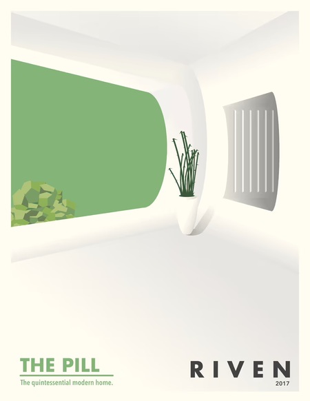
The Pill 1. The Pill 2. 2017.
Two panels. The first is a futuristic capsule home with the inscription, «THE PILL. The quintessential modern home.» The second is the interior of the same capsule, featuring a window and a plant. Yun constructs the building and its interior from simple shapes—a utopia born from primitives. The text on the first panel transforms the image into a conceptual poster. The diptych functions as a closed system: from exterior to interior. This is not a real house, but an idea of a home.
Five pieces from the «Early Works» series illustrate how a technical limitation became a method. Yoon could not work with shadows, textures, or complex brushes, so he focused on form and color. Within this constraint, his style emerged: constructing an image from simple shapes, eschewing detail, and trusting the viewer.
Even in his initial works, what would become his signature style is evident: a minimalism that is not cold, but warm, because behind every simple shape lies an idea—a house, the sea, a seat, a window. Yoon draws the ideas of things, and the viewer fills those ideas with their own experience.
[02] Vector and Precisionism: The Geometrization of Landscape. 2019–2022.
After moving from California to Wisconsin in 2014, Grant Raven Yoon began the «Midwest» series—a romanticization of life in the American Midwest. During this period, he transitioned from PowerPoint to vector editors, but the core principle remained the same: working with photography as a foundation, then «distilling» the landscape into geometric forms.
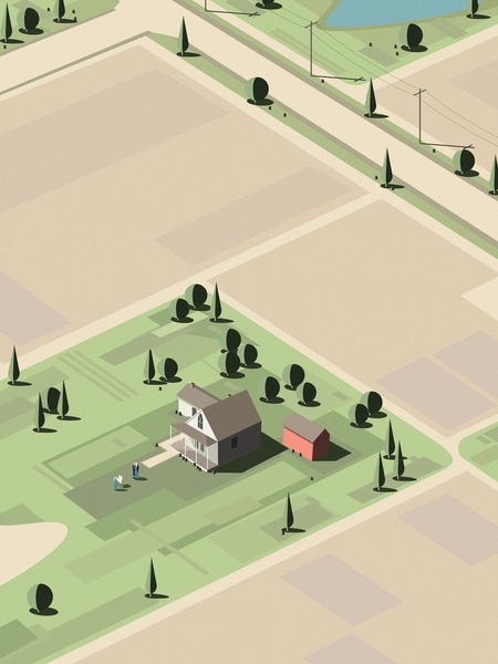
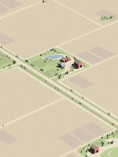
Farmland. Painting American Gothic.
It is during this time that his style, «Neo-Precisionism, ” is formed, influenced by American Precisionism of the 1920s–1930s (Charles Sheeler, Charles Demuth) and 1930s Regionalism (Grant Wood). Yoon takes their language—pure lines, geometry, industrial, and rural motifs—and translates it into the digital plane.
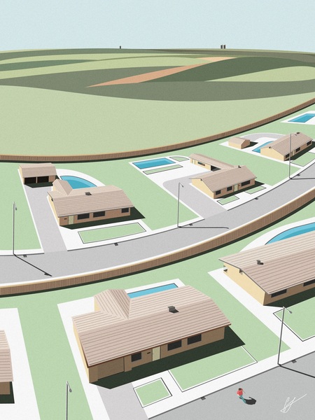
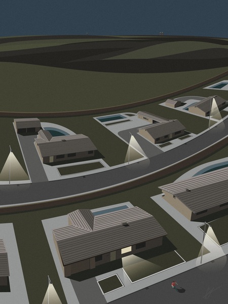
Midwest. Nighttime in the Neighborhood.
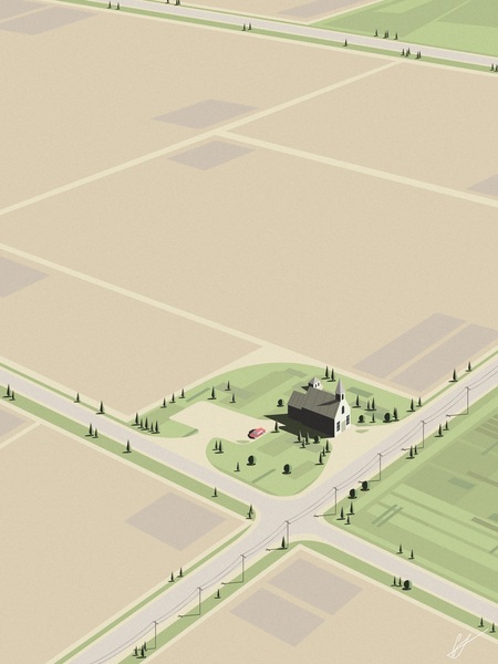
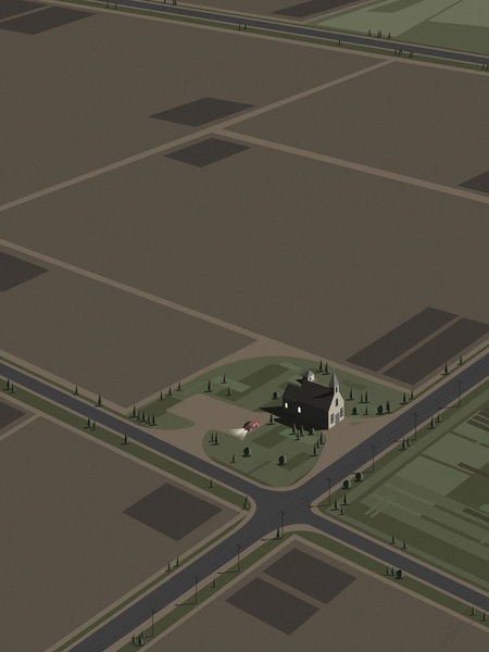
Sunday Sermon. One Last Sermon.
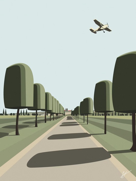
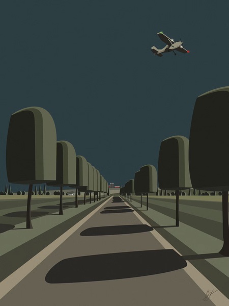
Calm Countryside. Bedtime.