Research Concept
Rationale for Topic Selection
The vinyl record is a dual cultural artifact. Inside the sleeve resides the sound; outside, the image. For several decades, from the mid-1950s to the early 1980s, the LP sleeve evolved from a purely pragmatic paper insert into a self-sufficient work of graphic design, merging painting, typography, photography, and conceptual art. This very process of transformation—from a utilitarian medium for information to a «canvas”—is the subject of this research.
The choice of this topic stems from personal interest: rock music of the latter half of the 20th century remains a living cultural space for me, not a museum exhibit. However, beyond fan admiration lies the question: how, and under what influences, did the record cover become a conceptual object?
Key Question and Hypothesis
Key research question: How did the vinyl record sleeve transform from a mere promotional label into a conceptual piece of graphic design, and what visual strategies facilitated this transition?
Hypothesis: The transformation of the vinyl record sleeve into a conceptual object resulted from the simultaneous action of several factors: technological (the advent of the LP with expanded design space), cultural (the 1960s rock revolution as a demand for visual identity), and institutional (the formation of the art director profession within the music industry).
The interaction of these factors gave birth to an entirely new genre of graphic design.
Material Selection Principle
The research material was selected based on the principle of «inflection points»: each section examines covers that signaled a qualitative shift in visual strategy or production practice. The chronological scope covers 1939–1982—from the invention of the sleeve for 78 rpm records to the peak of the LP era and the beginning of its displacement by the compact disc. Geographically, the study is focused on the American and British scenes, as they are the most documented and influential.
Another selection principle is genre diversity: alongside rock, jazz and avant-garde electronic music are considered, as it was within these genres that visual techniques were developed and later adopted by rock. The rubrication principle is chronological and thematic: each section corresponds to a specific stage and its dominant visual strategy.
Source Consultation Principles
The research is based on English-language design history literature (Meggs & Purvis, Paulo / Wiedemann, Thorgerson & Powell) and the work of David Burn, which merges musical experience with industry analysis. From domestic sources, we have utilized open articles on graphic design of covers, available on CyberLeninka. The covers themselves serve as the primary sources as visual artifacts.
Part I. Pre-Concept: The Envelope as Packaging (1939–1954)
Old vinyl record sleeves
The first record sleeves appeared in the late 1930s as a purely functional solution: to protect fragile shellac from scratches. In 1939, Alex Steinweiss, a recent graduate of the Art Student League, took the position of art director at Columbia Records—and immediately proposed replacing the plain paper sleeve with an illustrated cover. According to his contemporaries, the first illustrated sleeve significantly boosted sales of the repertoire recorded within.
Steinways developed a unique lettering style that merged Art Deco elements with American commercial poster art. His envelopes—festive, illustrative, and poster-like—defined the aesthetic of the «booklet» (as the envelope was then known) for a decade and a half. However, this was the aesthetic of advertising design, not conceptual design: the cover image advertised the contents, but it did not interpret them.
Alex Steinweiss. Early Columbia Records Covers
The technological revolution of 1948—the invention of the long-playing LP record (33 ⅓ rpm)—altered the physical form of the sleeve. This new 12 × 12 inch (30.5 × 30.5 cm) format offered designers an entirely different canvas for their work. The square format became one of the most recognizable «screens» of 20th-century visual culture.
Part II. Jazz as Laboratory: Abstraction and Typography (1954–1963)
1950s jazz labels did what commercial rock and roll imprints were hesitant to do: they elevated design as a statement above design as mere advertisement. Blue Note Records, under the guidance of Francis Wolff and with designer Reid Miles, created a cohesive visual system that became an emulation standard for decades to come.
Reed Miles. Covers for Blue Note Records. 1956–1967
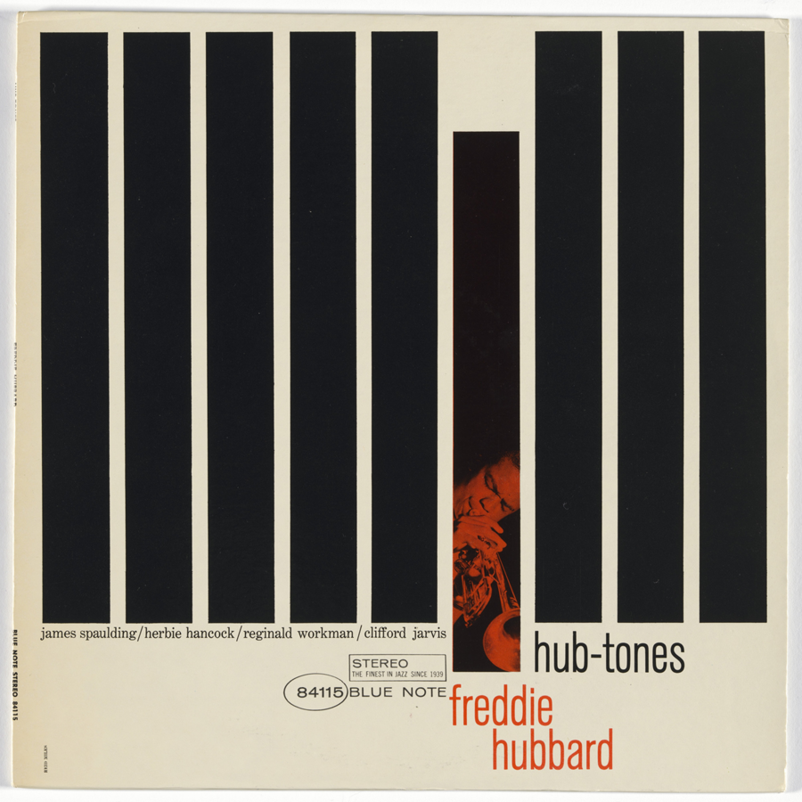
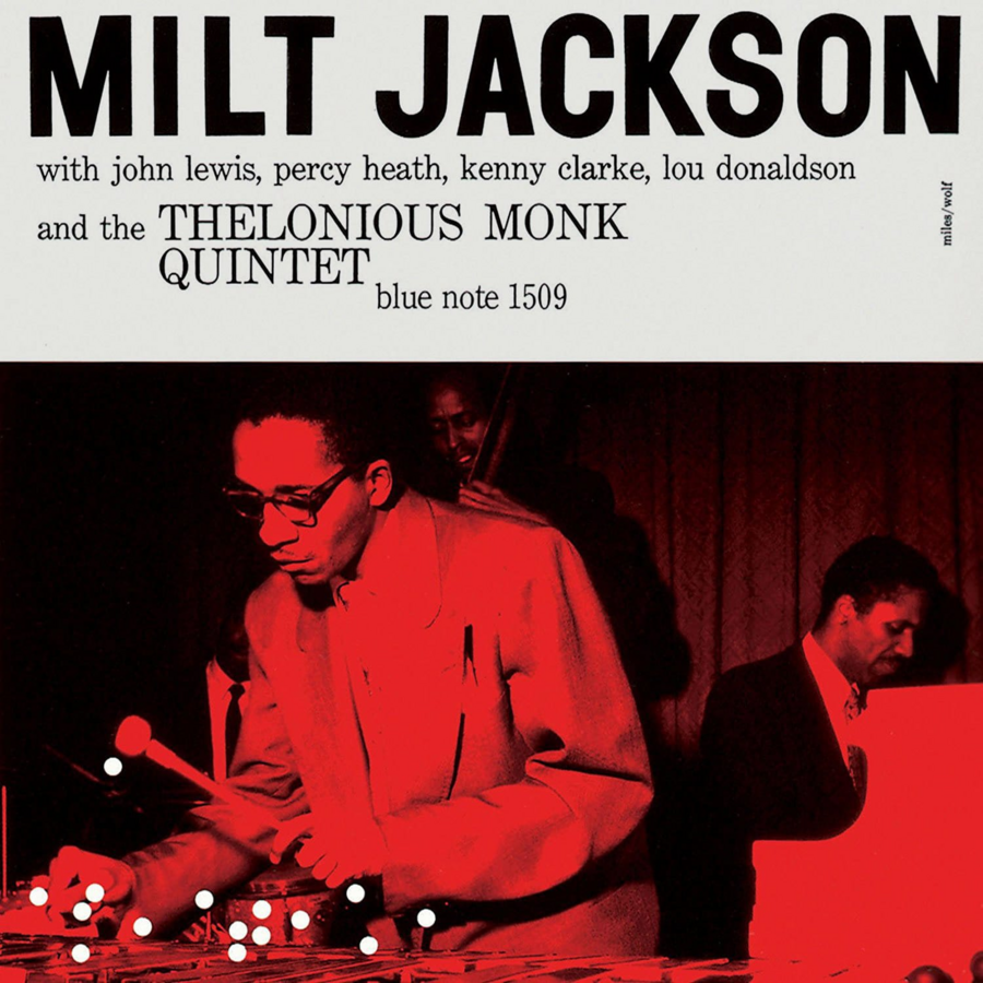
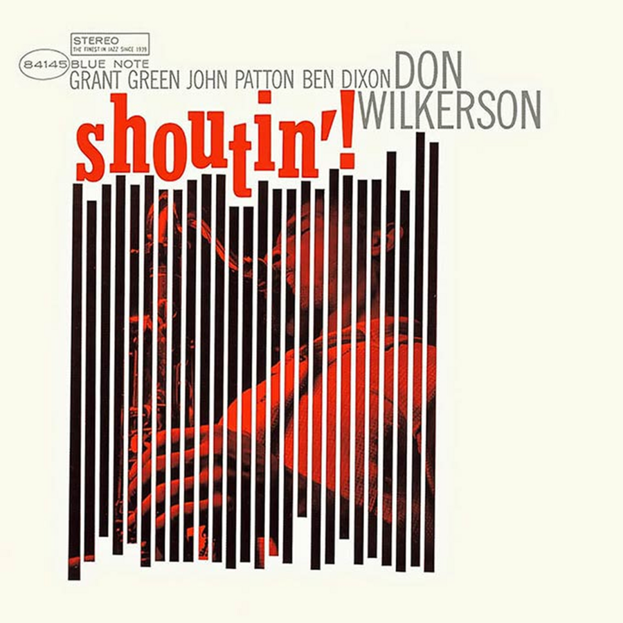
Reed Miles. Album Covers for Blue Note Records. Reed Miles' visual language: extreme cropping, tilted typography, high-contrast photography
Miles worked with the black-and-white photography of Francis Wolff, transforming portrait shots into nearly abstract graphic objects through radical cropping and experimental typography. The typeface on Blue Note covers didn’t just name the artist—it participated in the visual composition, becoming a design element equal to the image itself.
Radical cropping was Miles’ signature technique: a fragment of a musician’s face or hands would turn into a graphic spot that could be read from several meters away—from a store shelf.
Impulse! and Color as Concept
Impulse! , established in 1960, contrasted the monochrome minimalism of Blue Note with a vibrant, almost aggressive color palette. Art Director Bob Thiele, working with designers, developed a system of orange and black stripes—a instantly recognizable «signature» identity that anticipated the systemic approach to music label branding.
The jazz laboratory of the 1950s and early 1960s proved that an album cover could carry an intellectual and artistic weight equal to the music itself. This experience—abstract form + bold typography + systematic thinking—became the foundation upon which rock design was built in the mid-1960s.
Section III. The 1967 Revolution: Concept Art Comes to Rock
1967 was a turning point. The release of three albums overturned perceptions of what a cover could be. Sgt. Pepper’s Lonely Hearts Club Band, Their Satanic Majesties Request, and The Velvet Underground & Nico established three distinct, yet equally revolutionary, models.
Sgt. Pepper’s: Collage as a Total Work of Art
Peter Blake. Sgt. Pepper’s Lonely Hearts Club Band. The Beatles. 1967
Peter Blake and Jann Haworth created the collage cover for Sgt. Pepper’s Lonely Hearts Club Band, featuring over 50 famous figures—from Lewis Carroll to Karl Marx. It was more than just an image; it was a manifesto. For the first time, the LP cover became a sculptural object (the band posed against a fully constructed set), and the record was released with a full-color poster and booklet containing lyrics—an unprecedented publishing concept at the time.