Categories
- Introduction
- Broad-nib pen
- Pointed pen
- Brush
- Print media
- Digital outline
- Comparative analysis
Introduction
The form of a written mark is shaped by the instrument, material, and writing technique. The width of the writing point, its flexibility, angle of inclination, and the nature of the stroke determine line thickness, contrast distribution, and the shape of stroke terminals.
When using a broad-nib pen, line thickness depends on the direction of movement relative to the instrument’s cut. A pointed nib allows line thickness to be controlled by pressure. A brush combines variations in pressure, angle, and the position of the writing surface.
These characteristics become integral to letter construction and are preserved in calligraphic scripts and typographic fonts.
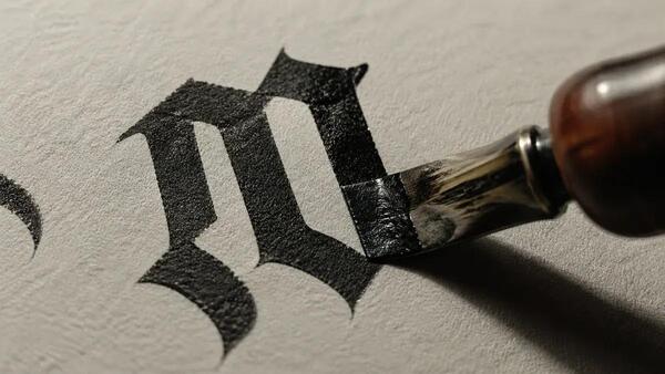
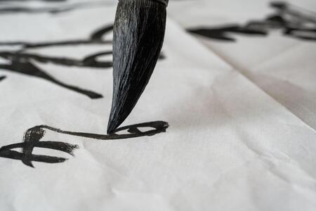
Writing tools: broad-nib pen, pointed pen, and brush. The shape of the tool’s working tip influences the character of the resulting stroke.
In the tradition of handwriting, many letter features emerge directly during the writing process. Characteristic thickenings, curves, and line endings are linked to hand movement. These elements subsequently become fixed in stable graphic forms.
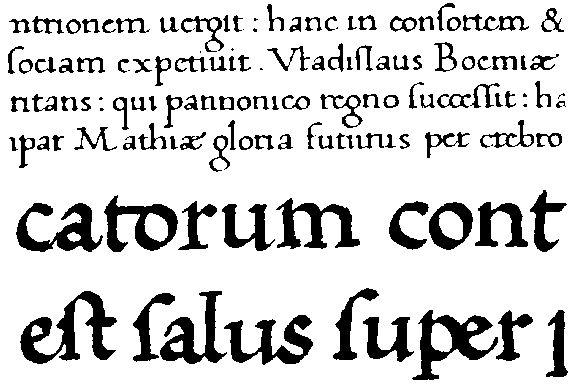
Handwritten letterforms. Recurring proportions and the characteristic distribution of thick and thin strokes create a unified graphic rhythm.
Broad-nib pen
A broad-edged nib is a writing instrument featuring a flat cut of a specific width. Its shape allows for the creation of lines of varying thickness at a consistent pressure. The quality of the stroke depends on the positioning of the writing edge relative to the direction of movement.In different historical periods, reed and bird quills with a broad cut were used for writing. Later, metal nibs became widespread. The principle of line formation remained the same.
Metal Pen.
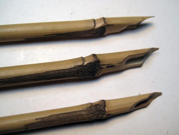
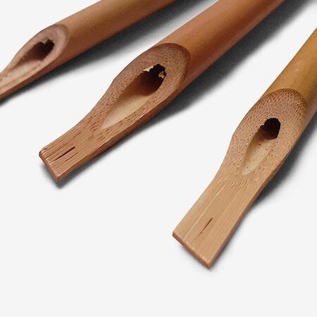
Varieties of broad-nib writing instruments: reed pen and flat-cut bird pen.
The width of the pen serves as the unit of measurement for the proportions of calligraphic letters. The height of the characters can be defined by the number of writing edge widths. This method allows the ratios between the stroke thickness and the letter size to be maintained when scaling the writing.
The slant of the letter is determined by the position of the broad edge of the pen relative to the horizontal baseline of the line. While maintaining one slant angle, vertical, horizontal, and diagonal movements create strokes of varying thickness. Changing this angle affects the distribution of visual weight within the letter. It dictates the placement of thick areas, the character of curves, and the shape of the terminals.
Line thickness dependency on pen direction. Illustration by Kathryn Scarfe Beckett, 2009.
Calligraphic practice utilizes various writing angles. For instance, in the Foundational Hand, a foundational book script systematized by Edward Johnston in the early 20th century, the primary angle is around 30°. Certain variations of Gothic script employ angles of approximately 40–45°.
Constructing letters in the Foundational Hand script. A study sample indicating stroke order and proportions. The historical basis of this script is tied to the study of medieval illuminated manuscripts by Edward Johnston.
The construction of letters written with a broad-edge nib is based on a combination of straight, diagonal, and curved strokes. Their thickness and form are determined by the nib width, the writing angle, and the sequence of movements. Vertical elements typically establish a stable rhythm. Curved strokes acquire variable thickness related to the direction of movement. Characteristic tapered and cut endings may appear at the beginning and end of the stroke.
A crucial constructive parameter is the ratio of letter height to the width of the stroke. Changing this ratio affects the density of the writing.
Uncial Script. 11th–14th Centuries
Early Cyrillic bookhand, characterized by its geometric nature, relatively large letters, and orderly arrangement of signs. Various stroke formation methods were found in the uncial script, including the use of a broad-nib pen.
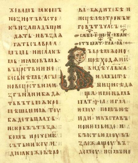
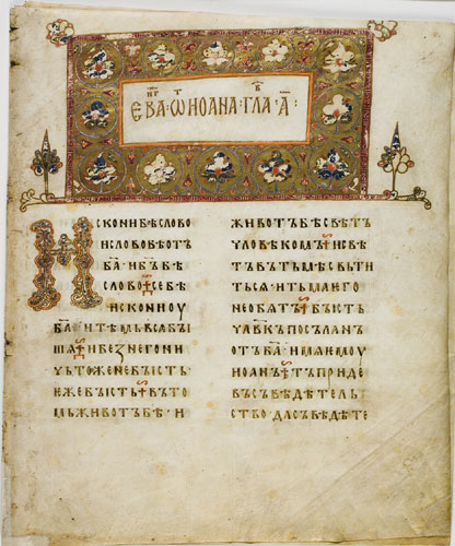
Ostromirovo Gospel, 1056–1057. A sample of ancient Russian liturgical script.
Gothic Script. 12th–15th Centuries
Gothic book hands are characterized by narrow proportions, a dense rhythm of vertical strokes, and angular connections. The broad-nib pen allows for the formation of repeating elements with distinct contrast.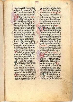
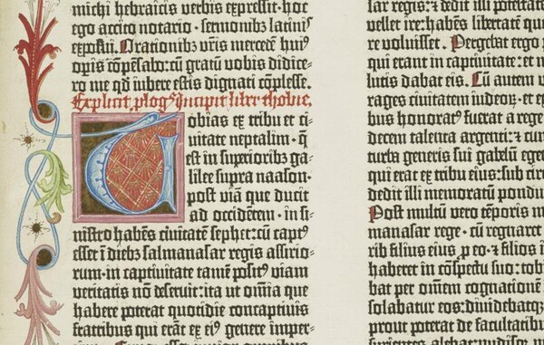
Sample of Gothic Textura script. Density of the textual composition and characteristic stroke endings.
Foundational Hand. Early 20th Century
Script systematized by Edward Johnston based on the study of medieval manuscripts. It is characterized by rounded forms, stable proportions, and a consistent distribution of contrast.
Calligraphic Samples: Foundational Hand. Edward Johnston and the tradition of instructional lettering.
The broad-nib pen significantly influenced the development of European and Cyrillic manuscript styles. Its structural characteristics are visible in the contrast distribution, the shape of letter terminals, and the proportions of the letters. These features subsequently evolved in typographic typefaces.
3. Pointed Nib
A pointed nib is a writing instrument with a narrow tip capable of creating fine lines. In flexible metal nibs, the tip is divided by a longitudinal slit into two leaves that spread apart when pressure is applied.Using a flexible pointed nib allows you to vary the line thickness directly during the act of writing. The shape of the line is influenced by the pressure applied, the direction of movement, and the flexibility of the tip.
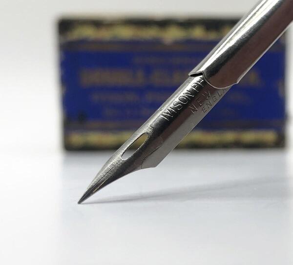
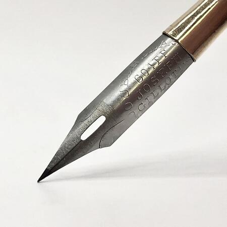
Pointed metal quills.
Pointed metal nib. The tip’s construction allows line thickness to be adjusted by varying the pressure.
Pointed nibs were used in European calligraphic traditions and gained widespread use in the 19th century with the development of metal pen production. They were employed for business correspondence, personal letters, and creating decorative script.