Concept
This research examines the advertising strategy of the Amsterdam-based Hans Brinker Budget Hotel, which has made its own shortcomings the foundation of its marketing campaigns. Instead of the typical promises of comfort and high-quality service, the hotel openly discusses its inconveniences, poor living conditions, and lack of amenities. Furthermore, these negative characteristics are presented with humor and become an integral part of the brand’s recognizable image.
Material Selection Principle
The sources include articles on the history of the Hans Brinker Budget Hotel advertising campaigns. They help explain the origin of the advertising strategy and hypothesize why it may be effective.Visual materials consist of Hans Brinker Budget Hotel advertisements, as well as other related materials that reveal the topic’s context.
Rubrication Principle
The research is divided into three parts. The first is dedicated to the historical context. The second examines specific advertising examples, the techniques used, and their significance. The third part focuses on the consumer profile and the reasons this approach appeals to a particular audience.
Navigation
(1) Historical Context
(2) Hotel Advertisement
(3) Consumer Persona
Key Question and Hypothesis
How does showcasing flaws in advertising for the Hans Brinker Budget Hotel become a tool for attracting consumers?
Intentionally exaggerating shortcomings allows Hans Brinker Budget Hotel to stand out from competitors, build a recognizable brand image, and attract an audience for whom an unconventional experience and low accommodation cost are more important than comfort.
(1) The History of Hans Brinker Budget Hotel
The facade of the Hans Brinker Budget Hotel on Kerkstraat in Amsterdam. The date and author are unknown.
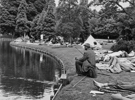
Hans Brinker Budget Hotel opened in Amsterdam in 1970. It is located on Keukstraat, in the building of a former Catholic monastery. The hotel’s appearance coincided with the rise of youth tourism in Amsterdam. In the late 1960s and early 1970s, the city became one of the centers of European counterculture. Young travelers came here from various countries, often staying directly on Dam Square or in Vondelpark. In 1970, city authorities began opening inexpensive accommodations designed for young people. By the first summer alone, about 55 thousand people had used them. Therefore, according to Eric Kessel’s memories, the main clientele of the hotel were students and travelers. This format subsequently became the foundation of the hotel’s advertising image.

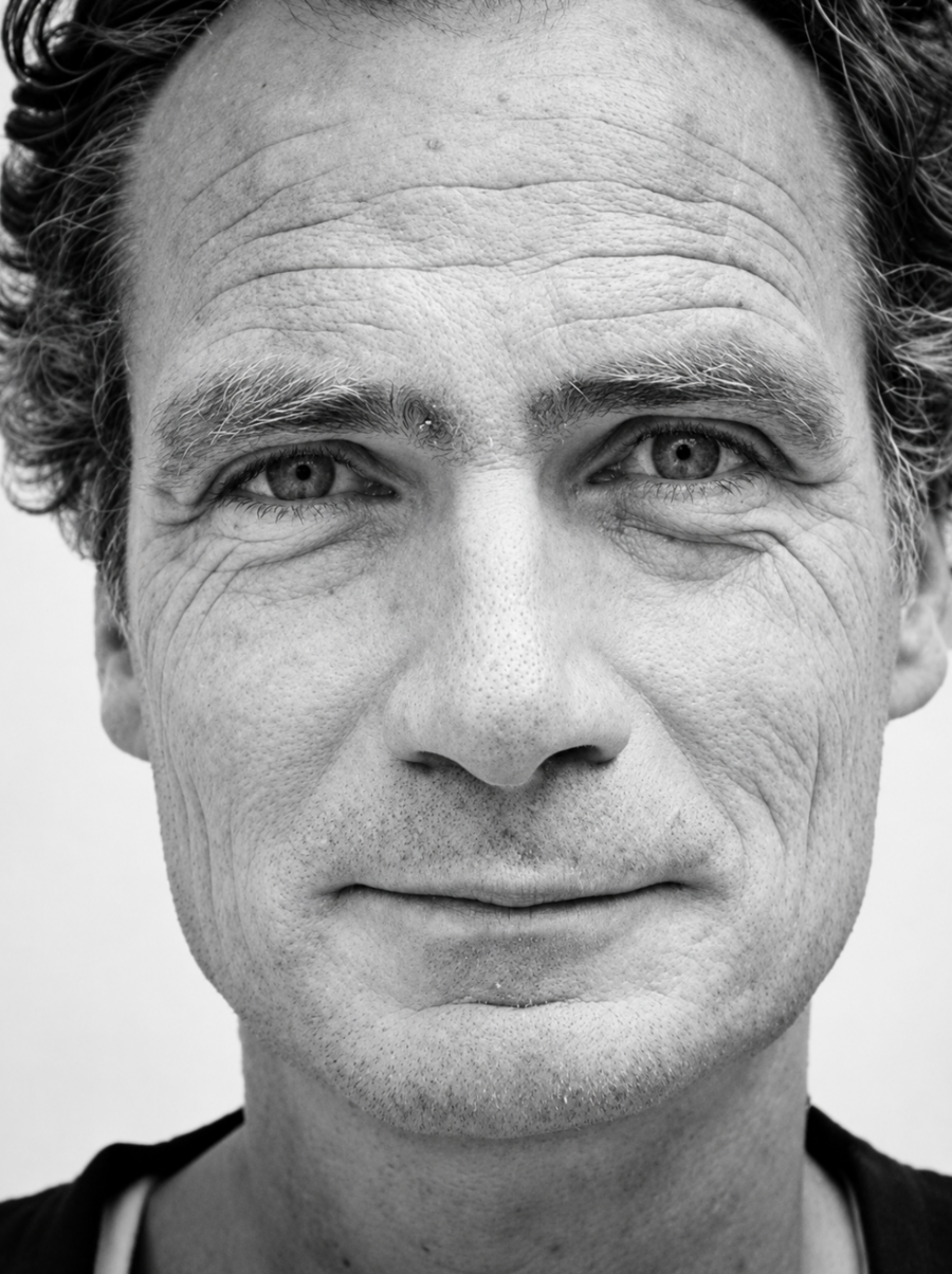
Erik Kessels and Johan Kramer, founders of KesselsKramer agency
In the early 1990s, Hans Brinker’s advertising campaign was taken over by Erik Kessels (Dutch artist and designer) and Johan Kramer (director, screenwriter, and producer). In 1996, they founded their own agency, KesselsKramer, which still exists today, and Hans Brinker became its first client. The main challenge was that the hotel had virtually nothing compelling to offer in terms of traditional hospitality advertising. Therefore, instead of hiding the hotel’s shortcomings or promising a high standard of service, the designers decided to openly leverage its negative attributes.
«Honesty and irony in their communication turned out to be a very successful solution.»
(2) Hotel Advertisement
As previously mentioned, Hans Brinker Budget Hotel’s advertising is built on contradiction: the hotel draws attention to what advertising messages usually try to eliminate. Here, they display broken items, lack of amenities, indifferent service, and tired guests. Ekaterina Borisova connects this strategy to the preemptive lowering of guest expectations in the article «How the Hotel in Amsterdam Became the Worst in the World?» [1].
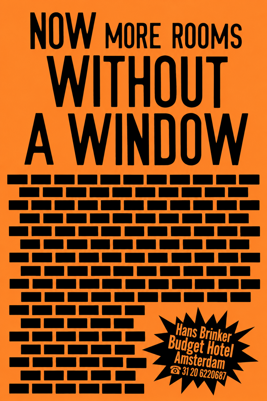
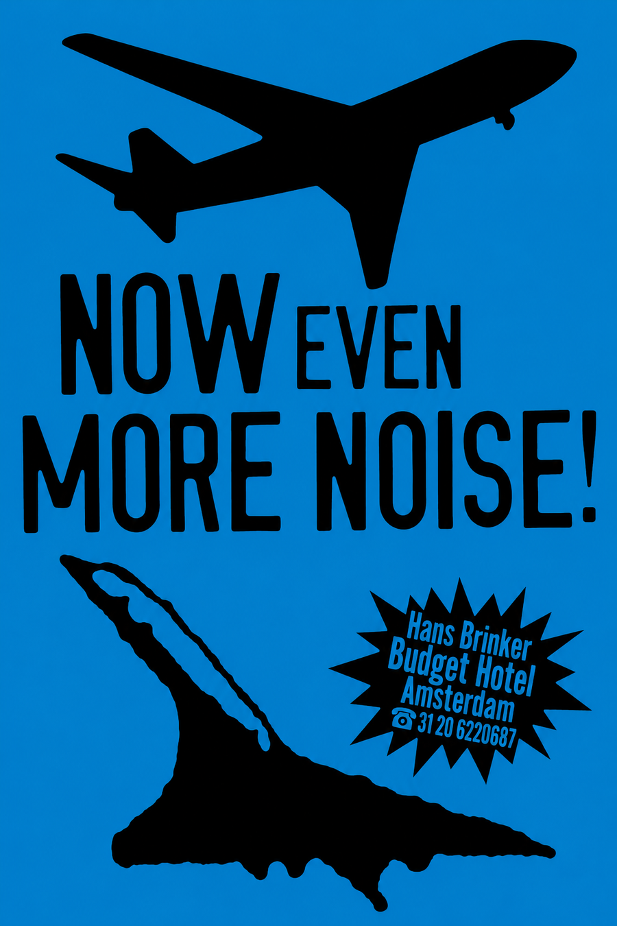
1. «Now more windowless rooms.» KesselsKramer, 1996 2. «Now even more noise!» KesselsKramer, 1996
In the description of the 1996 campaign, KesselsKramer notes that the unattractive features of the hotel were presented using the language of loud, sensational advertising [3]. This is particularly evident in the series of posters beginning with the word NOW—meaning «now.» Typically, such a construction signals brand evolution: new opportunities have emerged, quality has improved, or the selection has expanded. Following this, Hans Brinker delivers messages about having a bed, a door, or a free key, as if the hotel has made a significant leap forward, despite these items appearing to be standard amenities in any hotel.
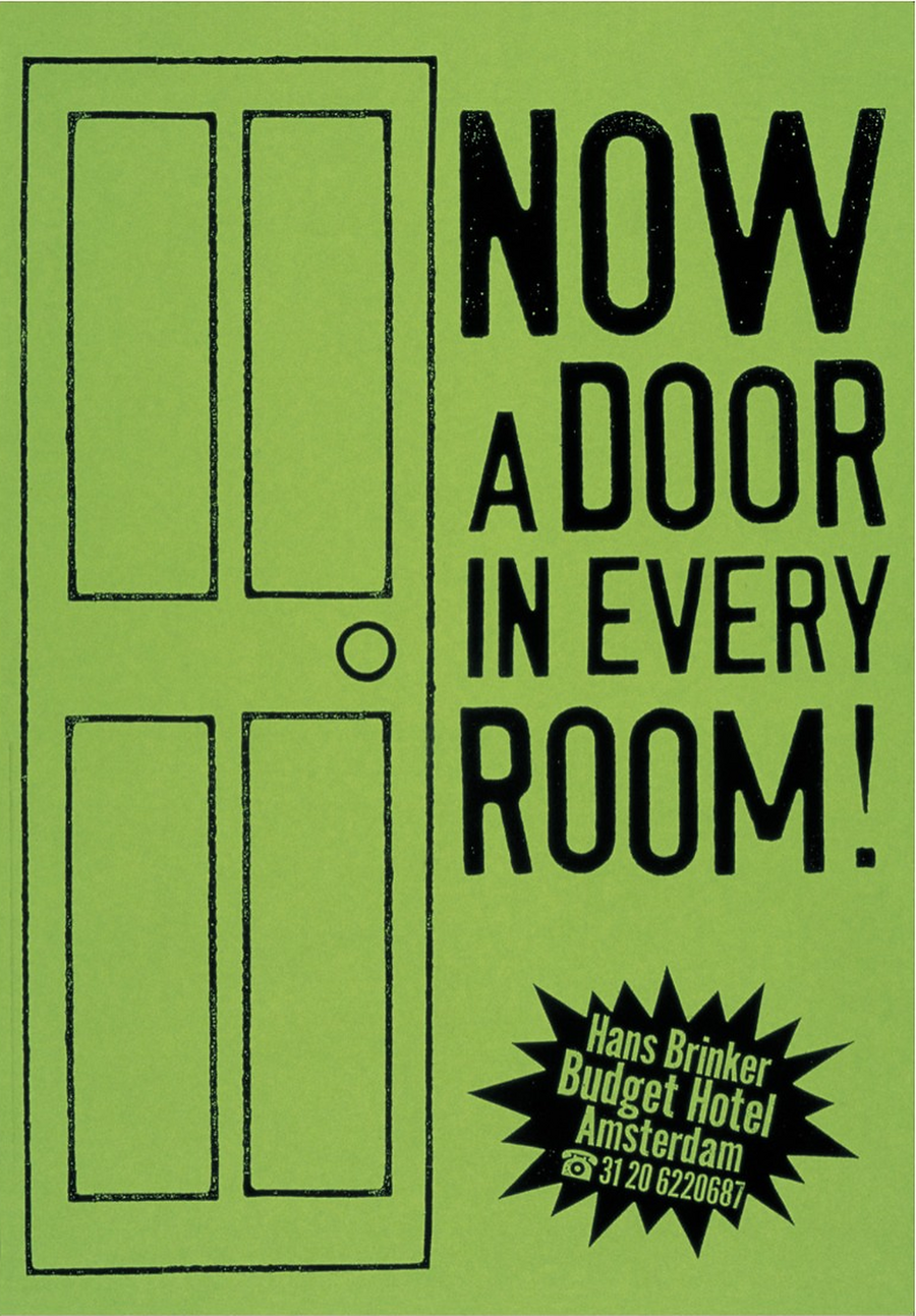
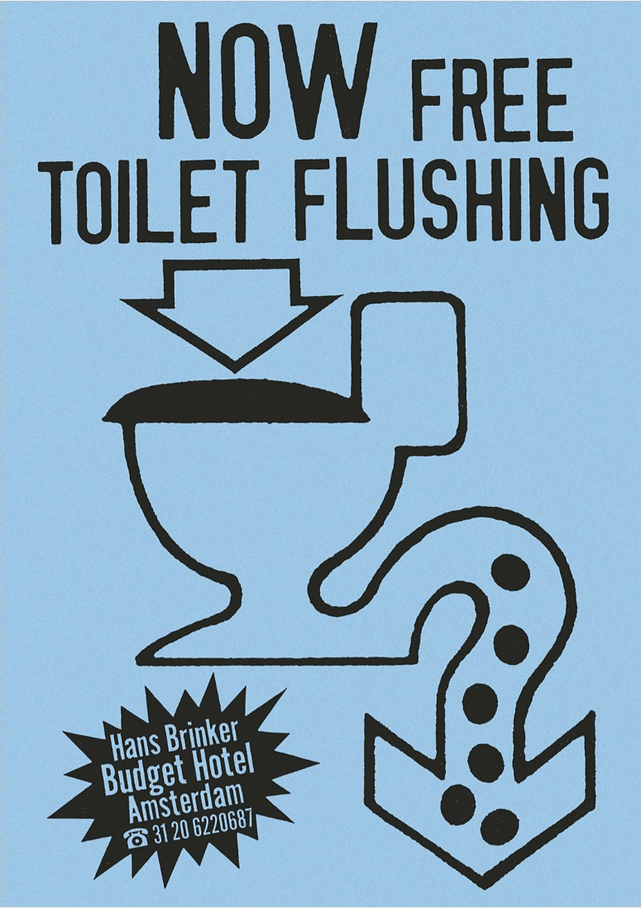
1. «Now the door in every room.» KesselsKramer, 1996 2. «Now with free flushing in the toilet.» KesselsKramer, 1996
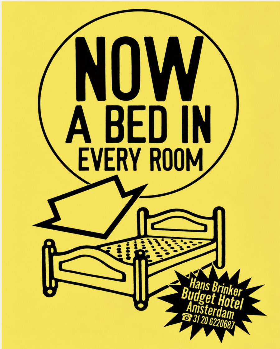
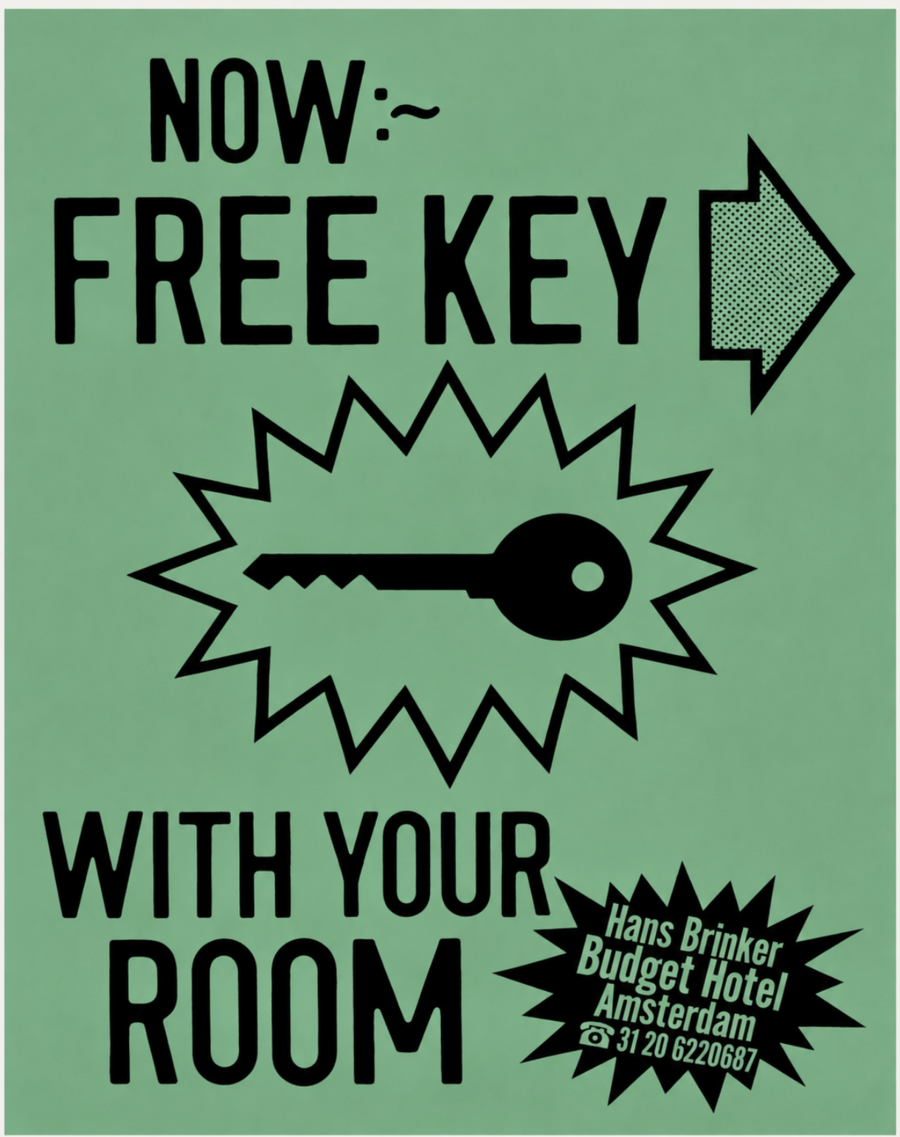
1. «Now, a bed in every room.» KesselsKramer, 1996 2. «Now, a free key to your room.» KesselsKramer, 1996
The colorful backgrounds, large black lettering, and jagged plaques resemble discount and special offer advertisements. It is amusing that next to the word «door, ” a door is shown; next to „toilet, ” a toilet is shown, and so on. This technique might seem overly simplistic and straightforward, but it is precisely this simplicity that creates a comical effect—the object is presented with such insistence, as if boasting about its inherent advantage.
«Even less service now.» KesselsKramer, 1996
In the poster announcing the service reduction, the pictogram resembles a familiar service icon, but instead of the expected item on the tray, there is a cross. It effectively communicates that the guest is being offered the absence of the service.The deliberately simple graphic conveys that the brand does not uphold conventional hotel formality.
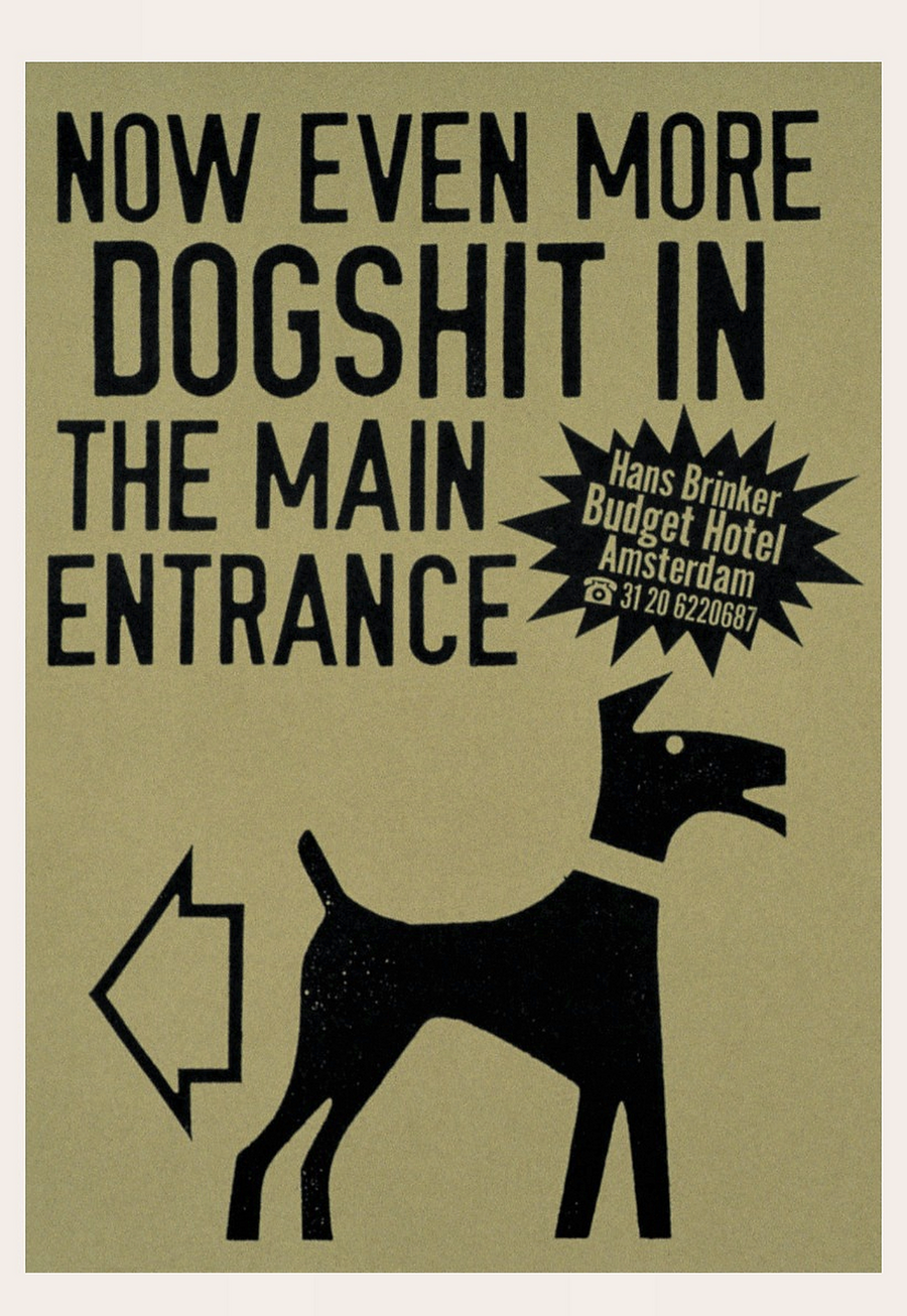
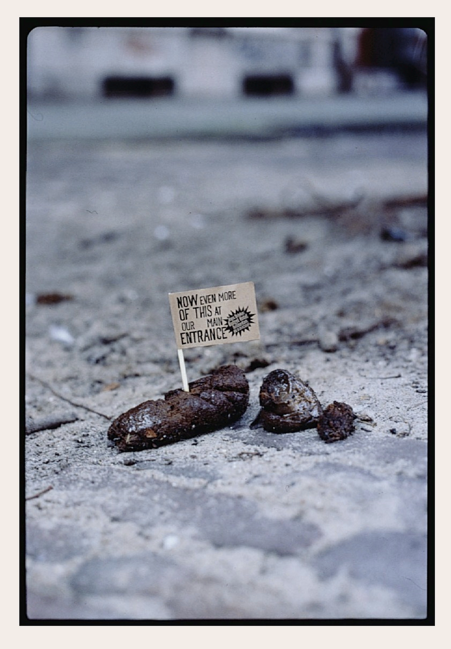
«Now even more dog excrement at the main entrance.» KesselsKramer, 1996
The posters announcing the increased number of dog excrement near the main entrance are even funnier. What usually causes disgust is transformed into a joke here. Thanks to the small writing on the flag in the second poster, the viewer has to look closely, which draws even more attention to the brand.
Clip from Bridal Suite («Honeymoon Suite»). Hans Brinker Budget Hotel, KesselsKramer.
The following example is built on the clash between «expectation vs. reality.» The caption, «Our bridal suite,» which translates to «Our room for newlyweds,» is placed over a photograph of a two-tiered bed. The image does not align with the perception of a romantic hotel room: instead of a single shared bed, two separate sleeping spaces arranged one above the other are shown.
«Not Included» Campaign Poster. KesselsKramer, 1996.