Concept
In comics, emotion is often sought through a character’s depiction—through raised eyebrows, tears, an open mouth, or a tense expression. Yet, the impression of the page itself arises before the reader even has time to scrutinize the faces. Intuitively, the reader notes the amount of negative space, how tightly the character is contained within the panel, how the frames are distributed, and the pace at which the images change. Studies on emotion in comics—such as A. V. Anishchenko’s work within text and communication theory—primarily focus on the character’s depicted state. The role of page space and composition in creating emotion remains less explored. Therefore, this work shifts the focus from facial expressions to the visual organization of the page.
In this sense, the comic page becomes a space for emotional interaction with the reader. The empty space between panels, the distance between characters, and the borders of the images collectively shape both the visual structure and the sense of distance, tension, or tranquility. By observing the hero’s state, the reader finds themselves within the rhythm established on the page. They may pause on an image, quickly transition between panels, or feel a lack of visual information. Thus, the emotional effect is created not only by what is depicted but also by how the image itself is organized.
The key question is how the comic artist uses drawing, panel borders, and negative space on the page to control the rhythm of perception and convey loneliness, anxiety, serenity, and nostalgia without a single word.
I believe that the emotional state in a comic can be conveyed through a combination of compositional elements that manage the reading pace and the perception of the page, regardless of the character’s facial expressions. Furthermore, the meaning of individual techniques depends on the context—the size of the empty space, the scale of the figures, the shape of the frames, and the rhythm of the panels do not possess a singular emotional meaning; instead, they interact with one another.
For this study, original comic books were selected. The sample includes works by Winsor McCay, Lionel Feininger, Frank King, Evan Dam, and Ryan Armond. Some works are in the public domain, and others were published by the authors under an open license. The chronological range from 1904 to 2008 allows us to examine compositional solutions across different historical and media contexts.
The objective of this research is to determine how the visual organization of a page contributes to conveying emotional states. The focus is on the scale and placement of figures, negative space, framing device, and the sequence of shots.
Navigation Menu
1. Introduction
2. Loneliness
3. Anxiety
4. Serenity
5. Nostalgia
6. Comparative Analysis
7. Conclusion
8. Bibliography and Image List
Loneliness
A character’s solitude is determined not only by their isolated presence in the frame. The key factor is the organization of the space: the presence or absence of other figures, their distance, the level of detail, and the «vitality» of the surroundings. Expansive yet empty territory can both underscore isolation and evoke a sense of freedom. Therefore, this section compares the degree of interaction between the character and the environment.
To conduct this analysis, pages were selected from Ryan Armand’s comic «Minus» and Evan Dam’s «Rice Boy.» In the former, the space is often presented as empty, lacking distinct objects or conversational partners for the protagonist. In the second comic, solitude is more attributable to the scale of the world and the duration of the journey. This difference allows for an investigation into whether a large distance between a figure and its surroundings always carries the same semantic weight.
Ryan Armand. «Minus, ” 2006–2008.
The key element on this page is the lack of visual reaction from the space, rather than the protagonist’s size. The empty space does not direct the protagonist toward another figure of action, nor does it offer her an activity that could change her situation. The gaze immediately catches the scale of the surroundings, and then the girl herself. Because of this, the figure appears very small and detached from everything that surrounds her. The space does not press upon her, as in scenes that convey anxiety, but it offers no support either.
Ryan Armand, «Minus,» 2006–2008.
In this instance, the vertical movement dictates the direction but does not guarantee proximity to other subjects. The protagonist navigates the space, but the route itself does not facilitate a meeting. When a figure’s position changes across adjacent shots while the environment remains constant, the movement is perceived as cyclical. This is the key difference from a typical journey scene. Therefore, the path here emphasizes the absence of a goal and accompaniment more than it indicates the achievement of one.
Ryan Armand, «Minus, ” 2006–2008.
This example illustrates that isolation can manifest not only in the physical absence of others. Adults are present in the narrative through voice, but they are not depicted within the frame. The reader hears an address but does not see the speaker. This creates the impression of a one-sided influence rather than a dialogue between equal participants. The heroine remains visually alone, even though other people are formally present around her. The compositional choice emphasizes the distinction between physical presence and actual connection.
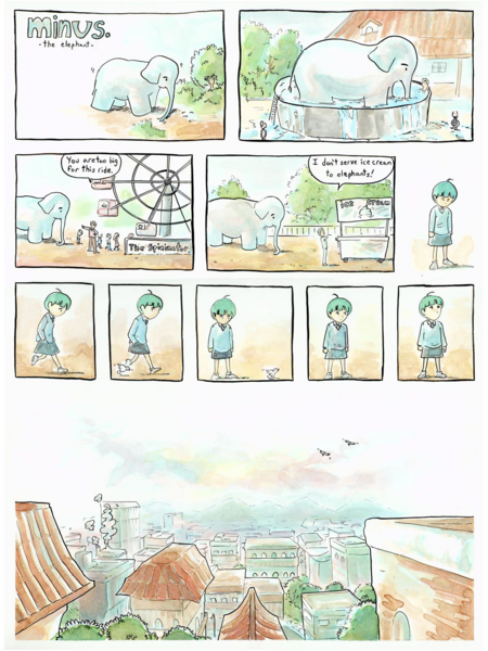
Ryan Armand, «Minus,» 2006–2008.Here, solitude manifests through the sensation of time. When successive frames barely differ from one another, the reader becomes trapped in a single state and gradually begins to notice the waiting itself. From a narrative standpoint, this moment might seem insignificant, but compositionally, it is crucial. The content of the page becomes the absence of an event. Emptiness takes on two forms immediately. There is little interaction both around the heroine and within the sequence itself.
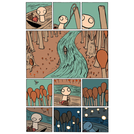
Solitude within a populated world. Evan Dam, «Rice Boy,» 2006–2008.Unlike «minus,» in this comic, the space around the character is not necessarily empty. The landscape may be richly detailed, but that detail does not substitute for close connection. The world’s scale makes the protagonist small, and since there is no second figure, he remains alone with that scale.Emptiness, as seen in Armand’s example, can be both literal and social. The world is full of objects, yet a conversational partner is still missing.
Loneliness in the negative space is usually constituted by an empty field, the absence of a visible counterpart, and infinite waiting. In «The Drawing Boy,» however, it is maintained more by the scale of the world and the length of the journey. The conclusion is this: a spacious frame, on its own, resolves nothing. It only begins to resonate when the space fails to respond to the character, or when movement does not culminate in contact. Moreover, the question «how much space is around the figure?» is not the only one that matters. Equally important is another: «what does this space afford her?»
Anxiety
In a comic, anxiety rarely stems from a direct threat to a character. More often, it is caused by the surrounding world, which begins to descend into madness. Objects suddenly become enormous, distances lose their meaning, panel borders press down on the heroes, and the sequence of pages accelerates the action. Order is broken—and the reader notices it. They anticipate that things will only get worse from here on out.When analyzing anxiety, the work of Winslow Macke is particularly interesting. In «The Cream Cheese Toast Dream» and «Little Nemo in Slumberland, ” he consistently depicts a world where ordinary things behave unpredictably. This isn’t just about depicting fantastic events. Macke alters the organization of the page itself: he uses panels of varying sizes, distorts conventional proportions, and pushes imagery outside the expected composition.This section explores two primary techniques: manipulating the scale and shape of the frame, and accelerating the narrative. However, these techniques alone do not always generate anxiety. They become unsettling when they disrupt the character’s established spatial position. And when they deny the reader the ability to predict what will happen on the next page.
Confined Space and Loss of Control
Winsor McQuee. «The Dreams of a Cheese Crouton Lover, ” 1904.
The anxiety on this page arises because the free space gradually disappears. The protagonist enters the train car, sits down, and at first, everything appears completely normal. But with each new stop, passengers board, and his position begins to shift. People occupy more and more space, draw closer, and eventually practically squeeze him out of the environment.It is not only the number of characters that is important, but also how they are positioned relative to the protagonist. He finds himself trapped between other people, and there is almost no space left to retreat to. The car ceases to be perceived as an ordinary public space. It transforms into a closed environment from which there is no escape.The composition reinforces this feeling sequentially. In the first frames, individual figures and gaps between them are still visible. Further on, the passengers fill almost the entire panel. The frame continues to maintain the boundaries of the scene, but inside, it becomes noticeably more cramped. This suggests that the threat does not necessarily have to come from the outside; it can arise right within a familiar environment.It is telling that McKee chooses a mundane situation rather than a fantastic monster. Fear here stems from the violation of personal space and the inability to control what is happening. The reader watches as the protagonist gradually loses his freedom of movement.
Tension can be created through compositional density, and this example serves as a clear illustration. In the section focusing on the hero’s solitude, a large expanse of empty space separated them from the world, but here it is the opposite: figures occupy every available space. The space loses its neutrality and pressures the character.
Altering Scale and Disrupting the Familiar World
Winsor McCay. «Little Nemo in Slumberland, ” 1908.
Here, anxiety is born from the density of the composition. In the section about the hero’s solitude from the world, a large empty space separated him; here, it is the opposite—the figures fill every available space. Space is no longer neutral; it presses down on the character, and this is felt immediately.In this issue, Nemo’s bed suddenly comes to life. It grows long legs and takes the characters for a walk through the night city. The plot is, of course, fantastical, but what is far more curious is how Mackay integrates it into the page’s composition.The entire strip is divided into horizontal rows. The bed’s legs gradually stretch out, and along with them, the panels grow in each subsequent row. The shape of the panels literally follows the object. This increasing height of the tiers gives the author the opportunity to show the scale of the events step by step: from the first seconds of transformation in the bedroom to the steps of the giant bed across the city rooftops. And in some places, the drawing completely breaks the frame boundaries and crosses into the next one.Usually, the border remains a passive boundary that neatly separates one event from another. For Mackay, it becomes part of the story. Anxiety arises here precisely because of the broken scale of everyday things. The characters become hostages to an ordinary domestic detail. There is humor in the plot, but it is the disruption of proportions that makes the scene unpredictable.In the finale, the flight ends in a fall, and Nemo wakes up on the floor of his room. This creates a cyclical narrative, returning the hero to the beginning of the dream. But what is more important for analysis is something else: the panel framing throughout the page was not static; it changed along with the narrative, creating the necessary tension.
In the comics MacKay examines, he employs various techniques to generate a sense of unease. Sometimes, a panel gradually fills with figures, making the hero feel physically constrained. In other instances, an ordinary object distorts its familiar proportions, and the panel frame stretches along with the character’s growth. The core principle here is simple: control over space is lost. The character can no longer comfortably fit within the frame or rely on the stability of the surrounding world. Furthermore, this anxiety is embedded in the very structure of the image—in the way its form transforms.
Tranquility